Scandi home design, translated for Australia
Scandi for Australian homes: why imported Nordic palettes read cold here, the warm translation, materials, costs and room-by-room specs.
Why this guide exists
Most Scandi home design content online is built for a different country. Nordic editorial sources lean into the climate the style was designed for: short days, low sun, six months of cool diffuse light, and interiors engineered to make the most of every hour of daylight. International style magazines treat Scandi as a single aesthetic with no real regional translation. Australian retailer marketing tends to fold Scandi, Japandi, coastal and warm minimalism into one big ‘natural materials’ bucket, which makes the styles harder to tell apart rather than easier. The result is a thin online answer to a real Australian question: what does Scandi style actually mean in a contemporary Australian home, why does the imported version often read cold under our light, and how do you do it well in 2026 without ending up with a clinical, postcard-Nordic room.
This guide is the deep answer. It covers what Scandi style genuinely is, where it came from, what’s different about Australian light and how that changes the palette and material choices, what the colour and material vocabulary looks like now, how Scandi reads in the kitchen, bathroom, bedroom and living space, the Scandi-barn exterior that has become Australia’s strongest architectural expression of the style, where the style sits next to Hamptons, coastal, Japandi and warm minimalism, what it costs to do well, and the mistakes that age it fastest. It is written for homeowners, renovators, designers and prospective buyers who want a clear read on the style rather than a feed of borrowed images.
It sits inside the broader interior design styles guide for Australia, where Scandi is one of the major contemporary directions alongside Hamptons, French Provincial and coastal. This page is the deep dive on Scandi specifically.
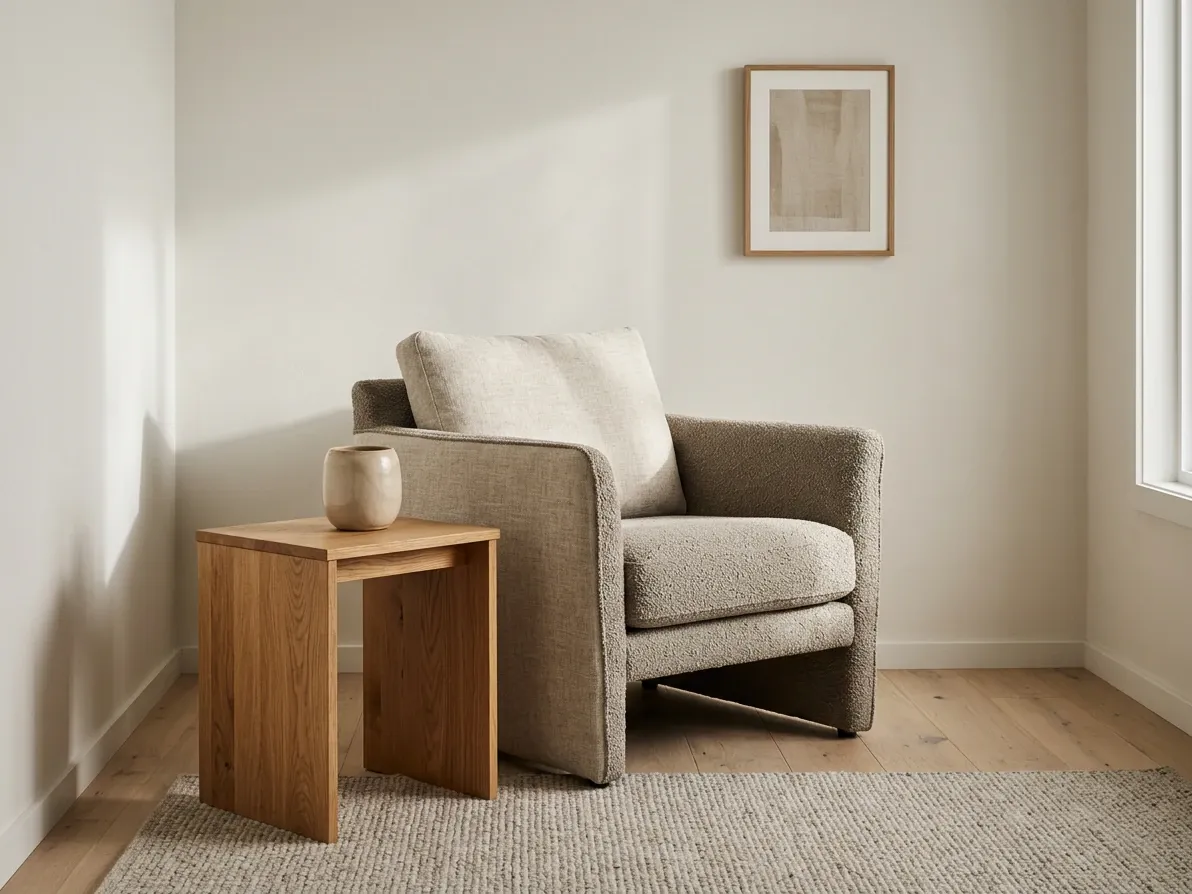
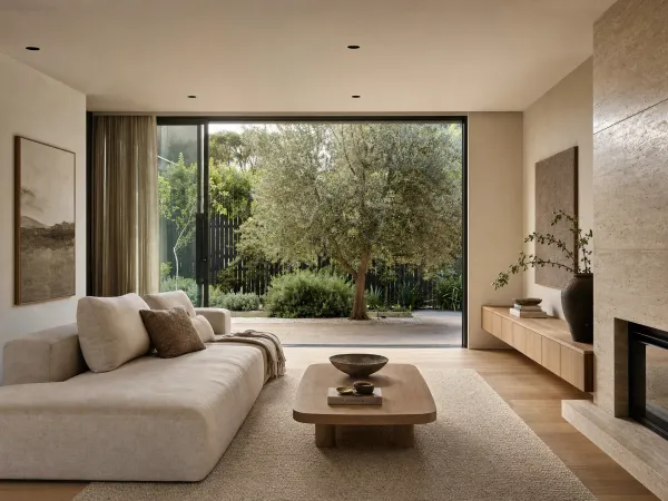
Honey oak, linen, bouclé and warm white. Restraint as the visual statement.
What Scandi home design actually is
Scandi home design is the contemporary expression of mid-twentieth-century Nordic functionalism. The intellectual core of the style, that beautiful, well-made objects should be democratic, practical and stripped of unnecessary ornament, was set in the 1930s and 1940s by designers like Finland’s Alvar Aalto and Denmark’s Arne Jacobsen and Hans Wegner, and reached international audiences during the 1950s as the Lunning Prize was awarded annually to outstanding Nordic designers from 1951 to 1970 and the ‘Design in Scandinavia’ touring exhibition opened in North America in 1954. According to Scandinavia Standard’s reference on Scandinavian design, the movement’s defining principles were functionality, simplicity, accessibility and a deep respect for natural materials and craftsmanship, and those principles are still what the word ‘Scandi’ means in 2026.
In a contemporary home, the style reads as a calm, light-filled room built around honest natural materials. The base palette is warm white across walls, ceilings and trim. The dominant timber is oak, historically pale Nordic oak, increasingly honey or mid-tone oak in current work, running through floors, joinery and furniture so the timber feel is consistent across the room. Textiles are linen, wool, cotton and bouclé in warm neutrals, with woven cane or rattan as a textural break. Stone is honed rather than polished. Hardware is matte black, brushed brass or natural patinated brass. Furniture is well-made, comfortable, and visually quiet: a slipcovered linen sofa, a pale-oak dining table, a wishbone chair or its descendants, a sheepskin or wool throw. Decoration is intentionally restrained.
Three Nordic concepts sit underneath the style and explain why the rooms feel the way they do. Hygge (Danish, pronounced ‘hoo-gah’) is the cultivated sense of cosiness and contentment that comes from soft lighting, natural materials, layered textures and a slow domestic atmosphere. According to Modern Dane’s Nordic Know-How explainer, it was developed as a response to long dark Scandinavian winters and the need to make the indoor hours feel worth being inside for. Lagom (Swedish) means ‘just enough’ and is the discipline that keeps a Scandi room from overcollecting: not too many cushions, not too many art pieces, not too much furniture, not too little either. Friluftsliv (Norwegian) is the cultural assumption that life is partly lived outdoors and that the home should connect to nature, which translates inside as plants, raw materials, large windows and a strong indoor-outdoor relationship. These are useful labels in an Australian context because they explain why a well-executed Scandi room feels intentional rather than just ‘minimalist’.
Where Scandi diverges from ‘minimalism’ as Australians often picture it (white walls, concrete floors, no soft materials, no warmth) is in its insistence on tactile comfort. According to King Living’s guide to Scandinavian-inspired interior design, the style was always meant to be warm, lived-in and welcoming. The minimalism is in the editing, not the experience. A well-resolved Scandi room is materially rich (oak under hand, linen against the body, wool underfoot, sheepskin on the chair) and visually restrained at the same time. That distinction is what most Pinterest-led Scandi rooms in Australia miss, and it is the single most useful thing to understand before specifying one.
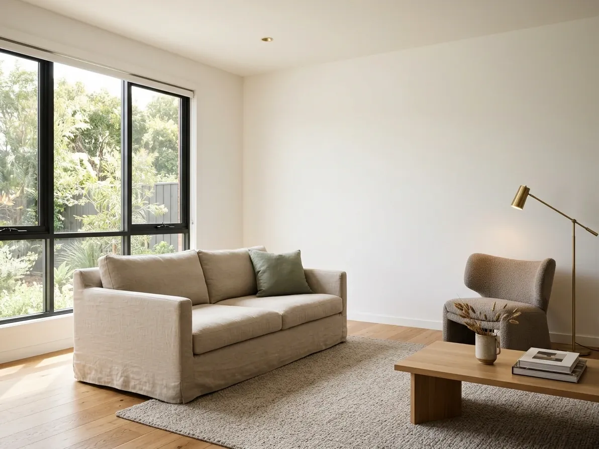
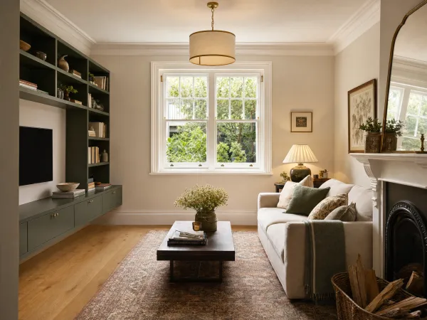
Warm-white paint, honey oak and oat linen. Warmed by one step at every layer.
Why imported Scandi reads cold under Australian light
The biggest mistake in Australian Scandi rooms is not a taste mistake. It is a climate mistake. The Scandi palette evolved in places where the light is cool, diffuse and scarce, and the colour and material choices were calibrated to brighten and warm rooms inside that light. In Australia, the same colour and material choices land in light that is warm, direct, abundant and high-contrast, and the result reads as flat, washed-out and clinical rather than soft and atmospheric.
The numbers underline how different the two starting points are. According to Current Results’ annual sunshine averages for Australian cities, citing the Bureau of Meteorology’s Climate Data Online, Sydney averages 2,628 hours of bright sunshine a year, Melbourne 2,373, Adelaide 2,774 and Perth 3,212. According to Current Results’ figures for European cities, citing national meteorological agencies, Stockholm averages 1,821 hours, Copenhagen 1,780, Oslo 1,668 and Helsinki 1,780. Major Australian cities receive between 30% and 90% more annual sunshine than the Nordic capitals where the style developed, and a Perth living room sees nearly twice as much bright sun as a Stockholm one.
The light is also a different colour. Nordic daylight skews cool and blue, particularly in winter and at the edges of the day. Australian daylight skews warm and golden, and at midday in summer it is intense enough to bleach surface colour and bring out every shadow. A cool-white wall paint plus a pale grey upholstery plus a Nordic birch floor plus 4,000K LED downlights produces a room that reads as soft, atmospheric and calmly cool in Copenhagen and as flat, harsh and clinical in Brisbane. The same room with a warm-white paint, an oat-tone upholstery, a honey-oak floor and 2,700 to 3,000K interior lighting reads as warm, calm and alive in both cities. The Australian version needs the extra warmth because the harsh midday sun is going to wash everything cooler than it does in the Nordics.
There is also a structural mistake to avoid. Northern Hemisphere Scandi homes are built to harvest light: large north-facing windows, deep glazing on every aspect, minimal shading. Lifting that design language straight onto an Australian site (especially in the eastern and northern states) without rotating the orientation and adding proper shading turns the living room into a sauna in summer. The Scandi vocabulary works in Australia, but the windows have to be sized and shaded for the local sun, not the Nordic one. Architecturally, that usually means generous south-facing glazing for ambient daylight, smaller deliberate north-facing openings (or larger ones with deep overhangs or operable louvres), eaves engineered for the local solar angle, and external shading on the western elevation.
The fix at the materials level is small but specific. Warm the palette by one step at every layer. Replace cool white with warm white, pale birch with honey or mid-tone oak, flat grey upholstery with oat or warm greige bouclé and linen, cool-white downlights with warm-white interior lighting at 2,700 to 3,000K, and brushed chrome hardware with matte black or natural patinated brass. The room still reads as Scandi (the moves are inside the style’s own vocabulary) but it reads as warm rather than clinical under the local sun.
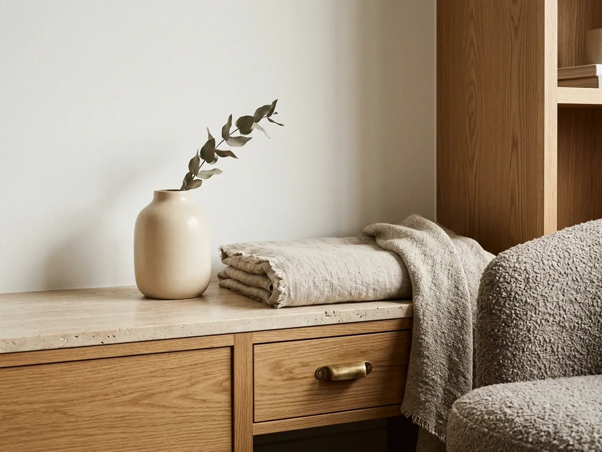
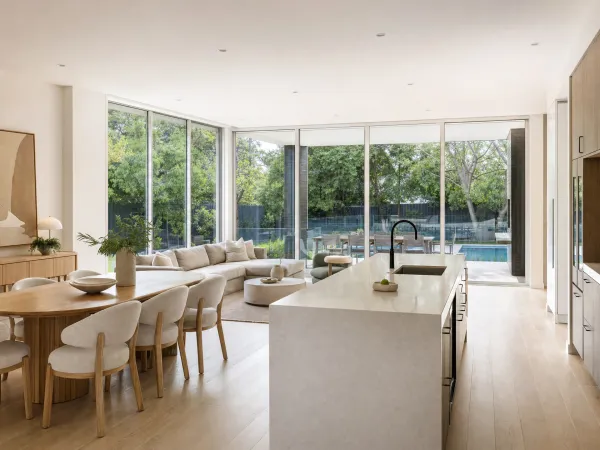
Honey oak, warm white, linen, bouclé, honed stone, brass. The 2026 vocabulary.
The 2026 palette and material vocabulary in detail
The 2026 Scandi palette has shifted noticeably warmer and softer than the cool-white-and-pale-birch take that dominated the late 2010s. According to Hudson Furniture’s 2026 Scandinavian trends note, the colour direction is moving toward honey oak, bouclé and muted greens, with FSC-certified timber and natural finishes like linseed oil becoming standard rather than premium options. According to Lifely’s 2026 Scandinavian living room guide, the dominant material story is texture-driven comfort (bouclé upholstery, woven cotton, slubbed linen, soft rugs and tactile ceramics) rather than the clean cool surfaces that defined the earlier version.
That direction is reinforced by the wider 2026 colour conversation. Pantone has named Cloud Dancer as its 2026 Colour of the Year: a soft, weightless, achromatic white that sits naturally inside the Scandi warm-white base. WGSN and Coloro have named Transformative Teal (a grounded blue-green that reads more confident than tentative) as their 2026 Colour of the Year, and a single restrained accent of teal sits cleanly inside the Scandi muted-secondary palette without violating its restraint. Neither colour fights the style.
The working palette breaks down something like this.
The base is warm white: a paint with enough yellow or pink in the undertone to read as warm rather than cool under direct Australian sun. White-on-trim and white-on-walls is standard. Where the brief calls for a second neutral on the walls (a feature wall, a hallway, a powder room), a soft greige, oat or warm taupe is the typical move.
The dominant timber is oak: pale European oak for an authentic Nordic read, honey oak for a warmer Australian read, mid-tone oak (close to but not as dark as walnut) for a richer 2026 take. The timber is usually used on the floor, on the kitchen joinery and on a hero piece of furniture (the dining table or the bench seat) so the wood reads through the room rather than appearing as an isolated material. Australian timber readers should note that locally-grown Tasmanian oak and Victorian ash work as close substitutes for European oak in joinery; they sit warmer and slightly pinker but read as a credible local equivalent and are widely available through FSC or PEFC-certified suppliers.
The supporting timbers are beech, ash and birch: lighter, blonder, more visually quiet than oak. Beech and ash often appear in dining chairs, side tables and small joinery; birch turns up in plywood casework and Nordic furniture imports.
The textiles are linen, wool, cotton and bouclé: linen for upholstery, curtains and bedding, wool for rugs and throws, cotton for sheers and slipcovers, and bouclé for sofas, chairs and the occasional curtain. The 2026 version leans tactile. Flat smooth fabrics (the late-2010s look) read as thin and aged here.
The texture set extends to woven cane, rattan, sheepskin, jute and chunky knit throws: each is used sparingly. One woven pendant, one cane-back dining chair, one sheepskin on the reading chair, one wool rug. Lagom: just enough.
The stones and hard surfaces are honed, not polished: honed travertine, honed limestone, soft engineered stone in warm white or soft greige for kitchen and bathroom benches, matte glazed ceramic for splashbacks and bathroom walls, terracotta or limewashed render for accent areas. Polished marble reads as decorated and tips the room out of the style.
The hardware is matte black, brushed brass or natural patinated brass: tapware, cabinet hardware, light fittings, mirror frames. Chrome reads as cold; antique brass reads as decorated. The Scandi register sits in between.
The accent palette is restrained and muted: dusty sage, soft forest green, dusty blue, warm terracotta, single deep black for grounding. Accents land in cushions, art, ceramics and one or two upholstered pieces, never on the walls and ceilings as a unified colour scheme.
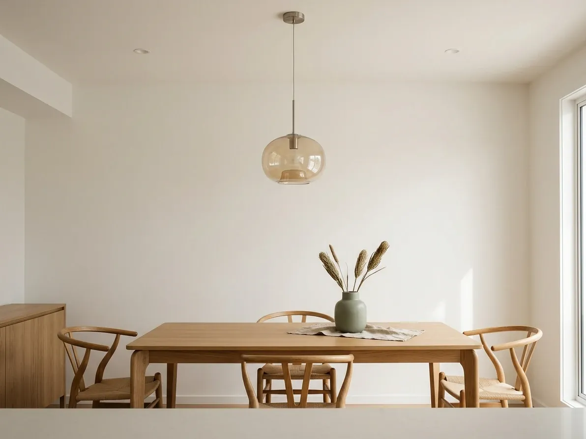
Scandi reads as quiet and material-led. No shaker, no rattan, no walnut.
Where Scandi sits next to Hamptons, coastal, Japandi and warm minimalism
The four styles overlap enough that they are constantly confused for each other in real Australian renovations. The differences are still material and easy to read once you know what to look for.
Scandi vs Hamptons is the cleanest split. Hamptons is the more decorated of the two. According to Coral Homes’ coastal-vs-Hamptons comparison, Hamptons leans on shaker cabinetry, raised inner panels, deep cornices, wainscoting, polished darker timbers (oak, walnut, sometimes rosewood), heavy statement furniture and a sharper cool-white-and-coastal-blue palette. Scandi runs flat-panel or vertical-board cabinetry, prefers lighter honey or mid-tone oak floors, treats architectural detailing as a distraction (no cornices, no wainscoting), uses lighter slipcovered linen or bouclé furniture rather than tufted upholstered statement pieces, and works to a warm-white-and-oat palette rather than a cool-white-and-navy one. The Hamptons home is the polished, decorated one and the Scandi home is the quieter, materially-led one.
Scandi vs coastal is closer at the materials level than at the philosophy level. Both styles share a warm-white-and-natural-timber base and both lean on linen, cotton, wool and slipcovered furniture. The differences are thematic and architectural. Coastal carries clear ocean references (rattan, jute, sandy palette, muted sage or seafoam accents, an indoor-outdoor flow that is the point of the room). Scandi is climate-neutral: no maritime references, the indoor-outdoor connection is welcome but not essential, and the accents are forest-floor (muted sage, dusty blue, terracotta) rather than ocean (seafoam, dusty blue, warm taupe). A practical test: a coastal room would look at home in a beach-adjacent suburb in Queensland, while a Scandi room would look at home in either a beach suburb or a Hobart hillside.
Scandi vs Japandi is the most commonly confused pair in 2026 because Japandi is the dominant headline in Australian interiors right now, and the two styles share most of their materials. According to House of Isabella’s Japandi 2025 explainer and 2Modern’s Scandi-vs-Japandi reference, Japandi is a hybrid that crosses Scandi’s natural-material restraint with Japanese wabi-sabi (beauty in imperfection), darker timbers (smoked oak, walnut, dark-stained ash), lower furniture inspired by Japanese floor-level living, softer diffused lighting (paper shades, indirect indirect), and a more meditative, gallery-like negative space. Scandi keeps oak in the pale-to-mid range, runs furniture at standard heights, treats lighting as a warm-white practical layer with bright daylight as the hero and uses negative space for restraint rather than meditation. The honest reality is that plenty of Australian rooms labelled Japandi are actually Scandi with one walnut piece; the Japandi label only earns the name when the Japanese half is genuinely doing work in the room.
Scandi vs warm minimalism is the most semantic of the four pairs. Warm minimalism is the broader 2025 to 2026 Australian category that the Houzz, Hudson Furniture and Better Homes & Gardens editorial conversation now uses as shorthand for ‘natural materials, restrained palette, considered negative space, light-led plan’. That description is essentially Scandi described without naming it. Most warm-minimalism rooms in Australian editorial work are Scandi-derived. The distinction, where it exists, is that warm minimalism is style-agnostic about provenance (it borrows freely from organic modern, Japandi, contemporary Australian and Mediterranean-modern moves) while Scandi insists on the Nordic vocabulary specifically (oak, linen, hygge, lagom). For a homeowner choosing a direction in 2026, the practical answer is that ‘warm minimalism’ is fine as a label and that the underlying execution is mostly Scandi in disguise.
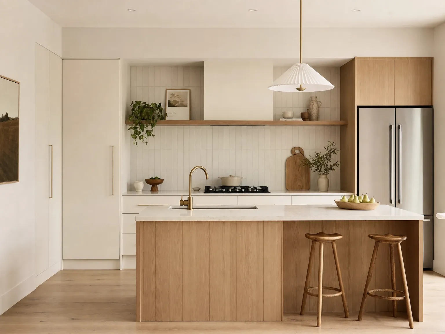
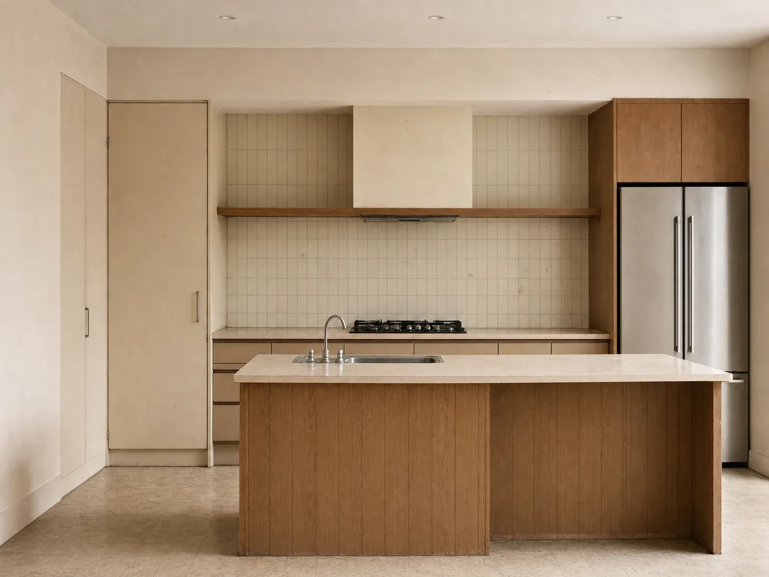 Before
After
Before
After
The Australian kitchen, done in Scandi
The Scandi kitchen is the room where the style is easiest to specify well in Australia, and the room where Australian renovators most commonly land on it. According to the 2023 Houzz Australia Kitchen Trends Study, surveying 473 Australian homeowners about their recent kitchen renovations, Contemporary is the top style choice (24%) followed by Modern (23%), then Hamptons (11%), Coastal (7%) and Country (4%). The remaining roughly third of the responses are spread across the other styles including Scandi, Japandi, Industrial and warm minimalism. In other words, almost half of Australian kitchen renovators are working in a Contemporary or Modern register, which is where the Scandi specification sits in the Australian retailer vocabulary, and the most-chosen cabinet colour by a wide margin is white (52% of kitchens), which is also the Scandi default. The data implies what the editorial conversation describes: Scandi-adjacent kitchens are by far the most popular kitchen direction in Australia, even if many of them are not explicitly labelled as Scandi.
- Contemporary24%
- Modern23%
- Other styles35%
- Hamptons11%
- Coastal7%
The base specification for a Scandi kitchen reads:
Joinery is flat-panel or vertical-board, with a 5 to 10mm shadowline reveal between doors rather than a handle, or with a slim brushed-brass or matte-black pull. The doors are either oak-veneer (honey or mid-tone), pale-painted MDF in a warm white or soft greige, or a combination, typically a paler island and warmer perimeter, or warmer perimeter with an oak feature pantry. Shaker doors are Hamptons; flat or vertical board are Scandi.
Floors are oak in the same tone family as the joinery, or a soft warm-tone tile (honed travertine, honed limestone, large-format matte porcelain) in a coastal or barn-style version. The standard renovation choice in Australia is engineered oak (Tasmanian oak, European oak or local equivalents), readily available across the price spectrum and far more durable than solid oak.
Benchtops are engineered stone in warm white or soft greige, or honed natural stone (limestone, dolomite, soapstone) where the budget supports it. The 2026 direction also accepts a butler-style timber bench on the island as a tactile contrast to a warm-white perimeter stone, but solid-timber benches need realistic maintenance expectations: oil twice a year, treat the surface like a living material rather than a museum piece.
Splashbacks are matte glazed ceramic tile (handmade or handmade-look, vertical or stacked subway, square zellige), large-format soft warm-tone porcelain, or a benchtop-up-the-wall extension of the stone. The Scandi splashback is the rare opportunity in the style for visible craft, a handmade tile with subtle variation is the right register; a high-gloss mirror splashback is wrong.
Hardware and tapware are matte black or brushed/patinated brass, with a small preference toward brass in 2026 as the wider conversation warms. Chrome reads as cold and tips the kitchen out of the style.
Lighting is warm white (2,700 to 3,000K), layered between discreet recessed ceiling lights and a single sculptural pendant (woven cane, blown-glass, paper-shade or a Nordic-designer original) over the island or dining area. Cool-white kitchen lighting (4,000K and above) is the single most common Australian mistake; it strips the warmth out of the materials and pushes the room toward ‘commercial bakery’ rather than ‘home kitchen’.
Appliances are integrated where possible: a panelled integrated dishwasher, an integrated fridge, a ducted rangehood concealed behind a slim plaster or oak hood. Black or steel as a deliberate hero appliance (a high-end induction range, a freestanding stone or steel oven) is acceptable when it carries weight in the composition. A row of stainless-steel small appliances on the bench is not Scandi.
A kitchen specified this way comfortably lands inside the Australian renovation median. According to the Housing Industry Association’s HIA Kitchens & Bathrooms Report 2025 summarising current market data, a typical Australian kitchen renovation falls in the median range of around $30,000 to $35,000, and the Scandi spec above (flat-panel oak-veneer or pale-painted cabinetry, engineered-stone perimeter, ceramic splashback, matte-black or brass tapware, pared-back rangehood, warm-white lighting) sits comfortably inside that envelope. Costs move up when the timber moves to solid European oak, when the appliance package goes fully integrated and high-end, and when the joinery is fully custom in dovetailed solid-timber construction. For most homeowners, the Scandi look is achievable inside the median rather than above it; the discipline is more in what’s left out than what’s spent.
The wider context is in the dedicated kitchen styles guide for Australia and the modern kitchen design deep dive, both of which sit one level down from this article and treat the kitchen-specific decisions in more depth.
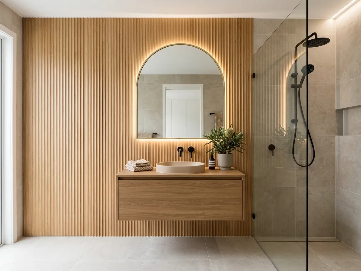
One fluted oak wall reads strongly. Stacking the move on every surface dates the room.
Scandi in the Australian bathroom
The Scandi bathroom reads as the most modern of the style’s room treatments, partly because the materials translate cleanly to a wet space and partly because the restraint reads as luxury rather than absence in a small room.
The base move is warm-tone floor and wall tile (large-format matte porcelain in a soft warm grey, honed travertine, honed limestone, or a small-format handmade-look ceramic) laid through the floor, the shower zone and often the bath surround. A second material breaks the room: a fluted timber feature wall (oak or oak-look battens) behind the vanity, a single timber benchtop on the vanity, a niche lined in a tactile contrast tile, or a half-height timber panelling that runs around the basin wall. Two materials done well is more than enough.
The vanity is wall-hung in honey or mid-tone oak with flat-panel or vertical-board fronts, topped with a honed stone or engineered-stone bench, with an under-counter or sit-on basin in matte white ceramic or honed stone. The mirror is round or arched in a slim matte-black or brass frame, ideally with integrated warm-white lighting. The tapware is matte black or brushed/patinated brass, with a wall-mounted spout and progressive mixer for the cleaner Scandi line.
Lighting is the make-or-break detail. The Australian default (a single cool-white centre downlight plus an over-mirror cool-white fluorescent) flatlights every reflective surface and pushes the whole room cold. The Scandi solution layers warm-white sources: a slim recessed warm-white perimeter strip behind the mirror, warm-white IP-rated downlights spaced to wash the walls rather than the centre of the floor, and ideally a frosted-glass or paper-shade warm-white pendant on a long drop where ceiling height allows. According to the editorial consensus on contemporary Scandi bathrooms covered by Livingetc’s Scandi bathroom ideas, warmer shades of white, beige and taupe paired with rich natural wood and matte black hardware are now the dominant Scandi-bathroom direction.
A practical caution on the fluted timber wall: it has become the signature Scandi-bathroom move in 2025 to 2026 Australian work and is being over-specified. A single feature wall behind the vanity reads strongly; running it across two walls plus the vanity fronts plus a fluted ceiling baffle reads as themed and dates the room quickly. Lagom.
The modern bathroom design deep dive covers the bathroom-specific decisions in more detail.
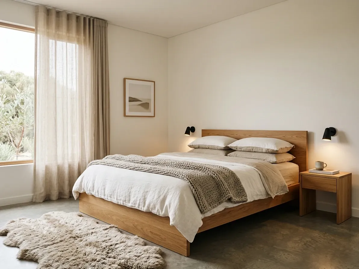
Low oak bed, slubbed linen, oat throw. The bedroom is where Scandi reads easiest.
The Australian Scandi bedroom
The Scandi bedroom is the easiest room to specify well because the style’s instincts (warmth, restraint, layered textiles, soft light) are exactly what a bedroom needs. The base palette is warm-white walls, ceilings and trim. The floor is oak (honey or mid-tone) or a wool or wool-blend rug in oat or soft greige laid wall-to-wall over neutral underlay.
The bed is the hero. A low-profile timber bed frame in oak, ash or Tasmanian oak is the standard Scandi shape, flat-panel headboard with a soft curve at the corners, or a square upholstered headboard in linen or bouclé in oat or warm greige. According to RJ Living’s Scandi bedroom note, the Vegas Timber Platform Bed in Tasmanian oak is a representative Australian execution of the form. Dressed in slubbed linen sheets in warm white and oat, a chunky knit throw at the foot, and two or three layered pillows.
Storage is built-in and visually quiet. Floor-to-ceiling joinery in oak veneer or warm-white-painted MDF runs along one wall; freestanding bedsides in slim oak with brass or matte-black pulls; an open warm-toned ash or oak shelving piece for books and ceramics rather than a closed cabinet. The Australian Scandi instinct is to keep the visible surfaces light and the storage hidden.
Lighting is warm-white and layered. A pair of wall-mounted reading sconces with brushed-brass or matte-black arms freeing the bedside table for a glass of water and a book; a sculptural paper-shade pendant or a single woven-cane shade on a long drop; warm-white interior bulbs at 2,700K throughout. The cool-white master-bedroom downlights that come standard in most Australian project homes are the single change that has the biggest impact on the room’s feel.
The bedroom design and decoration guide covers bedroom-specific decisions more broadly; this room is one of the cleanest applications of the style.
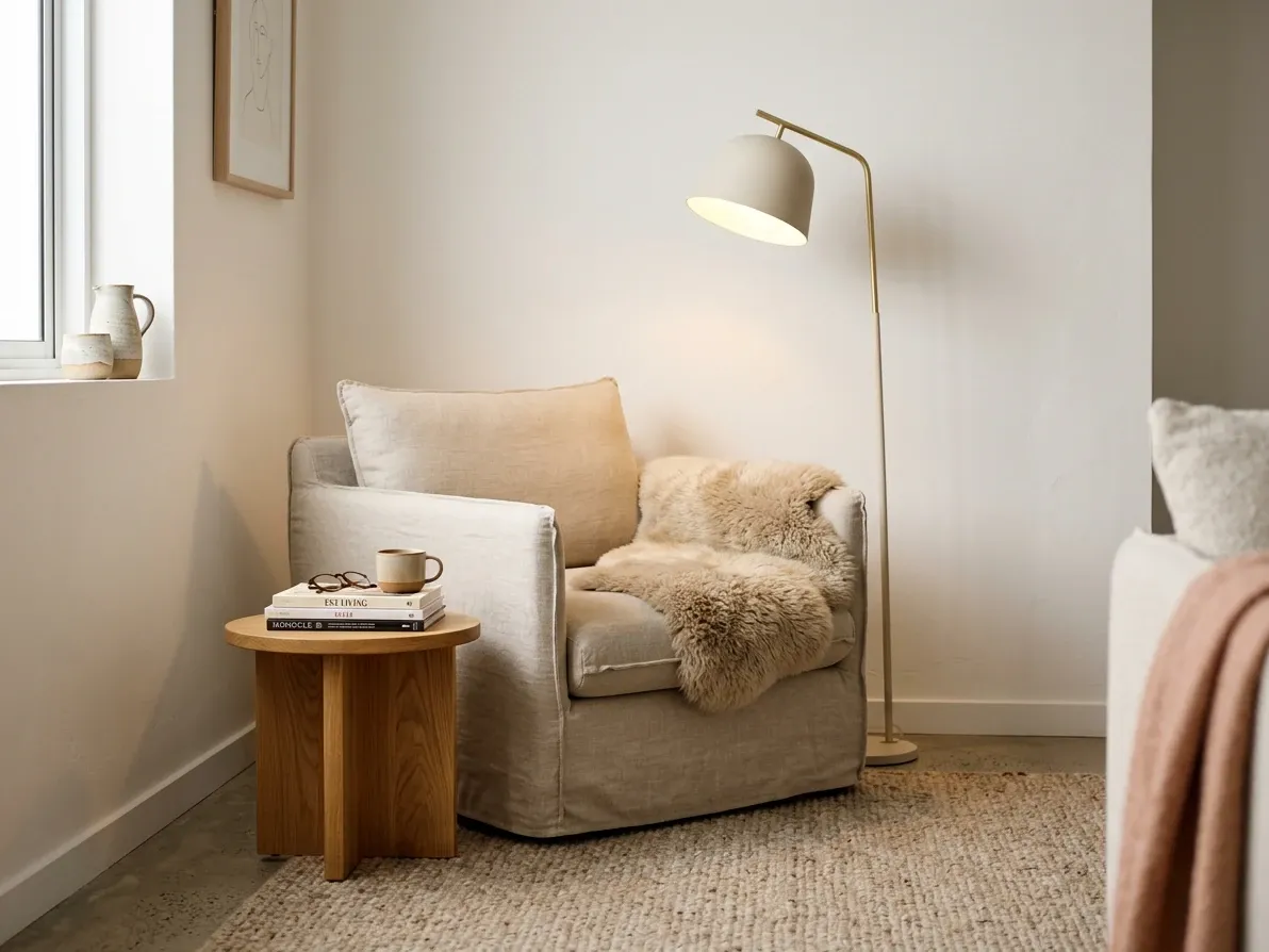
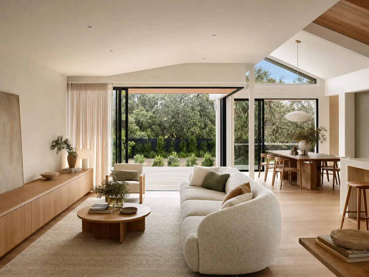
Layered linen, bouclé, wool and a single floor lamp at 2700K. Hygge after dark.
The living room and the Scandi sitting room
The Australian Scandi living room reads as a calm, light-filled space anchored by a slipcovered linen or bouclé sofa, a soft warm-tone rug in wool or oat-tone jute, a pale to mid-tone oak coffee table, a single sculptural accent chair (a wishbone, an Ant chair, a modern Australian interpretation), a wall of warm-white art or an oversized abstract canvas, and a generous amount of negative space.
Three moves separate a well-resolved Scandi living room from a thin one. The first is layered texture. A flat plaster wall, a flat sofa, a flat rug and a flat coffee table reads as showroom, too smooth, too uninhabited. The Scandi room layers: linen and bouclé together on the sofa, a chunky knit throw across the arm, a wool rug under a jute one, a sheepskin on the accent chair, a woven cane shade, a stack of art books on the coffee table. The materials do the visual work in place of decoration.
The second is the lagom edit. Empty floor between furniture is not a missing item; it is a finished decision. A Scandi room with three or four pieces of carefully chosen furniture and visible breathing room reads as deliberate and calm. The same room over-filled with side tables, accent chairs, console tables and styled bookshelves loses the calm entirely. According to Style Sourcebook’s broader writing on this kind of restraint, the relaxed feel of the style is created as much by the negative space as by the materials in it.
The third is layered warm light. A single ceiling-mounted downlight at 4,000K is the default in Australian new builds and the most common Scandi-killer in living rooms. The Scandi answer is a layered system: warm-white (2,700 to 3,000K) recessed perimeter lighting on a dimmer, a sculptural floor lamp at the reading corner, a single statement pendant over the dining table that operates independently, and warm-white side-table lamps within reach of the sofa. The room reads bright and airy during the day and warm and hygge at night.
Common Australian-Scandi accents that earn their place: a small sage-green or muted-forest-green pillow, a single dusty-blue or terracotta cushion, an oversized ceramic in warm earth-tone clay, a single piece of contemporary Nordic-influenced art (linework, soft abstract colour, a botanical study). Common accents that do not: souvenir-shop knitted reindeer, novelty Nordic figurines, framed text-art quoting hygge, and over-styled bookshelves arranged by colour.
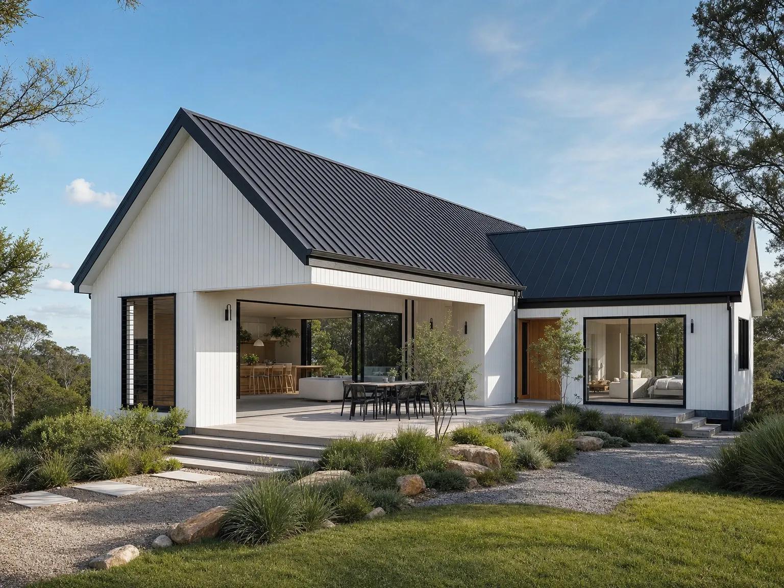
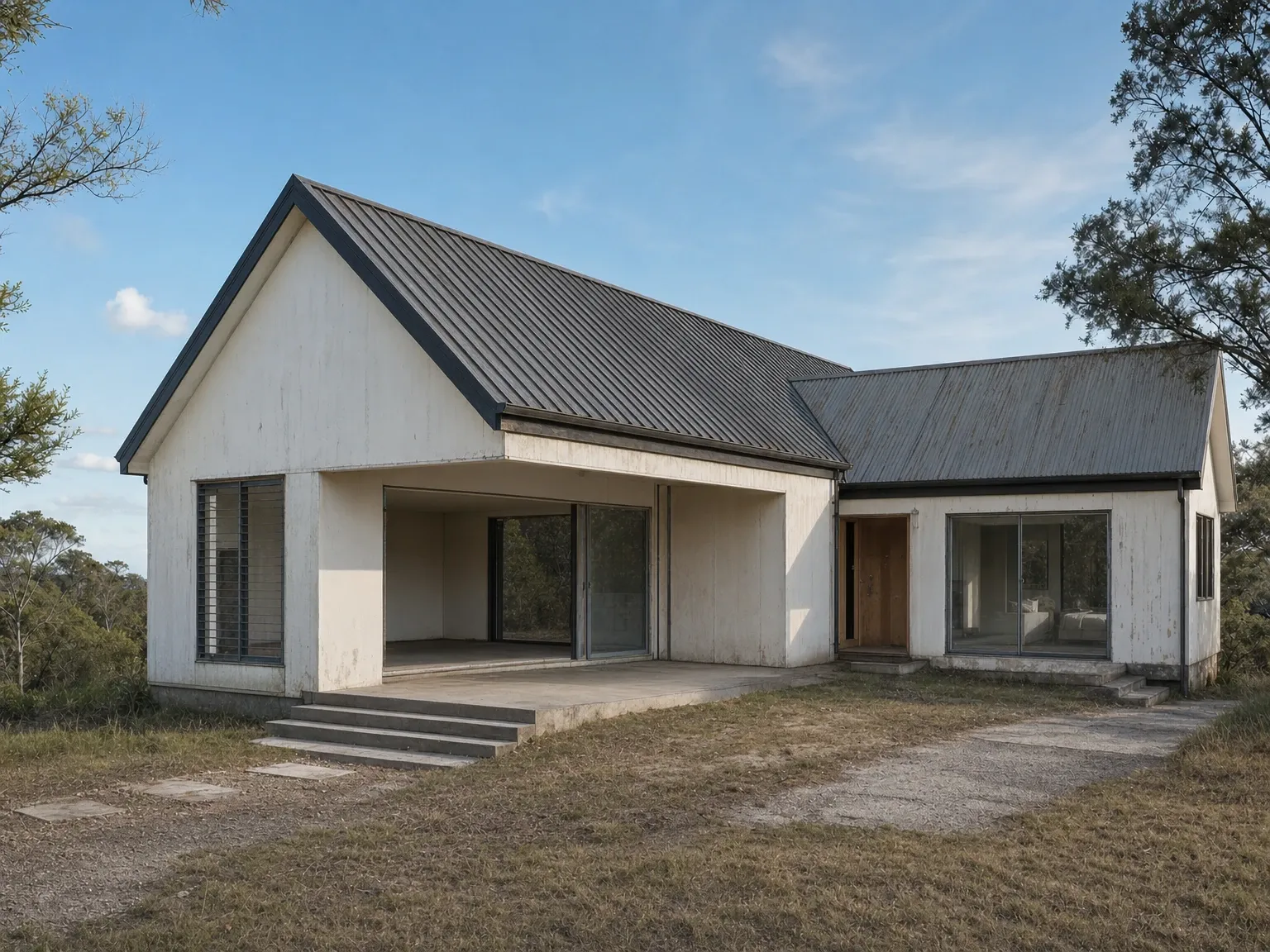 Before
After
Before
After
The Scandi-barn exterior and the architecture
In the last five years, the Australian expression of Scandi has shifted from a purely interior style into a recognisable architectural vocabulary, and the dominant exterior form is the Scandi barn. According to Manor Homes’ note on the modern Australian barn-house style, the Scandi barn is characterised by a steeply pitched gable roof (typically 35 to 45 degrees), simple cladding, pared-back architectural detailing and a neutral palette with one strong contrast (usually black-and-white, charcoal-and-timber, or warm-white-and-black). According to the James Hardie Scandi-barn brief and the Thompson Sustainable Homes Scandi-barn case study, the form translates well to rural blocks, coastal sites and suburban knockdown-rebuilds.
The architectural logic is consistent. A primary mass with a steep gable roof, often a secondary lower mass attached at right angles. A single dominant cladding (vertical fibre-cement weatherboard or shiplap, often the James Hardie Linea or Axon system, or vertical timber battens for a warmer take). One restrained contrast (black-framed windows, a charcoal roof, a feature timber door) against a warm-white or off-white body. Generous glazing that lets daylight through the main living spaces and connects to alfresco or garden, with deep eaves and operable louvres engineered for the local solar angle so the bright sun is filtered rather than baking the floor.
A handful of moves separate a credible Australian Scandi barn from a tired imitation. The roof pitch needs to be genuinely steep; a 22-degree roof reads as suburban Modern Farmhouse, not Scandi. The cladding needs to be consistent across the primary mass, and mixing weatherboard, brick and rendered panels on one elevation breaks the form. The window frames need to be genuinely black (not very-dark-grey) for the contrast to read. The orientation needs to engage with the site honestly: a Scandi barn dropped onto a hot west-facing block with no shading is a sauna no matter how well-detailed the roofline is.
The interior of a Scandi-barn house typically benefits from the high vaulted ceiling that the steep gable produces. The volume gives the warm-white walls and the oak floor the room to breathe that defines the style at its best, and the high glazing lets daylight wash the walls rather than the floor. The style works on rural blocks, coastal sites and even on standard suburban knockdown-rebuilds. The shape is flexible.
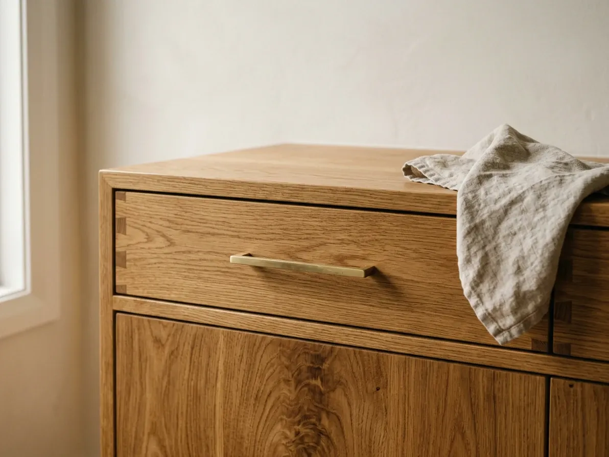
FSC oak with a hardwax-oil finish ages gracefully. Polyurethane reads as plastic.
The materials, sustainability and the case for FSC oak
Scandi design carries a sustainability story that most other style imports do not. The original Nordic principle that beautiful, well-made objects should be democratic, durable and made from honest materials lines up cleanly with the contemporary specification of FSC-certified timber, low-VOC paints and linseed-oiled rather than polyurethane-coated finishes. Australian Scandi work in 2026 increasingly reflects that lineage. According to Hudson Furniture’s 2026 Scandinavian trends note, FSC-certified timber and natural finishes like linseed oil are now standard rather than premium options in current Scandi furniture work.
Local suppliers with credible chain-of-custody options include Totem Road, which produces oak furniture from FSC-certified European oak, and The Natural Bedding Company, which uses PEFC-certified Tasmanian oak and New Zealand Radiata pine for its bed frames. SLH in Sydney carries FSC-certified solid-wood pieces. For homeowners specifying a Scandi joinery package, the question to put to the cabinetmaker is whether the oak veneer or solid stock is FSC- or PEFC-certified and what finish the timber will carry. Natural oil or hardwax-oil finishes preserve the tactile character of the timber and age gracefully, while polyurethane reads as plastic on close inspection and loses the warmth that justifies the timber in the first place.
The other material-level sustainability point is durability. The Scandi instinct toward solid timber, real linen, wool, real stone and honest ceramics is a long-life specification. The Houzz 2023 study found that 95% of Australian kitchen renovators incorporated some sustainable feature, with 45% citing ‘timeless design’ as a sustainable choice specifically because a kitchen that does not need to be torn out and replaced every decade is the largest waste reduction available to a homeowner. Scandi’s restraint is, conveniently, a timeless-design strategy.
Mistakes that age a Scandi-style Australian home fastest
Five mistakes shorten the life of a Scandi room faster than anything else.
Importing the palette without warming it. The single most common Australian failure: cool-white wall paint, pale-grey upholstery, pale-birch floor, 4,000K downlights. The room reads as clinical and washed-out under the local sun. The fix is the warm-by-one-step rule from above (warm white paint, honey or mid-tone oak, oat/greige textiles, 2,700 to 3,000K lighting).
Confusing minimalism with austerity. Scandi is not white-walls-and-nothing-else. The materials, textures and warm light are the style; an empty room with cold white walls is not Scandi, it is just a cold empty room. According to the Decorilla guide to Scandi living rooms, critics of the style often mistake it for harsh minimalism, but the discipline is in the editing rather than the absence. A well-resolved Scandi room is materially rich and visually quiet at the same time.
Over-specifying the fluted timber wall. The fluted oak panel has become the 2025 to 2026 signature Scandi move in Australian interiors and is being put on every available surface. One feature wall behind the vanity or the bedhead reads strongly; running it across multiple walls plus joinery plus a fluted ceiling baffle reads as themed and dates the room fast. Lagom.
Cool-white lighting. A 4,000K interior lighting plan is the single quickest way to strip the warmth out of every other choice in the room. Scandi runs at 2,700 to 3,000K interior, and the room needs warm sources (lamps, pendants, sconces) rather than only ceiling downlights.
Gloss surfaces, polished marble and chrome hardware. All three are decorated finishes. Scandi runs matte. Replace polished marble with honed stone, gloss subway tile with matte glazed ceramic, polished chrome tapware with matte black or brushed brass.
What a Scandi room costs to do well in Australia
Scandi is not, on its own, a high-cost specification. The materials are widely available at multiple price points (engineered oak from $80 to $160 per square metre installed, FSC European solid oak from $250 per square metre upward, engineered stone benchtops from around $600 per linear metre for entry-level grades, linen-blend slipcovered sofas from around $2,500 for off-the-shelf and $6,000+ for custom), and the look does not depend on rare materials or specialist joinery. A Scandi kitchen sits inside the HIA Kitchens & Bathrooms Report 2025 median range of around $30,000 to $35,000 for a like-for-like benchtop, splashback and cabinet replacement; a Scandi bathroom sits inside the equivalent bathroom-renovation median of around $25,000 to $35,000; a Scandi bedroom can be assembled for under $5,000 in furniture and textiles if the bones (paint, floor, window dressing) are already neutral.
The cost climbs when the specification climbs. Solid-timber custom joinery, imported Nordic designer furniture, fully integrated appliance packages and natural stone benchtops can each multiply the relevant line item by two or three. The Scandi-barn exterior, with steep-pitch gable roofing, full-height glazing, deep eaves and a high-spec cladding system, sits in the upper end of the Australian custom-build market. Current cost-to-build estimates put a custom architectural home at around $2,800 to $4,500 per square metre depending on location and finishes, and a Scandi-barn build typically lands toward the upper half of that band because the roof complexity and the glazing area sit above standard project-home specifications.
The defensible position is that Scandi pays for itself in longevity rather than entry price. A well-specified room (warm-white paint, FSC oak floor, honed stone or engineered stone, linen and wool, matte black or brass hardware, warm-white lighting) reads as current in 2026 and is still likely to read as current in 2036; the materials age slowly, the palette is forgiving of changing accent fashion, and the form does not telegraph a specific year. The cost case is the long-life case.
When Scandi is the right choice and when it is not
Scandi is the right choice when the homeowner wants a calm, well-built, materially rich room that reads as quiet rather than decorated; when the architecture allows generous daylight in the main living spaces; when the household genuinely lives with the lagom discipline (visible negative space, careful editing) rather than collecting; and when the brief is for a style that ages well rather than one that reads as the loudest trend of the year. It is particularly suited to Australian builds and renovations where the architecture is modest and the materials need to do most of the work: a small inner-city apartment, a Hobart cottage, a Newcastle Federation home, a coastal new build, a knockdown-rebuild in a suburban block.
It is not the right choice when the brief is for a strongly decorated room. Hamptons is more decorated; if the homeowner wants raised-panel doors, cornices and statement chandeliers, the style is fighting them. It is not the right choice when the architecture is genuinely heritage and the moves would erase character. French Provincial, Federation or Victorian homes generally read better with a style that respects their bones. And it is not always the right choice for a household that collects (antiques, books, art, ceramics, music), because lagom and a strong collecting instinct are in real tension, and the failed compromise is a Scandi room with surfaces buried under stuff.
The wider question of which style suits which home is covered in the interior design styles guide for Australia.
Putting the room together: a working checklist
If you are specifying a Scandi room from scratch in Australia in 2026, the working order is:
Choose the warm-white wall paint first and live with a sample on the wall through morning, midday and evening sun before committing. The paint sets the temperature of every other choice. Then choose the floor: oak in honey or mid-tone for joined rooms, oak in any matched tone for individual rooms, or a wool-blend rug in oat or warm greige if the existing floor is staying. Then choose the joinery tone (usually a one-step variation on the floor) and the joinery profile (flat panel or vertical board, with shadowline reveals or a slim matte-black or brass pull). Then pick the textiles in oat, warm greige, soft sage or dusty blue, with linen and bouclé as the primary fabrics and a single chunky knit throw and sheepskin or wool rug as the textural breaks. Then commit to warm-white (2,700 to 3,000K) lighting across every interior fitting and layer it: ceiling downlights for ambient, a sculptural pendant for hero light, lamps and sconces for the evening. Then put one or two restrained accents in: a single muted-colour cushion, one ceramic, one piece of art. Then stop.
The single most useful Scandi instinct is to specify one fewer thing than the room can hold. Empty space between furniture is a deliberate decision and the style depends on it.
Frequently asked questions
What is Scandi home design in simple terms?
Scandi home design is the interior language of mid-twentieth-century Nordic functionalism brought into the present: a calm, light-filled room built around honest natural materials (oak, ash, birch, linen, wool, stone, leather), a warm-white-and-soft-neutral base palette, restrained pops of muted colour, considered negative space and democratic, well-made furniture that does its job without ornament. It traces back to the 1950s ‘golden age’ of designers like Alvar Aalto, Arne Jacobsen and Hans Wegner, and the Lunning Prize that introduced their work to international audiences from 1951. The 2026 version is warmer and softer than the cool-white-and-pale-birch 2010s take, with honey oak, mid-tone beech, bouclé and warmer paint whites carrying most of the room and the literal pale-birch-and-grey palette dialled back.
What’s the difference between Scandi and Japandi?
Japandi is a hybrid. It takes Scandi’s emphasis on natural materials and functional restraint and crosses it with Japanese wabi-sabi (beauty in imperfection), darker timbers, lower furniture, softer diffused lighting and a more meditative, gallery-like negative space. The cleanest practical tests: timber tone (pale oak, ash, birch = Scandi; smoked oak, walnut, dark stained timber = Japandi), furniture height (standard sofa and dining-table heights = Scandi; lower-slung pieces in the spirit of floor-level Japanese living = Japandi) and lighting feel (Scandi pushes bright daylight and warm-white evening light; Japandi favours soft, diffused, low-output, often paper-shade light). Plenty of Australian homes labelled Japandi are actually Scandi with one walnut piece. The label only earns the name when the Japanese half is genuinely doing work.
Does Scandi style work in the Australian climate?
Yes, but the version most Australian homeowners see on Pinterest is engineered for a different sun. Nordic capitals receive around 1,700 to 1,800 hours of bright sunshine a year and the light is cool and diffuse; major Australian cities receive roughly 2,400 to 3,200 hours and the light is warm, direct and high-contrast. A cool-white-and-pale-grey Scandi palette that reads as soft and atmospheric in Stockholm reads as clinical and harsh in a Sydney living room at 2pm. The Australian translation keeps the underlying Scandi vocabulary (natural materials, restrained palette, considered negative space, light-led plan) and warms it: warm-white paints over cool, honey or mid-tone oak over pale birch, bouclé and slubbed linen over flat cotton, layered warm lighting for the evening, and proper shading on the western and northern glazing so the bright daylight is an asset rather than a problem.
What colours and materials are in a genuine Scandi palette?
The base is warm white across walls, ceilings and trim, layered with soft greige, oat and warm taupe through rugs, upholstery and floors. The dominant timber is oak, historically pale Nordic oak, currently leaning honey oak and mid-tone beech, used on floors, joinery and furniture and often run in parallel through a room so the timber feel is consistent. Secondary materials are linen, wool, cotton, bouclé and woven cane for upholstery and textiles; honed stone, ceramic and matte glazed tile for benches and bathrooms; and matte black, brushed brass or natural patinated brass for tapware and hardware. Accents are restrained: a muted sage or forest green, a dusty blue, a soft terracotta or a single black piece for grounding. The 2026 evolution leans warmer and more tactile than the 2010s palette.
How is Scandi different from Hamptons and from coastal?
Hamptons is more decorated than Scandi. Hamptons leans on shaker cabinetry, deep cornices and wainscoting, polished darker timbers, a cool-white-and-coastal-blue palette and heavier statement furniture. Scandi cuts the architectural decoration to almost nothing, runs flat-panel or vertical-board cabinetry instead of shaker, prefers lighter oak floors and lighter textiles, and treats restraint as the visual statement. Coastal sits closer to Scandi than Hamptons does, because both use a warm-white-and-natural-timber base, but coastal carries clear ocean references (rattan, jute, sandy palette, soft sage or seafoam accents, an indoor-outdoor priority) while Scandi is climate-neutral and more architecturally austere. A practical shorthand: Hamptons reads like a polished coastal estate, coastal reads like a well-considered beach house, and Scandi reads like a quiet, well-built city or country home that could be anywhere with good light.
What’s the worst Scandi mistake in an Australian home?
Importing the palette without adjusting it for the light. A cool-white wall paint, pale Nordic birch floors, all-grey upholstery and 4,000K downlights produce a room that feels atmospheric in Copenhagen and clinical in Brisbane. Australian sunlight is roughly twice as intense and significantly warmer in tone than Nordic daylight, so the same colour mix reads as washed out and cold here. The fix is small but specific: a warmer-white paint, a honey-tone or mid-tone oak floor, linen and bouclé in oat or warm greige rather than flat grey, warm-white (2,700 to 3,000K) interior lighting and proper external shading so the bright midday sun is filtered rather than baking the room.
What does a Scandi-style kitchen cost in Australia?
The base specification is not unusually expensive. The Housing Industry Association reports a typical Australian kitchen renovation at a median of around $30,000 to $35,000, and the Scandi spec (flat-panel oak-veneer or pale-painted MDF cabinetry, an engineered-stone benchtop in warm white or soft greige, a simple ceramic or matte-glazed tiled splashback, brushed brass or matte black tapware and a pared-back rangehood) sits comfortably inside that median. Costs move when the specification moves: solid-timber doors or specialist FSC-certified European oak veneer push higher, a fully integrated appliance package and a fluted-timber feature wall add more, and a custom Nordic-imported joinery package can run two to three times the median. Most of the Scandi look in a kitchen comes from restraint rather than spend; the discipline is more in what’s left out than what’s bought.
Is Scandi style still on-trend in 2026?
Yes, but in a warmer, less identifiably Nordic form. The 2026 conversation in interiors has shifted toward warm minimalism, Japandi and organic modern (Houzz, Hudson Furniture and Better Homes & Gardens Australia all cite this evolution), and each of those styles owes its dominant DNA to Scandi: natural materials, restrained palettes, considered negative space, light-led plans. Pantone’s 2026 Colour of the Year is Cloud Dancer, a soft achromatic white, and WGSN and Coloro’s pick is Transformative Teal, a grounded blue-green; both sit cleanly inside the Scandi vocabulary. The label ‘Scandi’ is appearing less in trend reports than it did in 2018 because the style has been absorbed into the wider mainstream, not because it has faded. A well-executed Scandi room in 2026 reads as current.