The interior design styles Australians choose
The interior design styles that actually matter in Australia in 2026, how each one reads here vs overseas, which house and climate each suits, and how to pick one.
Why this guide exists
Most “interior design styles” articles online are written for an American audience and ranked by an American algorithm. They cover Mid-Century, Farmhouse and Industrial in detail, drop in Mediterranean and Hollywood Regency, and treat Hamptons as a niche regional style. Almost none of them say what Hamptons actually means in Australia, why French Provincial outsells almost every other style here, why coastal reads differently in Australia than in California, or which style suits the brick veneer house most Australians actually live in.
This guide is the working version of how to read the style landscape from an Australian point of view. It covers the styles that actually dominate the conversation in 2026, what each one means in the Australian context (which is often subtly different to the international original), which type of home each one suits, the realistic cost direction of each, and the practical decision framework for picking one.
It is also the hub anchor for the deeper style-specific guides that follow. Each style below gets its own full guide on this site over the coming months; this is the map that puts them in context.
What counts as a “style”, and why nobody agrees on the number
The most-asked question on the internet about interior design styles is also the silliest: how many are there? Reputable American sources land anywhere between 12 and 40, with Decor8 listing 56. The reason the numbers diverge is that most lists conflate three different things: a design movement (Mid-Century Modern, Art Deco, Bauhaus), a style descriptor (modern, contemporary, traditional) and a regional or aesthetic flavour (Hamptons, Boho, Coastal Grandmother, Cottagecore, Modern Farmhouse).
For practical use in Australian homes, the useful list is about 16 styles plus one design principle (biophilic). Anything below that and you’ll miss styles real Australian homeowners are actively searching for. Anything above and you start splitting hairs between, say, “shabby chic” and “vintage” and “cottage” in ways that make no difference at briefing time.
What follows is that working list. Each one is genuinely searched at meaningful scale in Australia, each one reads as a coherent foundation rather than a single decorating flourish, and each one is distinct enough that builders, designers and tradespeople here will know what you mean when you name it.
The styles that dominate the conversation
Before walking through the styles individually, it helps to know which looks actually come up most in Australian homes, because a handful dominate. Hamptons and French Provincial have been among the most sought-after styles here for over a decade, and coastal looks sit over a large share of new builds along the east coast. Scandinavian, modern, mid-century modern and contemporary form the steady middle tier that designers and builders reach for constantly.
The clearer story for 2026 is direction rather than absolute popularity. Japandi has grown from a niche label into a mainstream foundation style, and the major trend reports (Houzz, Style Sourcebook, Pantone) keep flagging biophilic design and warm minimalism as the two currents reshaping the mid-market. Those are the styles worth watching, even where their overall take-up is still catching the established leaders.
The Australian style canon: 16 styles that earn the conversation
What follows is a brisk read of each style. For each one, the AU interpretation, the palette, the materials, the kind of home it suits, who chooses it, and the realistic cost direction. The full deep guide on each style is being written separately and will be linked from this hub as it goes live.
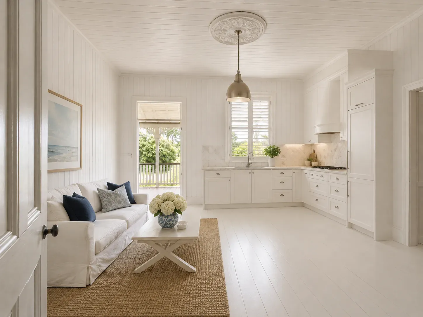
Hamptons: shaker joinery, VJ lining and a bright coastal palette.
Hamptons
The most-searched style in Australia for over a decade. Originated in the affluent coastal towns of Long Island, New York, but the Australian interpretation has diverged so far from the original that the styles read as cousins, not twins. Australian Hamptons is lighter, more relaxed, less weighty and less formal than the American version. According to Provincial Home Living, Australians use whites, creams, soft greys, coastal blues, navy and natural timber tones, all dialled brighter than the American original to suit the climate.
The architectural cues are shaker cabinetry, VJ wall lining, panelled doors, plantation shutters, painted weatherboards externally and a soft coastal-classical detail set. The palette is white, off-white, dove grey, sand, soft blue, with navy and gunmetal as deeper accents. Materials lean linen, cotton, sisal, light oak, painted joinery and brushed nickel or unlacquered brass.
Hamptons suits Queenslanders, weatherboard cottages, and new builds designed for it (most major Australian project home builders offer a Hamptons facade and floor plan). It struggles in inner-city apartments and post-war brick veneer because the architectural detailing has nothing to anchor against. Cost direction is mid to high, mostly because the joinery is the look: shaker cabinetry, panelled doors and detailed mouldings carry the style and cost more than flat slab equivalents.
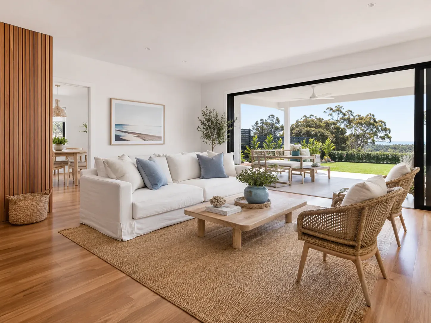
Modern coastal: white walls, pale timber and indoor-outdoor flow.
Modern coastal
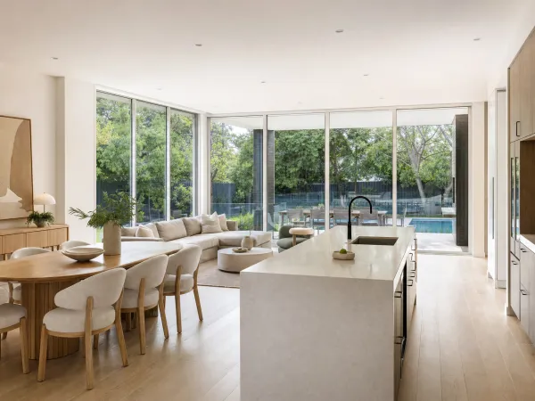
Modern coastal is what Hamptons became when designers wanted the same airy palette without the heritage joinery. It’s the style that sits over almost every coastal new build between Wollongong and Noosa, runs the Mornington Peninsula and the WA coast, and probably covers more Australian display homes than any other.
The look is white walls, light timber floors, natural fibres, oversized windows and doors, indoor-outdoor flow. Palette is white, off-white, sand, sage, soft blue and natural timber. Materials are oak or lighter blonde timber, linen, jute, cotton, raked or polished concrete, large-format porcelain tile, mat-finish metals. According to Houzz Australia, the contemporary coastal look has shed most of its literal beach references (no more shells, ropes or nautical motifs) and is now defined by clean lines, neutral colour, natural texture and uncluttered surfaces.
Modern coastal works in nearly any Australian home with reasonable natural light and is the lowest-friction choice for a buyer who has no specific style preference but wants a “nice Australian look”. Cost direction is mid: it is the style most builders can deliver at mid-tier price points without specialist trades. Where Hamptons demands shaker cabinetry, modern coastal accepts flat slab in white or pale oak.
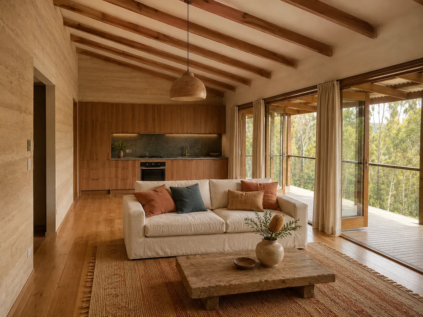
Australian coastal: local timbers, warm whites and honest natural materials.
Australian coastal
Australian coastal is a deliberately different reading of the seaside palette. Where modern coastal is breezy and almost transparent, Australian coastal grounds the look in honest local materials: spotted gum, blackbutt, bluestone, hemp, hand-thrown ceramics and the warm whites of beach sand rather than the cool whites of yacht hulls. It is the look that runs through Northern Rivers homes, the southern Mornington Peninsula, the more design-forward Byron and Geelong builds, and the Great Ocean Road.
The palette warms further than modern coastal: ochre, terracotta, warm beige, taupe, soft sage and the deep blue-green of Australian native foliage. Materials lean even more natural: rough-sawn timber, rammed earth feature walls, bluestone, raw linen and jute. According to Canalside Interiors, this style emphasises a strong connection to the natural environment with a minimalist approach.
Australian coastal suits beach houses, Northern Rivers and Byron-style architectural homes, and any property where the architect or owner wants the indoor experience to extend the outdoor one. It does not suit suburban brick veneer in a city without a coastline; the material palette feels self-conscious there. Cost direction is mid to high, because the materials that carry the style (solid timber, natural stone, raw linen) cost more than their painted or veneered substitutes.
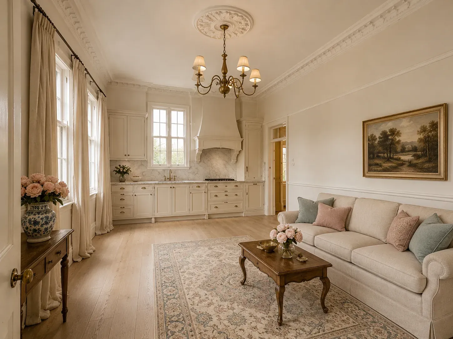
French Provincial: curved joinery, limewashed oak and soft provincial tones.
French Provincial
The dark horse of the Australian search data. French Provincial outsells every style except Hamptons by clustered volume, holds a dedicated audience particularly in older Sydney suburbs, the Mornington Peninsula and Adelaide, and shows no sign of going out of fashion. It originated in the Provence region of southern France in the 17th and 18th centuries and translates to Australia surprisingly well.
The Australian version reads softer than the European original. Palette is warm white, cream, beige, taupe with accents of duck-egg blue, sage green and dusty pink. Materials are limewashed oak, walnut, wrought iron, linen, distressed paint finishes and natural stone. The architecture leans curves: arched doorways, ornate cornices, ornate mantelpieces and shaker or panelled joinery with curved or carved detailing.
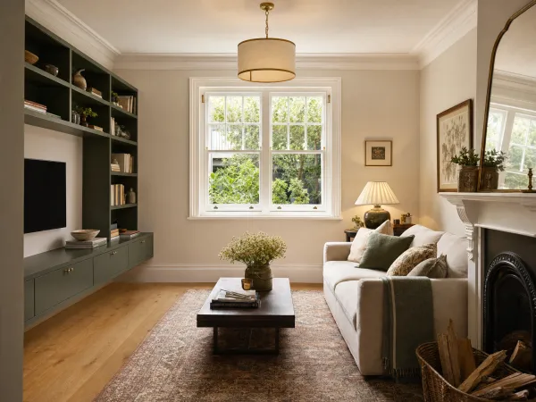
French Provincial suits Federation and Edwardian homes (the architectural moulding and detail give it something to anchor against), period brick villas, and purpose-designed French Provincial new builds in the Hampton and Mount Eliza markets. It does not work in apartments or post-1970 builds without architectural detailing. Cost direction is high; the curved joinery, carved details and authentic distressed finishes are expensive to execute well.
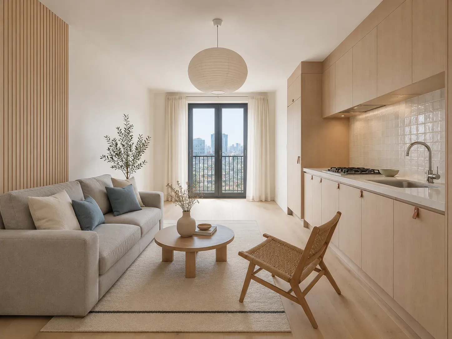
Scandinavian: pale wood, soft textiles and warm hygge light.
Scandinavian
Scandi was the dominant style in Australian inner-city apartments through the mid-2010s, and while it has been displaced as the leading inner-city look by Japandi and warm minimalism, its DNA still runs through both. The defining principles are light, comfort, simplicity, and the cosy “hygge” feel.
The 2026 Scandinavian look is warmer than the 2015 version. Palette is white, soft grey, warm beige, with accents of muted blue, sage and dusty pink. Materials are pale wood (Scandinavian oak, ash, birch), white-painted joinery, wool, linen, cotton and ceramics. Lighting is soft, layered and warm. According to Bright Side Interiors, the new Scandinavian is “warm, cosy, and hygge-driven”, a deliberate step away from the cool, stark minimalism the style had drifted into.
Scandi suits apartments, terrace houses, small townhouses and any home where the owner wants light and ease over decoration. It struggles in larger family homes where Scandi’s restraint reads as empty. Cost direction is mid: the look is achievable with flat-pack cabinetry, mass-market lighting and well-edited furniture.
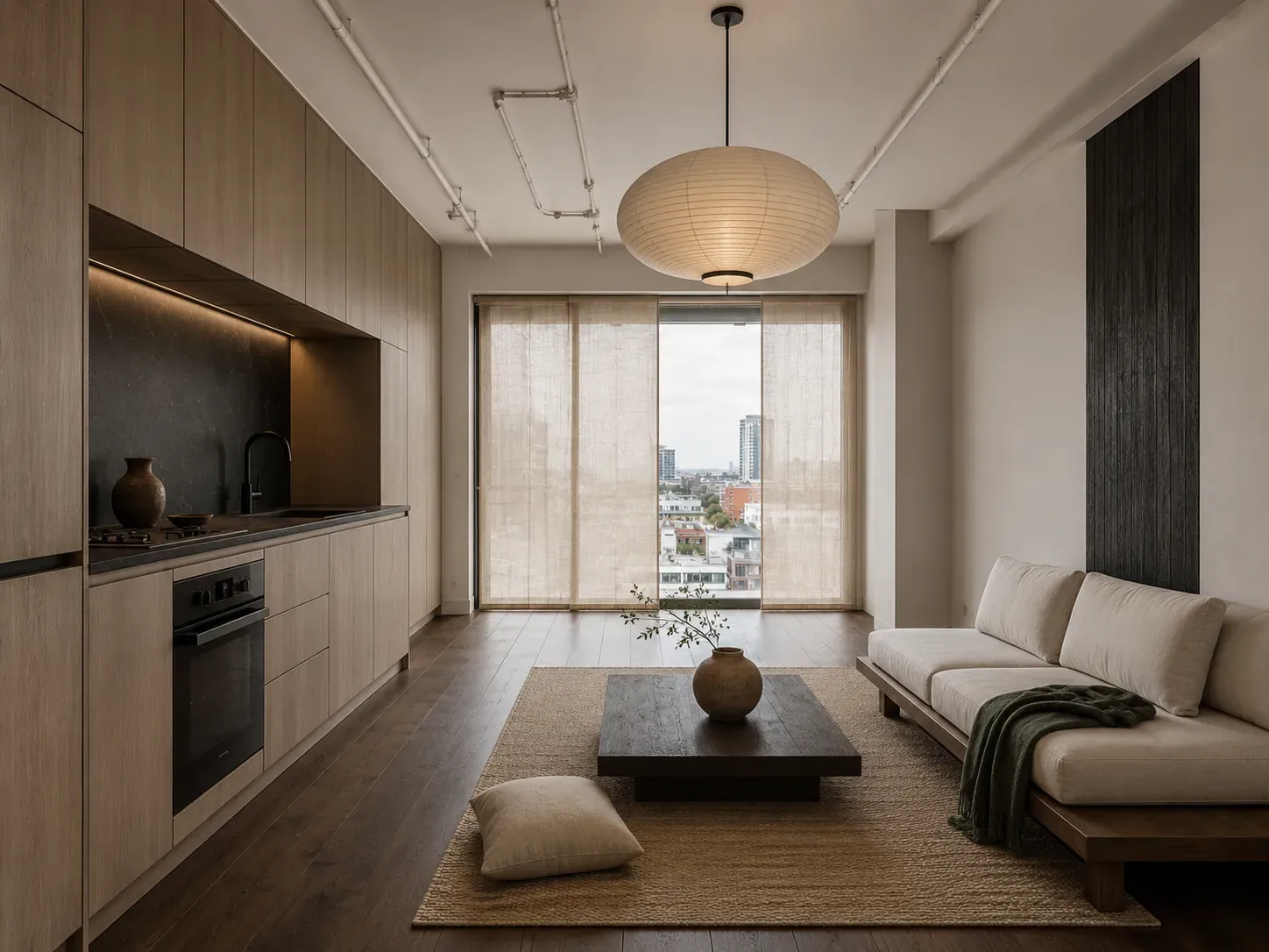
Japandi: Scandi calm grounded with darker Japanese tones.
Japandi
One of the fastest-growing styles in Australia in recent years, and the natural successor to Scandinavian for an inner-city audience. Japandi fuses Scandinavian’s light, clean, comfortable feel with Japanese restraint, darker tones and the wabi-sabi acceptance of imperfection.
The look is calmer than either of its parents. Palette is warm off-white, walnut, charcoal, soft greige, deep green and the muted clay tones of Japanese ceramics. Materials are stained or natural timber (often walnut or stained oak), linen, paper, cotton, hand-thrown ceramic, unlacquered metal and bamboo. The aesthetic discipline is strict: every object earns its place, surfaces are kept clear, decorative ornament is rare and intentional.
Japandi suits apartments, small inner-city homes and any property where the owner is design-literate and willing to live with restraint. It does not suit family homes with young children unless the parents are unusually tolerant of the visual editing the style requires. Cost direction is mid to high; the look is achievable with relatively few pieces, but each one needs to be considered, which usually means custom or design-led rather than mass market.
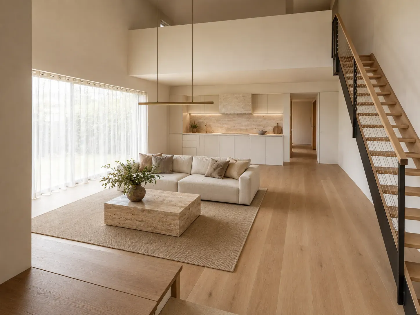
Modern: clean lines, warm materials and uncluttered surfaces.
Modern
Modern, used precisely, is the design movement that emerged in the early 20th century around clean lines, function-led layouts, restrained palette and the absence of ornament. The 1920s Bauhaus, the 1940s mid-century, the 1990s minimalist and the 2026 warm minimalist are all modern in this strict sense.
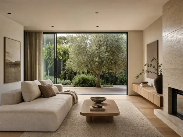
In the Australian house-buying conversation, “modern” is often used loosely to mean “current” or “new build”, which is the contemporary definition (see below). Used precisely, a modern interior has clean cabinetry without ornament, restrained colour, function-first layout, natural materials and uncluttered surfaces. The 2026 version of modern is warm: soft off-white, oak, travertine, brushed brass, linen. The 2010 version was cool: pure white, polished stainless, glass.
Modern works in almost any home with good architectural bones, and is especially strong in new builds, mid-century houses, contemporary apartments and well-renovated older homes. It struggles in homes with strong heritage detailing because the architectural ornament fights the minimalist surface. Cost direction is wide: a budget modern kitchen is cheaper than its Hamptons equivalent because there’s no joinery detailing to pay for, but a high-end modern interior often costs more because the materials and the discipline of “nothing extra” both demand quality.
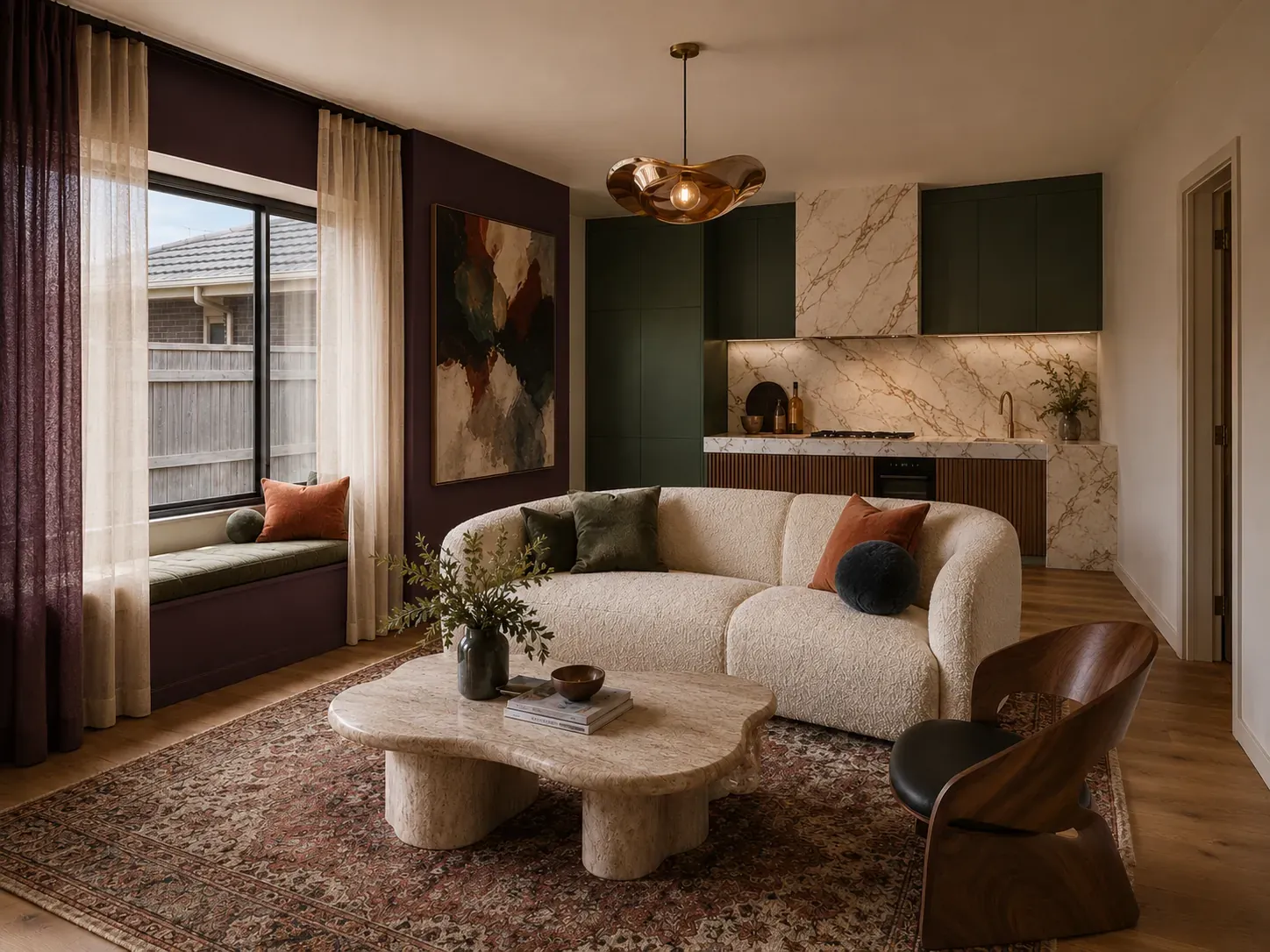
Contemporary: layered, textured and warm — whatever reads current now.
Contemporary
Contemporary, used precisely, is whatever is current. It borrows from modern, industrial, mid-century, Scandinavian, Japandi and elsewhere, and the look shifts over time. A contemporary room from 2015 already feels dated. A contemporary room from 2026 is the eclectic, layered, slightly maximalist mix that publications like Style Sourcebook are forecasting: bolder colour, expressive shapes, deeper textures, heritage-inspired details, playful statements.
In practice, designers and showrooms use “modern” and “contemporary” interchangeably, but the meaningful difference is permanence: modern stays put, contemporary moves with the season. If you say “contemporary” to a builder, what you’ll get is the current default look (currently warm-toned, textured, layered, with natural materials and considered detailing).
Contemporary suits any home with reasonable bones and an owner who wants to feel current rather than committed. Cost direction is wide, depending on how custom the execution becomes.
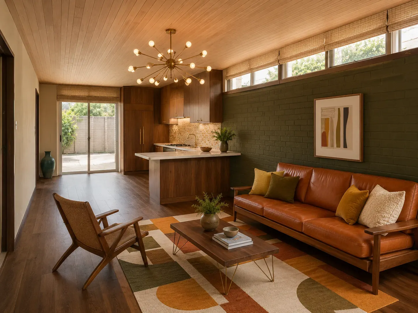
Mid-century modern: walnut, low-slung furniture and bold accents.
Mid-century modern
Mid-century modern has held steady as a third-tier major style in Australia for years. The movement is rooted in 1940s to 1970s American design (Eames, Saarinen, Knoll) and has aged better than almost any other 20th-century movement.
The look is recognisable: clean horizontal lines, low-slung furniture, walnut and teak timber, geometric shapes, bold accent colours (mustard, olive, terracotta, deep teal) against a warm white or oatmeal backdrop. Materials are walnut, teak, brass, leather, wool, ceramic. Furniture pieces (the Eames lounge, the Saarinen tulip table, the Wegner CH24) are status objects that often outlast the houses they’re bought for.
Mid-century modern suits 1950s to 1970s Australian houses (brick veneer, fibro, original mid-century architectural homes) where the architecture provides the right backdrop. It works less well in Federation and Victorian homes (the ornament fights), and is awkward in modern apartments because the period feel of the furniture has no architectural anchor. Cost direction is mid to high; the look depends on heritage furniture pieces, which are not cheap, and reproductions read as obvious next to the real thing.
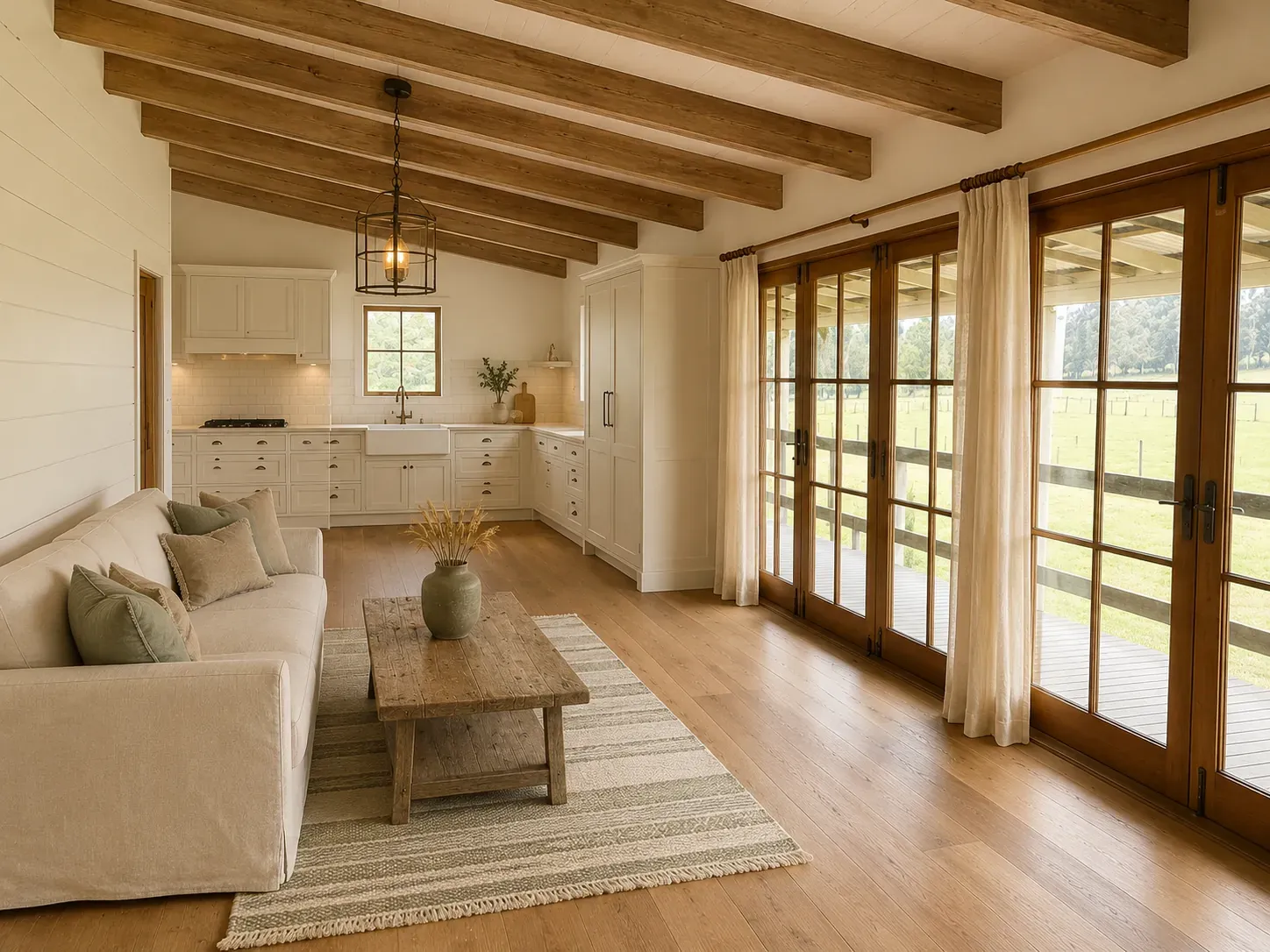
Modern farmhouse: shaker joinery, exposed beams and honest country detail.
Modern farmhouse
Modern farmhouse came from the American suburb but translates to Australian semi-rural settings, the outer ring of major cities and the hinterlands behind the coast. The 2026 version is gentler than the 2018 version, with less black trim and shiplap and more honest country detail.
The palette is white, warm white, soft black accents, sage and natural timber. Materials are painted shaker joinery, exposed timber beams, blackbutt or oak floors, linen, cotton and shaker-style cabinetry. Architectural cues include barn doors, exposed rafters and lining boards.
Modern farmhouse suits acreage homes, semi-rural builds, hinterland houses and any property with the architectural setting (pitched roofs, exposed structural timbers, generous land) to support it. It looks contrived on a suburban block without the rural context. Cost direction is mid; the style is achievable in any standard build that includes the joinery detail and trim work.
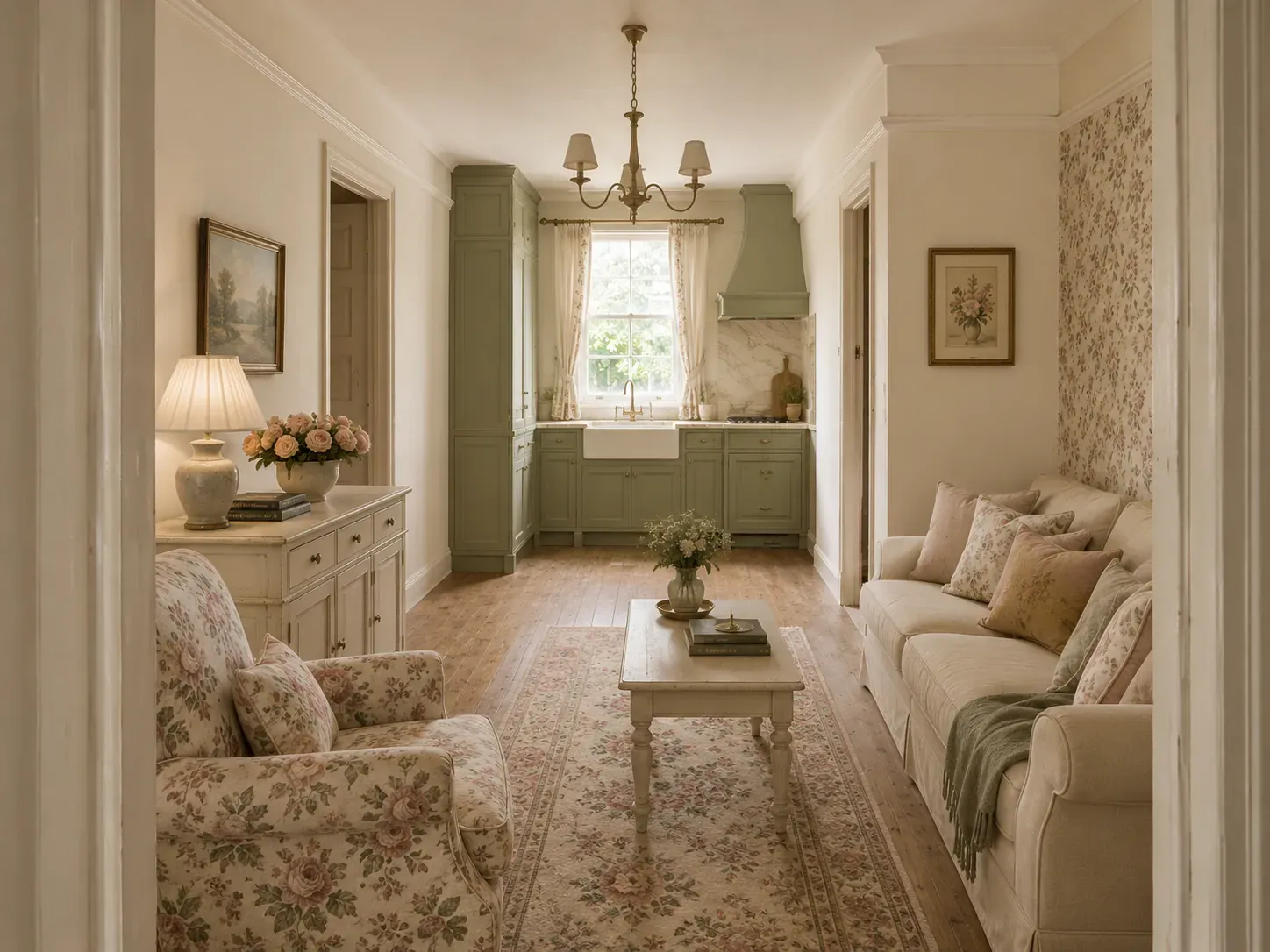
Cottage and country: cosy, layered and warmly accumulated.
Cottage and country
Cottage and country sit close enough together to discuss as one. Both lean cosy, layered and warm; both use natural materials, soft palettes and a sense of accumulated rather than designed décor. The British country aesthetic (chintz florals, Aga cookers, Welsh dressers, sage greens) reads heavier than the American cottage aesthetic, which is the lighter half of the family.
The Australian interpretation pulls from both. Palette is warm white, cream, sage, soft yellow, dusty pink and washed-out blues. Materials are linen, cotton, vintage timber, painted joinery, woven natural fibres. The furniture is comfortable, often slightly worn, layered with textiles and books. Modern interpretations are tighter and less cluttered than the historical versions, but the warm, accumulated feel is the constant.
Cottage and country suit traditional weatherboard cottages, period brick cottages, Victorian terraces and rural homes. They do not suit modern apartments or new-build estates without architectural detailing. Cost direction is wide; the look can be built up gradually from vintage purchases, but high-quality interpretations (custom joinery, authentic detailing) match Hamptons in price.
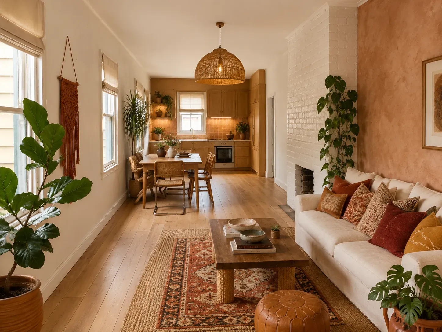
Boho: layered rugs, plants and collected global texture.
Boho (Bohemian)
Boho is the layered, eclectic, globally-influenced style that came out of 1960s and 1970s counterculture and has cycled back several times since. The Australian interpretation reads warmer and less student than the European original, with strong overlap into the modern coastal palette.
The look is layered: rugs over rugs, plants, woven fibres, ceramics, hand-printed textiles, vintage furniture mixed with new pieces. Palette is warm white, sand, terracotta, ochre, deep red, sage, dusty pink. Materials are rattan, jute, linen, cotton, brass, leather, hand-thrown ceramic. The discipline is the inverse of Japandi: where Japandi edits down, boho layers up.
Boho suits younger renters, share houses, first-home owners and homes whose owners travel and collect. It works well in old terraces, share houses and most apartments. It does not suit homes where the owners want a calm, edited look; boho’s appeal is its texture and accumulation. Cost direction is low to mid; the look can be built up over time from markets, second-hand pieces and travel finds.
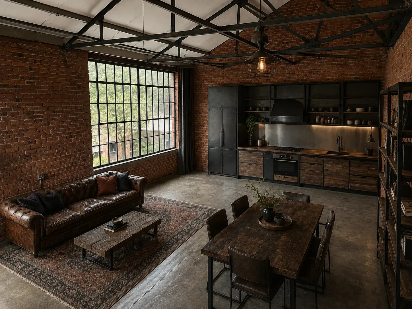
Industrial: exposed brick, blackened steel and raw timber.
Industrial
Industrial is the warehouse-converted-to-loft style: exposed brick, concrete floors, blackened steel, leather, raw timber. It originated in 1970s New York loft conversions and remains popular in Australian inner-city warehouse conversions in Surry Hills, Fitzroy, Fortitude Valley and Northbridge.
The palette is grey, charcoal, deep brown, with rust and copper accents. Materials are exposed brick, concrete, blackened steel, raw or recycled timber, leather and dark linen. Furniture is often heavy and architectural: leather chesterfields, metal-framed bar stools, Edison-bulb pendants.
Industrial suits true warehouse conversions, loft apartments, and the occasional architecturally-designed contemporary home. It looks forced in suburban homes that try to import the aesthetic without the bones. Cost direction is wide; in a real warehouse, the building does most of the work and the interior can be light. In a suburban home, recreating the look is expensive and rarely convincing.
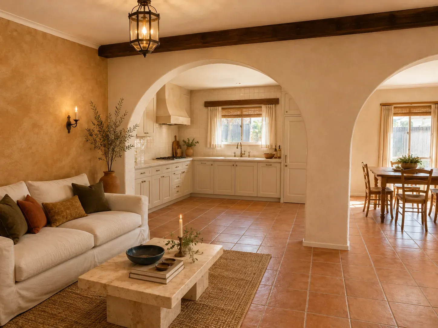
Mediterranean: terracotta, travertine and sun-drenched limewash.
Mediterranean
Mediterranean style (which folds Spanish mission, Italian villa, Greek coastal and the broader sun-drenched-southern-European look together) translates well to the Australian climate, particularly in Perth, Adelaide, the Hunter Valley and parts of the WA coast. The architecture of these regions is similar enough to the southern European original that the style reads as natural rather than imported.
The palette is warm white, cream, terracotta, ochre, deep blue, olive green. Materials are limewash, cement-rendered walls, terracotta tile, travertine, wrought iron, woven fibre and warm timber. Architectural cues include archways, exposed ceiling beams, terracotta-tiled roofs and recessed windows.
Mediterranean suits homes with the right architectural cues (arched openings, exposed beams, terracotta tiles) and homes in warm climate zones with strong indoor-outdoor flow. It does not work as a surface-only style; the architecture has to support it. Cost direction is mid to high because the right materials (genuine terracotta, travertine, wrought iron) are not cheap to source in Australia.
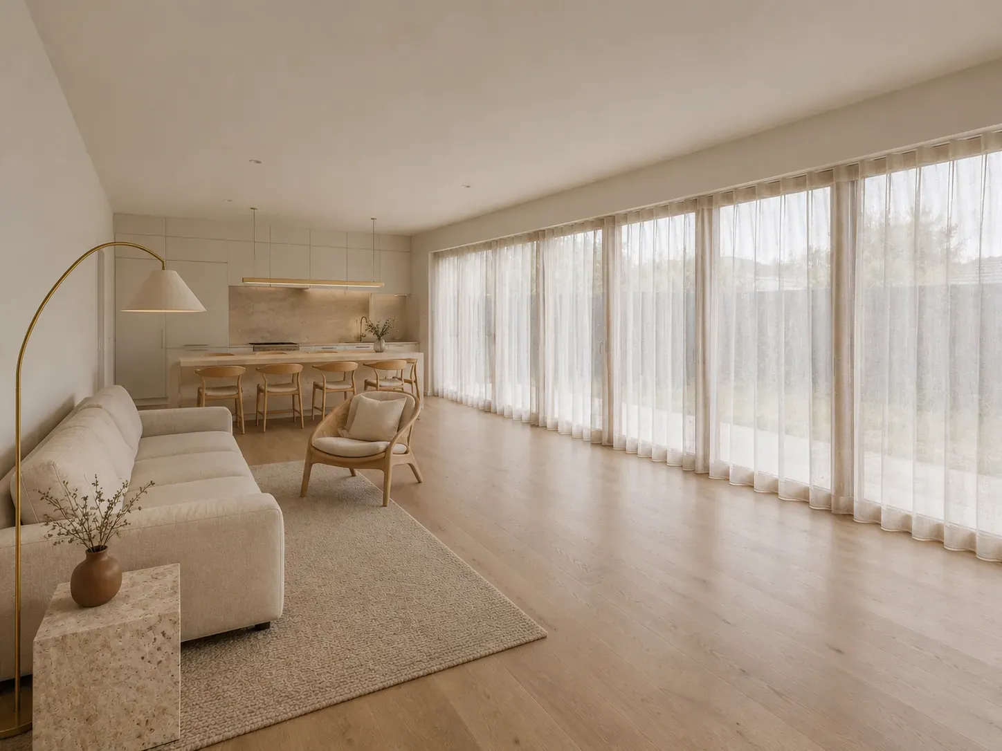
Warm minimalism: restraint warmed with oak, travertine and linen.
Minimalist (warm minimalism)
Pure 2010s minimalism (the all-white, no-decoration look) is now read as cold and dated in Australia. The 2026 version, often labelled warm minimalism or organic modern, keeps the discipline of restraint while warming the palette and adding tactile natural materials.
The look is calm and considered. Palette is warm off-white, beige, taupe, soft greige and natural timber, with sparing accents in deep green or terracotta. Materials are oak, travertine, linen, wool, cotton, paper, hand-thrown ceramic and brushed brass. The defining discipline is restraint: empty surfaces, few objects, every piece chosen carefully.
Warm minimalism suits architectural new builds, well-designed apartments and renovations where the architecture provides good bones. It struggles in homes with strong heritage detailing (the ornament reads as clutter) and in family homes where children’s accumulation undoes the restraint daily. Cost direction is high; the materials are expensive and the discipline of “nothing extra” usually means every piece is bespoke or design-led.
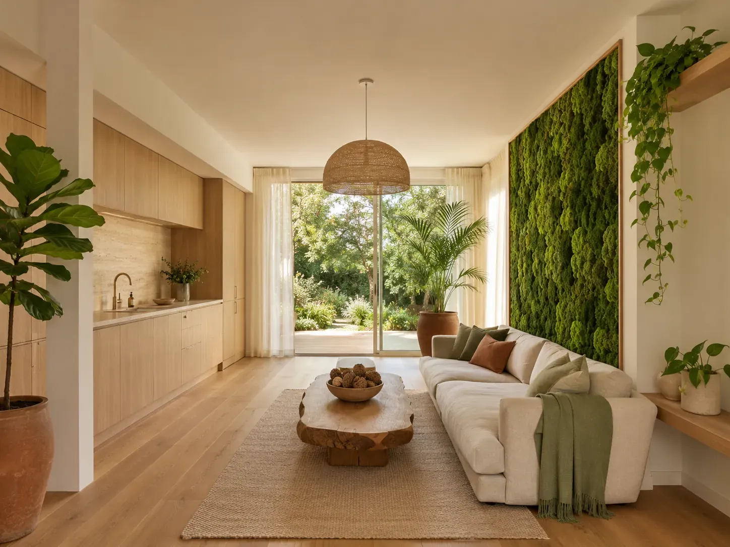
Biophilic: light, greenery and a deliberate connection to nature.
Biophilic
Biophilic design is the strongest emerging movement in Australian residential design and the one shaping more 2026 new builds than any other named style. It is less a decorative look and more a design principle: the interior should reinforce the human connection to nature through light, plants, materials, water and views.
In practice, the biophilic palette overlaps with warm minimalism and Japandi (warm whites, natural timber, deep green, stone) but the planning is more aggressive: indoor-outdoor flow, living walls or planted feature areas, large windows oriented to natural views, materials that age honestly (timber, stone, linen, wool) and a deliberate avoidance of synthetic finishes. According to the Style Sourcebook biophilic interiors edit, the 2026 version emphasises immersive ecosystems with living walls, moss panels and strategic natural light synchronised with circadian rhythms.
Biophilic suits new builds where the orientation and glazing can be designed for it from the start, and existing homes with good light and indoor-outdoor flow. It works less well in dark inner-city apartments without natural light. Cost direction is mid to high because the architectural moves that support it (glazing, ceiling height, orientation, planting) are not retrofits.
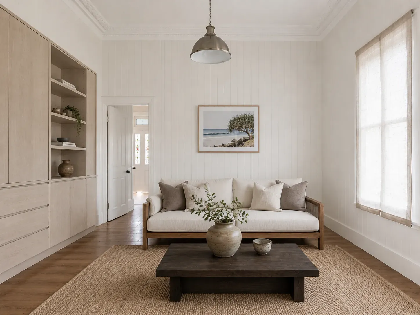
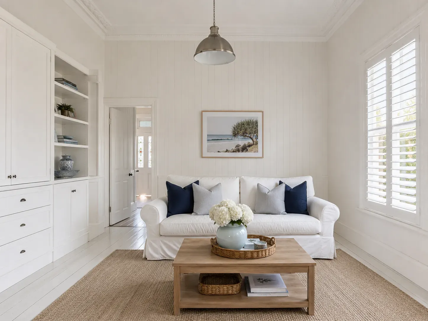 Before
After
Before
After
What suits your Australian house
The single most important factor in choosing a style is the architecture you’re working with. Style sits on top of architecture; if the two fight, the room looks confused regardless of how much you spend on finishes.
The Australian residential stock, according to the Australian Bureau of Statistics 2021 Census, runs roughly 70% separate houses, 13% townhouses and 16% apartments. Within that, the period split matters more than the type split for style fit. Federation and Edwardian homes (built roughly 1890 to 1915, common across inner-ring suburbs in every capital) carry significant architectural detail and anchor traditional, Hamptons, French Provincial, cottage and country styles well. Inter-war and post-war brick veneer (built roughly 1920 to 1970, dominant across the middle-ring suburbs) is architecturally neutral and accepts most styles, with mid-century modern often the most natural fit. Modern brick veneer (1970s to 2000s) is the trickiest because the bones are too plain for heritage styles and too dated for strict modern; modern coastal, contemporary and modern farmhouse usually translate best. New builds (post-2010) can host almost any style and typically lean modern coastal, warm minimalism or biophilic.
- Houses70%
- Townhouses13%
- Apartments16%
- Other1%
Queenslanders deserve a paragraph on their own. The architectural detailing (VJ wall lining, wide verandahs, generous ceiling heights, original timber floors) carries Hamptons, coastal, country, contemporary and modern coastal beautifully, often with very little intervention. Pure modern and industrial usually fight a Queenslander’s bones. According to the Conversation, the Queenslander was designed for cross-ventilation and indoor-outdoor flow, which means it anticipated modern coastal living a century before the term existed.
Apartments are the opposite case. Strict heritage styles (Hamptons, French Provincial, traditional) struggle in apartments because there are no architectural details to anchor them and the room dimensions usually fight the joinery scale. The styles that suit apartments are the ones built for tight spaces and limited architectural detailing: Japandi, warm minimalism, modern coastal, contemporary, Scandinavian.
The decision tree is short. Start with the house. The architecture suggests two or three styles that will sit comfortably. Pick the one that suits how you actually want to live (do you want calm and edited, or warm and layered?). Layer the secondary influence as your taste signal. Don’t try to force a style the house won’t carry.
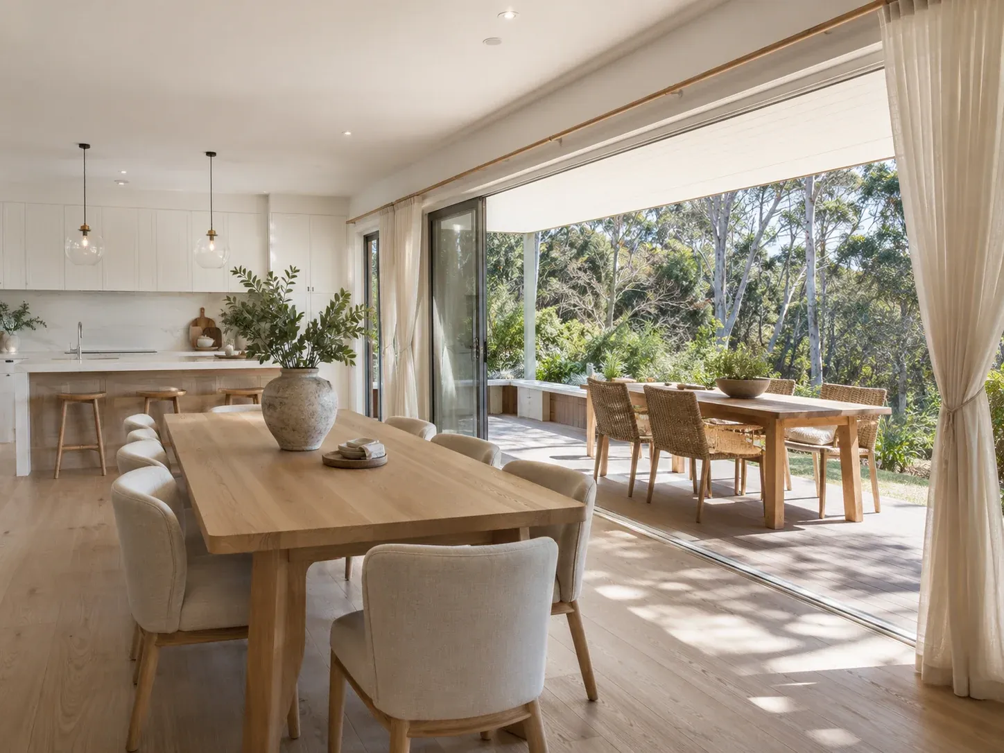
Australian light flatters warm palettes more than cool ones.
Australian climate, light and lifestyle
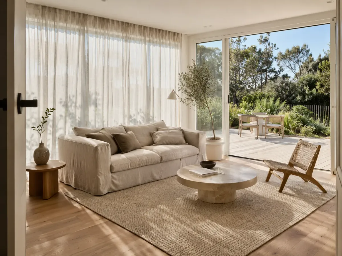
The climate matters almost as much as the architecture. Australia’s high natural light makes pale, cool, Scandi-style palettes read as flat and exposing rather than calm and serene. Styles that originated in colder, lower-light climates (Scandinavian, English country, American Hamptons in its original form) generally need to be warmed for the Australian environment.
Conversely, styles built for high light translate naturally. The Mediterranean palette works in Perth and Adelaide because the light is structurally similar to Marseille. The Australian coastal palette works because it was developed under the same light it’s deployed in. The Australian Hamptons interpretation works because it lightened the original to match the local sun.
Tropical and subtropical Australia (Brisbane, Cairns, Townsville, Darwin) adds the humidity and storm consideration. Heavy fabrics, dense layering, full-cover upholstery and dark closed spaces work against the climate. The styles that thrive in subtropical Australia are the open, light, well-ventilated ones: Queenslander-anchored Hamptons, modern coastal, Australian coastal, contemporary and warm minimalism.
Cooler southern climates (Hobart, Adelaide Hills, Highlands NSW, Victoria’s High Country) take the opposite end of the palette comfortably. Traditional, French Provincial, English country and modern farmhouse all work because the climate justifies the cosy materials (heavy textiles, layered rugs, fireplaces, warm timber) the style requires.
How to actually pick a style (the 70/30 framework)
The most useful framework for picking a style is the 70/30 rule that designers use to mix styles without making the room feel themed. The principle is simple: the foundation of the room (the architecture, the joinery, the flooring, the larger furniture) comes from one style, and the layered detail (the textiles, the art, the lighting, the decor) borrows from a secondary style.
The foundation is the 70%. It’s expensive to change. It’s what the room’s bones look like with no styling. It has to suit the house. If you live in a Federation home, your 70% is likely traditional, Hamptons, French Provincial or cottage. If you live in a 1960s brick veneer, your 70% is likely mid-century modern, contemporary or modern coastal. If you live in an inner-city apartment, your 70% is likely Japandi, warm minimalism or modern coastal.
The 30% is the styling layer. Cheap to change. Carries your taste signal. Can evolve every five to ten years without re-renovating. A Hamptons foundation (white shaker cabinetry, painted timber floors, plantation shutters) can carry a coastal 30% (linen, sisal, soft blue accents) or a country 30% (warm textiles, vintage timber furniture, layered rugs) or a Japandi 30% (hand-thrown ceramic, walnut accent furniture, restraint). According to Homes & Gardens, the rule works because it grounds the room in cohesion and adds enough contrast through the second style to keep it interesting.
- Foundation70%
- Layered styling30%
The trap is mixing two foundation styles. A Hamptons kitchen with a French Provincial dining room and a mid-century modern living room reads as confused rather than considered, because each space is fighting for a different foundation. Pick one foundation and run it across the whole house; vary the layered styling room by room if you want texture.
The other trap is trying to do too many styles at once. Two influences (the 70 and the 30) is the workable limit. Three is the upper edge if executed by a designer. Four or more is always wrong.
The decision framework: ten questions
A useful working sequence for picking a style without paying a designer to do it for you:
What is the architecture of your home? List the bones (heritage detailing, ceiling height, light, floor plan).
What two or three styles does that architecture naturally anchor?
Of those two or three, which one matches how you actually want to live? Calm and edited, or warm and layered? Heritage-referenced or contemporary?
Which one matches the climate you live in? High light needs warm palettes; cooler climates can carry cosier styles.
Build a Pinterest board of 30 to 50 references in that direction. Notice what consistently catches you and what doesn’t.
Identify your 30%. What other style would you layer in to give the room your signature?
Test the palette physically. Order large samples of the dominant materials (tile, paint, fabric, timber) and sit them in the room at the time of day you use it most.
Test the proportions. Two-dimensional moodboards hide proportional mistakes that three-dimensional space exposes. A 3D rendering of your specific room with your selected finishes catches the mistakes a flat moodboard can’t, particularly the relationship between the joinery, the lighting and the floor materials.
Brief your builder, designer or trades using the style name as shorthand for the foundation. Use the palette, materials and reference images to communicate the detail.
Allow for the 30% to evolve over time. Don’t lock yourself in to every cushion and lamp on day one. The styling layer should be free to grow.
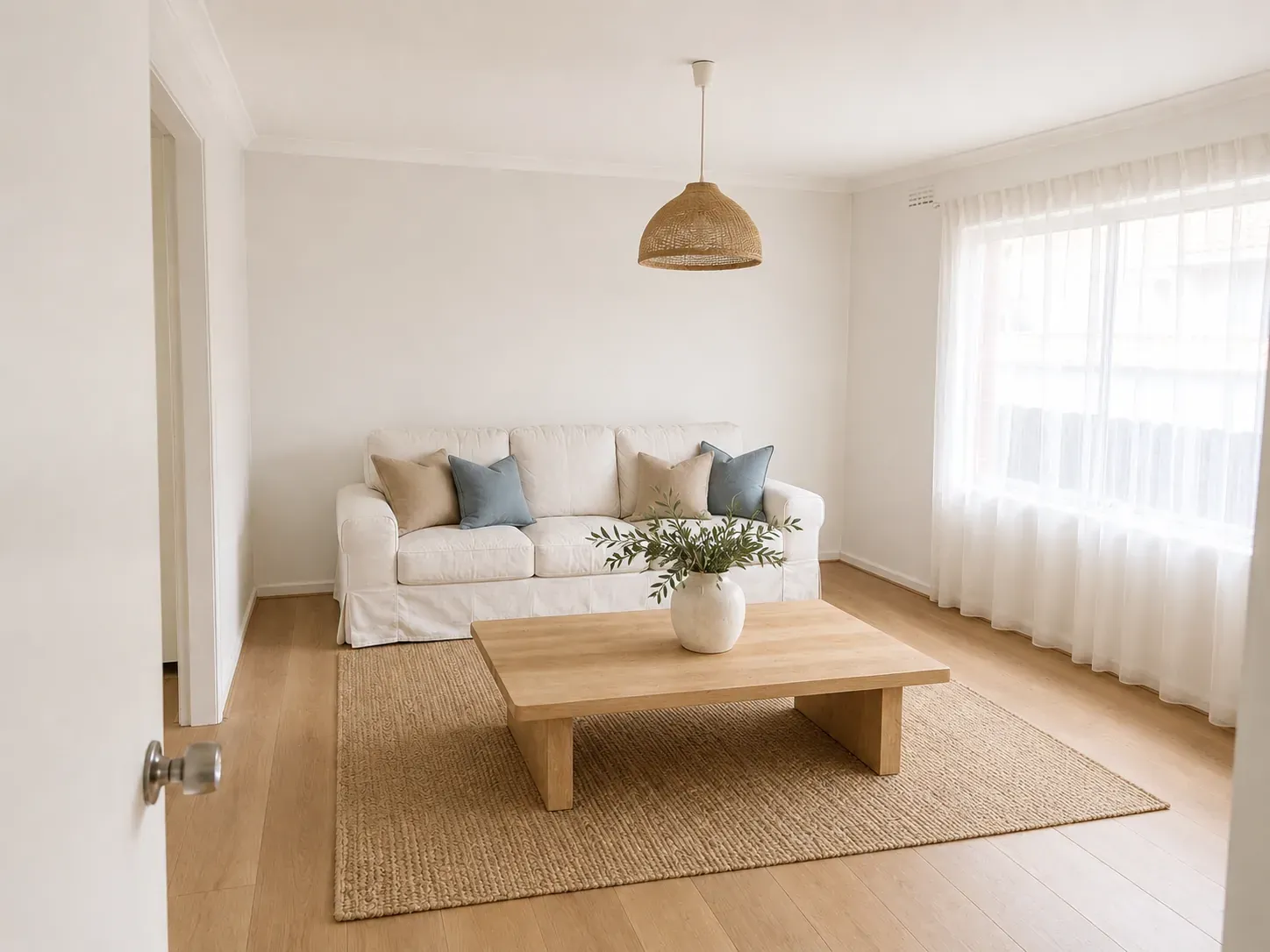
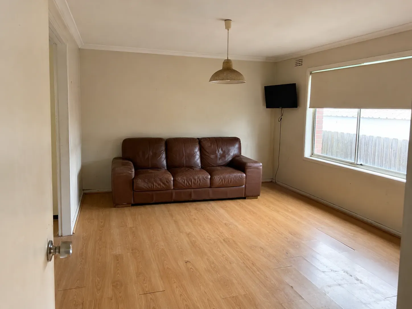 Before
After
Before
After
How a 3D visualisation closes the gap
For a long-running renovation or new build decision, the gap between a style brief and the finished room is where most regret happens. The brief might read “warm Hamptons with coastal layering” and the cabinetry samples might look right on the kitchen bench, but the moment the joinery is installed and the wall colour goes up against the timber floor, the proportions and the lighting reveal mistakes that no two-dimensional planning could catch.
This is the gap a photorealistic 3D visualisation closes. Photograph the existing room (or use the architectural drawings for a new build), brief the style direction with the palette, the materials and a small set of reference images, and a 24-hour render turns the brief into a photoreal image of how the finished room will actually look. The mistakes you would otherwise discover on installation day (the warm beige reading pink under the cool LED, the dark cabinetry making the room feel low-ceilinged, the brass tapware fighting the brushed nickel doorhandles) all show up in the render with no consequences except a $100 to $150 cost and one revision cycle.
For renovators committing to a style they haven’t seen executed in their own home, this step has the highest return of any single decision in the project. It is cheaper than ordering a single set of samples and faster than any showroom appointment. The same approach drives reIMG’s interior design and virtual staging work for agents and builders.
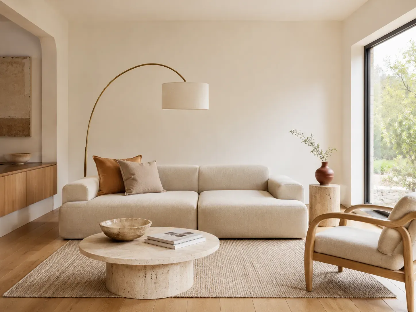
Warm minimalism: the dominant new-build direction in 2026.
What 2026 actually looks like in Australian interiors
The story of 2026 in Australian interior design, drawn from the major trend forecasts (Houzz, Style Sourcebook, Pantone, Pinterest Predicts and the major Australian builders), is consistent across sources. Warm minimalism is the dominant new-build direction. Biophilic design is reshaping the brief itself, not just the finish palette. Japandi has matured from a label into a workable foundation style. Pure cool minimalism is finished. Heavy ornament is not coming back but considered detail, texture and craft are returning. According to Broadsheet, the 2026 palette skews warm: beige, terracotta, soft brown, creamy white and muted green replacing the cool greys of the 2010s.
For traditional styles, the news is good. Hamptons, French Provincial, country and cottage have all softened toward the warmer end of their palettes and shed their heaviest detailing. They read more wearable in 2026 than they did in 2018. Modern coastal and Australian coastal have moved further apart, with modern coastal becoming the high-volume builder default and Australian coastal claiming the design-led, architecturally-considered end of the market. The same arc is visible in the kitchen and bathroom, where modern kitchen design and modern bathroom design have both moved from the cool, white, glossy 2010s version to a warmer, more tactile 2026 reading.
For contemporary work, the direction is layered, textured, expressive and less white than 2020. Statement art is back. Curved furniture is back. Bold colour (rich blue, terracotta, deep green, plum) is back as accents on warm neutral palettes. Pinterest’s defining 2026 palette is Cool Blue, Jade, Plum Noir, Wasabi and Persimmon, which signals the appetite for richer colour even in otherwise calm rooms.
The single message across every trend forecast is the same. The 2026 interior is warmer, more personal, more grounded in natural materials and more comfortable with restraint than the 2020 version. Whatever style you choose, the direction is toward warmth, texture and a sense of considered ease.
Frequently asked questions
What are the most popular interior design styles in Australia in 2026?
The most popular interior design styles in Australia in 2026 are Hamptons, French Provincial, modern coastal, Scandinavian, modern, mid-century modern, contemporary, farmhouse and boho, with Japandi rising fast from a smaller base. Hamptons and modern coastal dominate the broader east-coast suburban market, French Provincial holds its place in the Mornington Peninsula and Sydney upper north shore, and Japandi has overtaken pure Scandi in inner-city apartments. The Australian Houzz Renovation and Design Trends report has also flagged biophilic design and warm minimalism as the two style currents shaping mid-market new builds.
How is Australian Hamptons different from American Hamptons?
Australian Hamptons is lighter, less formal and less weighty than the American original. American Hamptons leans into navy, dark timber and heavier traditional joinery; the Australian interpretation runs a softer palette of white, dove grey, sand and coastal blue, with painted shaker cabinetry rather than stained timber, and uses linen and cotton instead of velvet and brocade. The architectural details translate too: panelling and VJ wall lining replace the heavier American boiserie, hampton roofs and weatherboard read more cottage-by-the-sea than estate-by-the-shore. The shift is climate driven. The Long Island original was built for a cold, grey-winter setting; the Australian version is built for an indoor-outdoor lifestyle and high natural light.
Which interior design style suits a Queenslander or weatherboard cottage?
Hamptons, coastal, modern coastal, country and contemporary all sit comfortably in a Queenslander or traditional weatherboard cottage. The architecture itself (high ceilings, VJ panelling, wide verandahs, original timber floors) carries a soft coastal-traditional feel by default, which means the interior can lean into those bones with white cabinetry, light timber, linen and a soft coastal palette. Stark industrial or strict modern struggle in a Queenslander because the architectural detailing fights the minimalist surface; warmer takes on minimalism (warm minimalism, Japandi) work, but pure mid-century modern doesn’t read well against Federation moulding.
How do I choose an interior design style without locking myself in?
Pick a foundation style for the architecture (the 70%) and pair it with a secondary influence for the layered detail (the 30%). The foundation usually has to suit the house: a Federation home anchors traditional or Hamptons, a 1970s brick veneer takes mid-century or contemporary, an inner-city apartment takes Japandi, warm minimalism or modern coastal. The 30% is your taste signal, layered through textiles, art, lighting and decor that you can swap without re-renovating. This is the principle behind the 70/30 rule designers use to mix styles without making the room feel themed. The foundation stays put; the layered 30% can evolve every five to ten years without the whole house feeling dated.
What is warm minimalism and why is it replacing cool minimalism in 2026?
Warm minimalism keeps the discipline of minimalist design (clean lines, restraint, every element earning its place) but swaps the cold palette for warmth. Cool minimalism used pure white, polished stainless and glass; warm minimalism uses soft off-white, oak, travertine, brushed brass, linen and natural texture. The shift is partly a reaction to the sterile look of 2010s minimalism and partly Pantone’s Cloud Dancer (a soft off-white) being named the 2026 colour of the year. In the Australian context, warm minimalism reads as the modern version of the country’s instinct for relaxed, light-filled, indoor-outdoor living. It is currently the dominant direction in new builds and high-end renovations through Sydney’s eastern suburbs, Melbourne’s inner north and Brisbane’s inner suburbs.
Is Japandi just a passing trend?
Japandi looks like a marketing label but it is the longest-running of the recent style hybrids and has held steady for five years. It is the natural successor to pure Scandinavian for an Australian audience because it solves Scandi’s biggest weakness here, which is that pale-everything reads as cold rather than cosy in our high-light climate. Japandi grounds Scandinavian’s light woods and clean lines with darker Japanese tones (walnut, charcoal, deep green) and the wabi-sabi acceptance of imperfection through hand-thrown ceramics and unlacquered metal. The result is a calmer, more textural look that suits apartment living and small homes especially well. As a foundation style, it is as durable as any single-origin style and far more durable than passing aesthetics like Coastal Grandmother or Cottagecore.
What is the difference between modern and contemporary interior design?
Modern has fixed design principles that do not change with trends: clean lines, uncluttered surfaces, function-first, natural materials, restrained palette. Contemporary is whatever is current, so it borrows from modern, industrial, mid-century, Scandinavian and elsewhere, and the look shifts over time. A modern room from 2015 still reads as modern in 2026. A contemporary room from 2015 may already feel dated. In practice, designers and showrooms use the words interchangeably, but the meaningful difference is permanence: modern stays put, contemporary moves with the season.
How do I see what a style will look like in my actual room before committing?
Before you commit to cabinetry colours, tile, flooring or furniture, build the room visually in three layers. Start with a tight Pinterest board (30 to 50 references in one style direction) to lock the palette and the feel. Then collect physical samples: tile, paint chips, fabric, timber. Sit them in the room at the time of day you use it most, because warm beige reads pink under cool LED downlights. For the final check, a photoreal 3D visualisation of your specific room with the selected finishes catches the proportions, the lighting and the material combinations a 2D moodboard cannot. Services like reIMG turn a phone photo and a brief into a finished image inside a day for around $100 to $150, which is cheaper than discovering a finish mistake once the trade is on site.