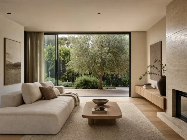
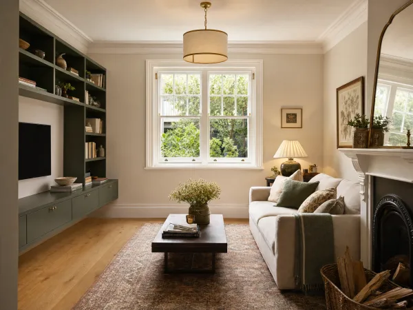
Mid-century modern style for Australian homes
What mid-century modern means in Australia: the post-war Boyd, Seidler and Iwanoff houses, the warm walnut palette, and how to do it without going kitsch.
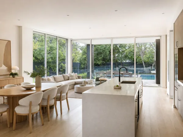
Why this guide exists
Most of the mid-century modern content online is American. The hero homes are Palm Springs Eichlers and the Stahl House on a Los Angeles hillside, the furniture references are American Modern manufacturers (Herman Miller, Knoll), and the climate, the floor plans and the suburban context assume the United States rather than Australia. That gap is the problem this guide exists to close. Australia produced its own substantial body of mid-century modern work between about 1948 and 1986, with houses by Robin Boyd in Melbourne, Harry Seidler in Sydney, Roy Grounds across both, Peter Muller in Sydney and Iwan Iwanoff in Perth that sit comfortably next to anything the United States produced in the same window. A meaningful share of the existing Australian housing stock is mid-century or mid-century-influenced. A great deal of contemporary Australian new-build design (warm minimalism, organic modern, the modern barn) is mid-century modern under a different name. None of that comes through clearly in the imported material.
This guide is the deep answer. It covers what mid-century modern actually is, where the period sits in design history, the Australian architects who produced our local version of it and the houses they built, why the style suits the Australian climate and the Australian block better than the imported version assumes, what the 2026 colour and material vocabulary looks like, how the style reads in the kitchen, living room, bedroom and exterior, where it sits next to Scandi, Japandi, contemporary and warm minimalism, what a mid-century modern kitchen costs at Australian rates, and the mistakes that send a room from intentional to kitsch. It is written for homeowners, renovators, designers and prospective buyers who want a clear read on the style rather than a feed of borrowed images.
It sits inside the broader interior design styles guide for Australia, where mid-century modern is one of the major historical directions alongside Hamptons, French Provincial and coastal. This page is the deep dive on mid-century modern specifically.
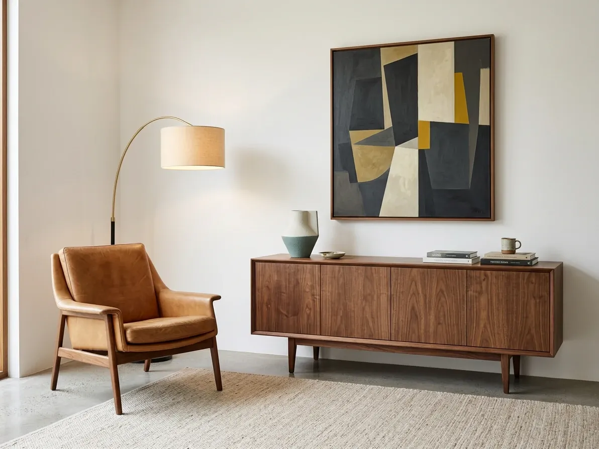
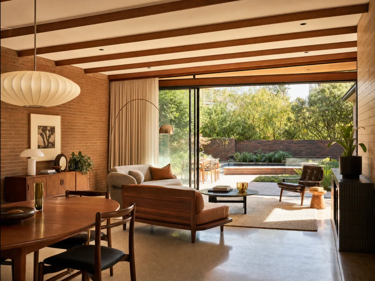
Walnut, leather and a single pendant: the period vocabulary, with restraint.
What mid-century modern actually is
Mid-century modern is the residential and furniture design language that emerged in the years after the Second World War and ran for roughly twenty-five years. According to Wikipedia’s overview of mid-century modern, the label was coined retrospectively by the American writer Cara Greenberg in her 1984 book Mid-Century Modern: Furniture of the 1950s, applied to the design output of roughly 1945 to 1969. Most authoritative references treat 1969 as the soft end-date, with the early 1970s marking the slide into late-modernism, postmodernism and the High-Tech moment.
The intellectual core of the style is functionalism. According to Dezeen’s introduction to mid-century modern design, the movement was a deliberate continuation of pre-war Bauhaus thinking on the other side of the Atlantic: form follows function, every piece should do its job well, every surface should be honest about what it is made of, and ornament should earn its place rather than appear by default. The post-war American expression added warmth and optimism to that European intellectual foundation. The result was a design vocabulary that read as serious and considered without reading as cold, which was a balance the Bauhaus original sometimes struggled to strike and which the public eventually responded to.
Three threads weave through the style and explain why a mid-century modern room feels the way it does.
The first is the post-war material moment. New materials made viable by wartime production (moulded plywood, fibreglass, plastic laminate, aluminium, steel tube) suddenly became available for furniture and architecture in the late 1940s. According to the Plaidsmith mid-century modern furniture history, Charles and Ray Eames spent the war years developing plywood splints for the United States Navy and emerged from that work with the moulded-plywood techniques that produced the LCW chair, the Lounge Chair and the case-goods systems for Herman Miller. Eero Saarinen developed the pedestal Tulip Table specifically to “clear up the slum of legs” under a typical mid-century dining table. Florence Knoll built an entire interior architecture practice around lightweight steel-framed furniture and large planes of glass. The materials are visible in every original piece of mid-century furniture, and a contemporary reproduction that hides them under a heavy traditional finish has missed the point.
The second is the Scandinavian thread. The Lunning Prize, awarded annually from 1951 to 1970 to outstanding Nordic designers, brought the warmer, more domestic Scandinavian version of modernism to international audiences during the formative years of the style. Hans Wegner’s Wishbone Chair (1949), Arne Jacobsen’s Series 7 chair (1955) and Egg chair (1958), and Alvar Aalto’s earlier bent-plywood furniture all sat inside the mid-century modern conversation rather than next to it. The Scandinavian thread is why mid-century modern is warm rather than industrial. Eames, Saarinen and Bertoia were working with steel and moulded plastic. Wegner, Jacobsen and Aalto were working with oak, teak and beech. The two streams flowed into each other and the resulting style takes from both.
The third is the architectural shift. According to the Eichler Homes for Sale evolution of mid-century modern homes, the residential side of the movement deliberately broke from the pre-war American single-family house. Roofs went from steeply pitched gables to low-sloped and flat. Façades went from solid timber weatherboards and brick veneer to large planes of glass. Floor plans went from a series of small enclosed rooms to open-plan great rooms with glazing on multiple aspects. Carports replaced detached garages. Eaves got deeper. Site planning began to engage with sun, view and landscape as design moves rather than as accidents. Joseph Eichler in California built thousands of these houses for the post-war American middle class between 1949 and 1966. The Case Study Houses programme, sponsored by Arts & Architecture magazine from 1945, commissioned twenty-eight experimental modernist houses from architects including the Eameses, Saarinen, Pierre Koenig and Richard Neutra. The architectural language those projects established is the language that turned up in Australia at almost the same moment.
What makes mid-century modern a style rather than just a period is the consistency of those threads across the work. A 1955 Eames lounge chair, a 1958 Hans Wegner shell chair, a 1956 Saarinen Tulip Table, a 1949 Eames House and a 1958 Iwanoff house in Perth all sit comfortably in the same conceptual room. The warm timber, the low horizontal proportions, the moulded organic forms, the honest expression of materials and the architecture’s deliberate negotiation with light and landscape are all coming from the same set of ideas.
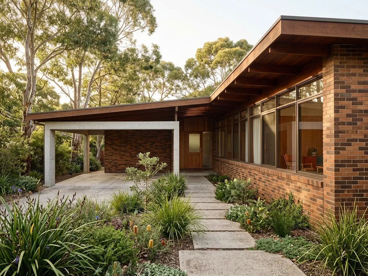
The Boyd-Seidler tradition: low roof, brick, native planting, single-storey.
The Australian mid-century modern story
What gets left out of imported mid-century modern content is that Australia produced its own substantial body of work inside the international movement, beginning at almost exactly the same moment and continuing for roughly the same duration. The local version translated the international vocabulary onto Australian sites, into Australian brick and timber, and under Australian light. The architects who led that translation are still the reference set for Australian residential modernism, and the houses they built are now among the most-photographed properties in the country.
Harry Seidler is the most internationally recognised of the Australian mid-century modernists. Born in Vienna and trained at Harvard under Marcel Breuer (one of the original Bauhaus masters), Seidler arrived in Sydney in 1948 to design a house for his parents. According to Modern House on Australia’s first true modernist architect and Wikipedia’s entry on Harry Seidler, the resulting Rose Seidler House in Wahroonga, completed in 1950, was the first uncompromisingly modernist house in Australia: an elevated white pavilion on a steel frame, with a long ramp, expansive glazing on multiple sides and a clear connection between the building and the surrounding bushland. The house won the Sulman Medal in 1951, set a public benchmark for modernist residential design in Australia and is now preserved by the Historic Houses Trust as a permanent house museum.
Robin Boyd is the architect who did most to bring modernist thinking into mainstream Australian housing. Boyd was a Melbourne architect, journalist and public figure who wrote Australia’s Home in 1952 and The Australian Ugliness in 1960, the two most influential books on Australian residential architecture of the post-war period. According to Wikipedia’s entry on Robin Boyd, he designed dozens of small and medium-sized residences in Melbourne and Canberra during the 1950s and 1960s, including the Walsh Street house in South Yarra (1958), which was his own family home and is now preserved by the Robin Boyd Foundation. Boyd was a partner in the firm Grounds, Romberg and Boyd from 1953 to 1962, with Roy Grounds and Frederick Romberg. His residential work emphasised the small Australian house, the relationship to landscape, and an honest expression of materials. Boyd argued through both his architecture and his writing that the Australian house could be modernist without being international, drawing on local brick, timber and tile rather than imitating American or European precedents.
Roy Grounds was the third member of the Grounds, Romberg and Boyd partnership and the senior partner in firm rank, although his stylistic register sat somewhere between Boyd’s small-house pragmatism and Seidler’s high-modernist intellectualism. Grounds was based in Melbourne and worked across both residential and large-scale public projects, including the original National Gallery of Victoria building on St Kilda Road (1968), the Academy of Science Shine Dome in Canberra (1959), and the Heide II building in Bulleen (1963). His 1950s houses, including the Round House at Mount Eliza (1953) and the Henty House (1953), used pure geometric shapes (circles, squares, arcs) as their organising principle and remain among the most distinctive Australian residential designs of the period.
Peter Muller produced the most consciously organic Australian residential modernism, working in Sydney from the early 1950s. According to Wikipedia’s entry on Peter Muller, his Audette House at Castlecrag (1953), Richardson House at Whale Beach (1954) and Muller House at Whale Beach (1955) introduced ideas drawn from Frank Lloyd Wright’s organic architecture into the Sydney housing market, with stone masonry, timber cladding, open-plan interiors and a strong relationship between building and bushland setting. Muller later worked extensively in Bali and Lombok and remained an active designer until his death in 2023.
Iwan Iwanoff is the architect most associated with mid-century modern in Perth and Western Australia. Born in Bulgaria and trained in Germany and Austria, Iwanoff arrived in Perth in 1950 and produced an Adelaide and Perth residential body of work that remains the strongest mid-century modern output west of the Eastern States. According to Wikipedia’s entry on the Paganin House, the 1965 Paganin House in Floreat was his best-known building until it was destroyed by fire in 2015; other significant Iwanoff houses, including the Marsala House (1976) in Dianella and the Skiotis House (1969), demonstrate his distinctive combination of geometric masonry, exposed concrete, and an exuberant use of decorative concrete-block patterns that has no real parallel in Eastern States work.
A range of other architects produced significant mid-century modern residential output between roughly 1948 and 1980. Neville Gruzman, Russell Jack, Sydney Ancher, Bryce Mortlock, Allan Stafford and others built houses in Sydney that contributed to a recognisable Sydney School style. In Melbourne, Kevin Borland, Peter and Dione McIntyre and David Godsell extended the work of Boyd and Grounds. In Canberra, the planned modernist suburbs of Forrest, Reid, Yarralumla and Red Hill carry a concentration of post-war modernist houses that has earned the city the informal nickname ‘the Palm Springs of Australia’ (the comparison appears in Modernist Architecture’s piece on Canberra, among others).
The Australian furniture story is equally substantial. According to the National Gallery of Victoria’s exhibition record for Mid-Century Modern: Australian Furniture Design, the major Australian designers of the period include Grant and Mary Featherston (responsible for the Contour Chair, of which Aristoc Industries manufactured an estimated 250,000 between 1951 and 1958, making it one of the most-produced Australian furniture pieces of the era), Schulim Krimper (the Melbourne cabinetmaker known for his exquisite handling of timber), Douglas Snelling (responsible for the Snelling line of furniture for Functional Products), Clement Meadmore (better known later for his large sculptural work), Fred Lowen, Gordon Andrews and Lester Bunbury. Their work is now collected by the major Australian galleries and by private collectors, and original pieces command serious prices at auction. The contemporary Australian reissue and high-end secondary market is large enough to support specialist galleries and dealers in every major Australian city.
The takeaway from this section, for an Australian homeowner researching the style: the imported American or European reference is not the only reference. A mid-century modern Australian home does not need to look like Palm Springs; it can sit comfortably inside the Australian architectural tradition that Boyd, Seidler, Grounds, Muller and Iwanoff built. That tradition still feels current.
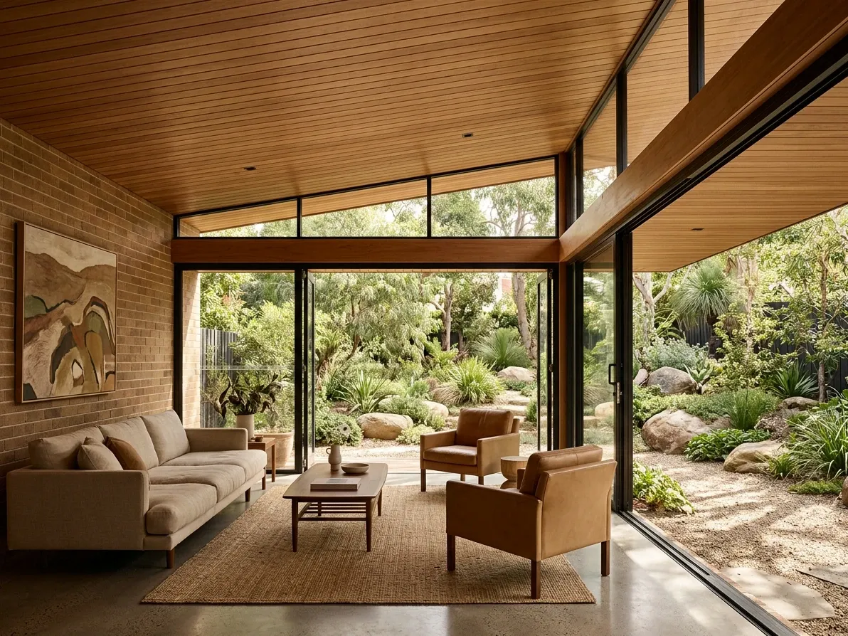
Deep eaves and oriented glazing: a 1950s style move and a passive-design fix.
Why mid-century modern suits Australian light and the Australian block
One of the consistent surprises in researching this style is how naturally it fits Australian conditions. Other imported styles need to be adjusted carefully for the local context. Hamptons needs a lighter palette than the original New England version. French Provincial needs cooler-leaning paints to handle direct sun. Scandi needs warming across every layer because the imported version was engineered for cool diffuse Nordic light. Mid-century modern needs no equivalent translation, because its core architectural moves were already engineered for the kind of climate Australia has.
The original American mid-century houses were built for California, the American south-west, Florida and other warm, sunny climates with strong indoor-outdoor traditions. The Eichler tract houses in California assumed bright sun, low rainfall and outdoor living as the default. The Case Study Houses on the Los Angeles hillsides assumed expansive views, ocean breeze and a year-round comfortable climate. The Floridan and Texan mid-century houses dealt with humidity and heat. The architectural responses (low-pitched roofs with deep eaves, expansive glazing oriented for sun, single-storey horizontal massing, the carport instead of the closed garage, the indoor-outdoor great room) translate directly onto an Australian site without modification. The match is close enough that the same house plans were occasionally licensed across both markets.
The Australian block reinforces the fit. According to the ABS Census 2021 data on dwelling structure, roughly 70% of Australian occupied dwellings are separate houses, which is far higher than the equivalent share in most comparable Northern Hemisphere countries. The Australian quarter-acre block, even where the average block has shrunk over the past forty years, still assumes a freestanding family house with garden on multiple sides. The mid-century modern preference for horizontal single-storey plans, deep eaves, generous glazing and a carport translates more cleanly onto a freestanding suburban block than it does onto a terraced street in London or a townhouse in Brooklyn. The architectural language matches the local building stock at a base level.
There is also the climate-comfort case. According to Your Home, the Australian Government’s guide to sustainable design, the passive-design principles that produce a comfortable Australian home (orient living spaces north, shade glazing with eaves sized to the local solar angle, use thermal mass appropriately, ventilate cross-breezes through the open plan, connect inside and outside spaces) are essentially the same principles a 1950s mid-century modern architect was working with. Boyd in particular wrote extensively about Australian sun and shade in his residential work, and the deep eaves and oriented glazing of a typical Boyd small house are an early passive-design exercise as much as they are a stylistic choice. A well-designed Australian mid-century modern house is comfortable in a way that a more recent compact double-storey on a tight block often is not, because the older house was thinking about sun and breeze from the start.
The colour palette translates without the climate friction that fights Scandi here. Walnut, teak and oak read warmly under both Nordic light and Australian light. Mustard, burnt orange and avocado read identically. The earth-toned base palette (creams, oats, soft beiges) sits inside the warm white range that holds up under direct Australian sun. There is no equivalent to the Scandi ‘cool-grey palette goes clinical in Brisbane’ failure mode; the mid-century palette was warm to begin with, and Australian light reinforces rather than fights it.
The only structural caveat is glazing exposure. American mid-century houses (and their Australian descendants from the 1950s and 1960s) sometimes ran large planes of unprotected glass on the western elevation, which produces unmanageable solar gain in Australian summer. A contemporary Australian mid-century modern house, or a thoughtful renovation of an existing one, addresses this with operable louvres, deep timber overhangs, brise-soleil screens or careful planting on the western elevation. The vocabulary supports the fix; nothing about the style needs to change to accommodate it.
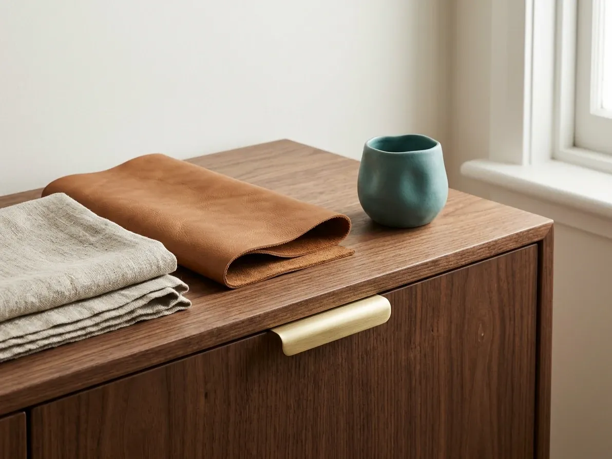
Walnut, brass, leather, one accent: the 2026 read uses the palette sparingly.
The 2026 colour and material vocabulary
The 2026 read on mid-century modern is materially close to the original era but considerably more restrained on the accent palette. The original 1950s and 1960s rooms used the period accent colours densely (a mustard wall, an orange sofa, an avocado armchair and a starburst light fitting in the same space) and that density is what now reads as kitsch. The current direction picks one or two accents and lets the timber and the architecture do most of the colour work.
The base palette breaks down something like this.
Warm whites and creamy off-whites carry walls, ceilings and trim in most contemporary mid-century modern rooms. According to Apartment Therapy’s mid-century modern colour palette guide, the base set should sit warm rather than cool: cream, soft oat, warm taupe, mid-tone greige, warm charcoal. Pure cool white reads thin in this context and fights the warm timber that does most of the room’s work; warm white reinforces it.
Walnut is the signature timber. American walnut and Australian black walnut both work well; the colour sits mid-tone, deeper than oak but not as dark as wenge or smoked oak. Walnut appears on dining tables, sideboards, console tables, beds, joinery and furniture frames. According to the Antique Farmhouse mid-century modern colour palette piece, walnut is treated as a colour in its own right within the palette, rather than as a neutral background.
Teak is the second signature timber and is particularly strong in the Scandinavian-influenced wing of mid-century modern. Teak runs slightly warmer and oranger than walnut and was extensively used in 1950s and 1960s Danish and Australian furniture. Original teak pieces are now expensive on the secondary market and contemporary reproductions usually substitute mid-tone oak or veneer-on-engineered-substrate, which works visually but reads less authentic at close inspection.
Oak, beech and ash are the supporting timbers. Oak (European or Australian Tasmanian oak) carries floors and joinery in rooms where walnut would read as too heavy. Beech and ash turn up in dining chairs, side tables and lighter case goods, particularly in the Scandinavian-influenced pieces.
Stone, glass and brick carry the architectural surfaces. Brick is the standard Australian mid-century-modern wall material, often left exposed internally as a feature wall behind a fireplace or behind the living-room joinery. Off-form concrete and exposed aggregate concrete appear in the more architecturally serious work (Iwanoff, late Seidler). Honed natural stone (limestone, travertine, Carrara) appears in benchtops and bathroom surfaces. Polished marble reads as later and tips the room out of the period.
Hardware is matte black, brushed brass, bronze or chrome. Original 1950s and 1960s hardware ran heavily to brass and bronze in the Scandinavian wing and chrome in the American wing; the 2026 read uses brass and matte black most often, with chrome as an occasional deliberate choice for a Saarinen-influenced kitchen or a Knoll-influenced bathroom.
The accent palette, used sparingly, is the period palette:
- Mustard yellow is the most-used mid-century modern accent. A single mustard cushion, a mustard reading chair, a mustard wall in a single room.
- Burnt orange and rust sit next to mustard in the warm corner of the palette. A burnt-orange sofa is a strong mid-century move; it should be the only strong-coloured upholstered piece in the room.
- Avocado and olive green appear in cushions, art, ceramics and the occasional upholstered chair. The 1970s ran avocado green to the point of saturation; the 2026 read uses it sparingly.
- Deep teal and slate blue appear in art, ceramics and the occasional accent wall. Teal in particular sits well with walnut and was a strong period choice.
- Terracotta and warm clay appear in pottery, plant pots and occasional wall colour, often in the rooms that lean closer to organic modern.
- Black grounds the room without being read as a primary colour. A black leather chair, a black powder-coated lamp, a black-framed window.
According to Hudson Furniture’s 2026 trends note and Style Sourcebook’s 2026 forecast, the 2026 direction is for warm tones, organic curves and one or two strong accents rather than a full retro palette. The Style Sourcebook forecast notes that the 2026 mid-century moment has shifted toward homeowners ‘committing to a chosen era and letting its design language guide the space’, which in practice means picking one of the period’s accent palettes (the warmer mustard-and-burnt-orange register, the cooler teal-and-slate register, or the green register) and staying inside it rather than mixing all three.
Textiles run more tactile than the 1950s original. Bouclé, slubbed linen, wool felt and leather carry most of the upholstery. Velvet appears in deeper period rooms and in mid-century-influenced glam interiors. Vinyl and plastic upholstery, common in the 1960s original, are largely absent from the contemporary read. Patterned textiles use restrained geometric prints (the warm minimalist version of mid-century modern uses almost no pattern at all; the more traditional reading might run a single geometric rug).
Where mid-century modern sits next to Scandi, Japandi, contemporary and warm minimalism
The four styles overlap enough at the material level that they are routinely confused for each other in real Australian rooms. The differences are still clear and worth knowing if a homeowner is trying to commit to one direction.
Mid-century modern versus Scandi is the closest of the four pairs, because both styles draw on the same Scandinavian wing of mid-century design. Scandi runs lighter on the timber (pale oak, ash, birch dominate, with honey oak and mid-tone oak as the current warmer reading), keeps the accent palette more restrained (muted sage, dusty blue, terracotta, never the saturated period colours), and emphasises lagom and hygge rather than the post-war optimism that drives mid-century modern. Mid-century modern uses walnut and teak as the dominant timbers, accepts the saturated period accents (mustard, burnt orange, avocado, teal) as part of the vocabulary, and reads as a period style rather than a continuously-evolving contemporary style. The Scandi home design guide explores Scandi in detail; the practical short version is that Scandi is climate-neutral and timeless, mid-century modern is period-specific and warmer-toned.
Mid-century modern versus Japandi is the second-closest pair. Japandi crosses Scandi with Japanese wabi-sabi and uses darker timbers (smoked oak, walnut, dark-stained ash), lower furniture inspired by Japanese floor-level living, soft diffused paper-shade lighting and meditative negative space. The walnut and the low furniture both overlap with mid-century modern, which is why the two styles are confused so often. The cleanest practical tests: Japandi uses asymmetric, organic, often hand-thrown ceramics and avoids hard machine-finished surfaces; mid-century modern is comfortable with machine-finished surfaces (moulded plywood, polished steel, plate glass) and uses geometric rather than wabi-sabi accent objects. A Japandi room is meditatively quiet; a mid-century modern room is curated but optimistic.
Mid-century modern versus contemporary is more about era than material. Contemporary refers to whatever is being designed now, and the current contemporary Australian read is heavily mid-century-influenced (warm minimalism, organic modern, the modern barn). The distinction sits in literalness: a contemporary room takes the mid-century vocabulary as inspiration and resolves it cleanly into the present, with no period accents, no original pieces and a fully current palette. A mid-century modern room makes the period reference visible, usually through one or two hero pieces of furniture (a walnut sideboard, a Tulip table, a Wassily-influenced reading chair) and one or two accent colours from the period palette. A room that uses mid-century moves with no reference visible is contemporary; a room that names the period clearly is mid-century modern.
Mid-century modern versus warm minimalism is the same comparison made with less period-specific vocabulary. Warm minimalism is the broad Australian editorial label for natural materials, restrained palettes, considered negative space and light-led planning. The execution is usually mid-century-modern in disguise, with the iconic period pieces and the accent palette removed. For a homeowner choosing a direction, the practical question is whether the room should make the period reference visible (mid-century modern) or absorb the moves into a quietly contemporary read (warm minimalism). Both are valid; mid-century modern is the more confident, more specific choice and warm minimalism is the more flexible, more universally-readable one.
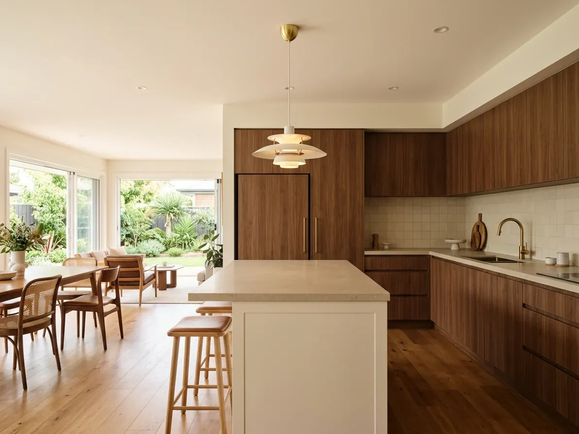
Walnut perimeter, warm-white island, single hero pendant: the kitchen reading.
Mid-century modern in the Australian kitchen
The Australian kitchen is a strong room for mid-century modern, and one where the style reads more naturally than in some of the other rooms. The combination of a flat-panel or slim-shaker cabinet face, warm walnut or teak veneer, a hero pendant over the island and a restrained tile splashback hits the period reference clearly without going kitsch.
The base specification reads as follows.
Joinery is flat-panel or slim shaker, never raised or panelled. The face is walnut veneer, teak veneer (rare and expensive at solid; reasonable as a veneer), mid-tone oak veneer, or warm-white painted MDF with a walnut or teak feature element (an island, a tall pantry, an open shelving system). The shadowline reveal between doors is slim (5 to 8mm) and the hardware is either brushed brass, matte black or a slim brass pull. Handleless flat-panel doors in walnut veneer with a J-pull or shadowline reveal is the cleanest current reading of the style. According to Vitality Kitchens’ mid-century kitchen renovations page and The Maker Designer Kitchens’ mid-century modern guide, walnut or walnut-look veneer is the single most distinctive choice for an Australian mid-century kitchen.
Floors are warm-tone timber (European oak, Tasmanian oak, or a walnut floor in the more confident reading), warm-tone matte porcelain in larger formats, or terrazzo (the speckled terrazzo of the 1950s and 1960s reads particularly well in a mid-century modern bathroom or laundry, and contemporary engineered terrazzo is widely available in Australia). Cork is a historical mid-century modern flooring choice and worth considering for a small or wet space.
Benchtops are honed natural stone (limestone, dolomite, Carrara, soapstone) in a warm-white or oat tone, engineered stone in warm white or a creamy beige, or a butler-style timber bench on the island as a tactile contrast. Polished marble reads as later and is not the period choice. Stainless-steel benchtops are a confident period reference and read well in a more architectural reading of the style.
Splashbacks are matte glazed ceramic tile in small or medium formats (handmade-look square or rectangular tile, often laid in a grid rather than a brick bond), terrazzo, exposed brick (a strong period reference, particularly in a renovation of an existing 1960s or 1970s house), or a stone slab that continues from the benchtop. Mirror splashbacks and high-gloss tile read as later eras and break the period reference.
Hardware and tapware are brushed brass, matte black, bronze or chrome. The 2026 leaning is brass and matte black, with chrome reserved for the kitchens that consciously reference the American Knoll-and-Eames wing of the period. The tapware is gooseneck or articulated, never the high-arc waterfall profile that reads as 2010s contemporary.
Lighting is warm white (2,700 to 3,000K), with one or more hero pendants over the island or dining area carrying most of the visual weight. The hero pendant is the room’s strongest mid-century reference; appropriate choices include the Louis Poulsen PH series (1958), the Foscarini Caboche range, the Gubi Multi-Lite (1972, just outside the period proper but in the conversation), the Tom Dixon Beat or Melt lights, or a reissue of a Verner Panton Flowerpot. A single sculptural pendant is the right number; a row of three matched globe pendants reads as later contemporary.
Appliances are integrated where possible (panelled fridge, panelled dishwasher, ducted concealed rangehood) or expressed as a deliberate hero choice (a freestanding integrated range, a stainless-steel oven with the cabinetry built around it). The appliance package is one of the easiest places to send the kitchen toward the 1970s by accident: avocado-green appliances are a period reference but read as costume rather than home in a 2026 kitchen.
According to the Housing Industry Association’s HIA Kitchens & Bathrooms Report 2025, a typical Australian kitchen renovation falls in the median range of about $30,000 to $35,000, and the mid-century modern specification above sits comfortably inside that envelope. Costs move when the timber moves to solid walnut, when the appliance package goes fully integrated and high-end, or when a curved-front joinery piece (a 2026 mid-century-modern direction) is custom-built rather than veneered onto a standard flat-panel substrate. According to the 2023 Houzz Australia Kitchen Trends Study, surveying 473 Australian homeowners about their recent kitchen renovations, Contemporary is the top style choice (24%) followed by Modern (23%), with Hamptons (11%), Coastal (7%) and Country (4%) trailing. A mid-century modern kitchen specified in 2026 most commonly arrives via the Contemporary or Modern label, since the underlying vocabulary is shared.
- Contemporary24%
- Modern23%
- Other styles35%
- Hamptons11%
- Coastal7%
The wider kitchen context sits in the dedicated kitchen styles guide for Australia and the modern kitchen design deep dive, both of which treat the kitchen-specific decisions in more depth.
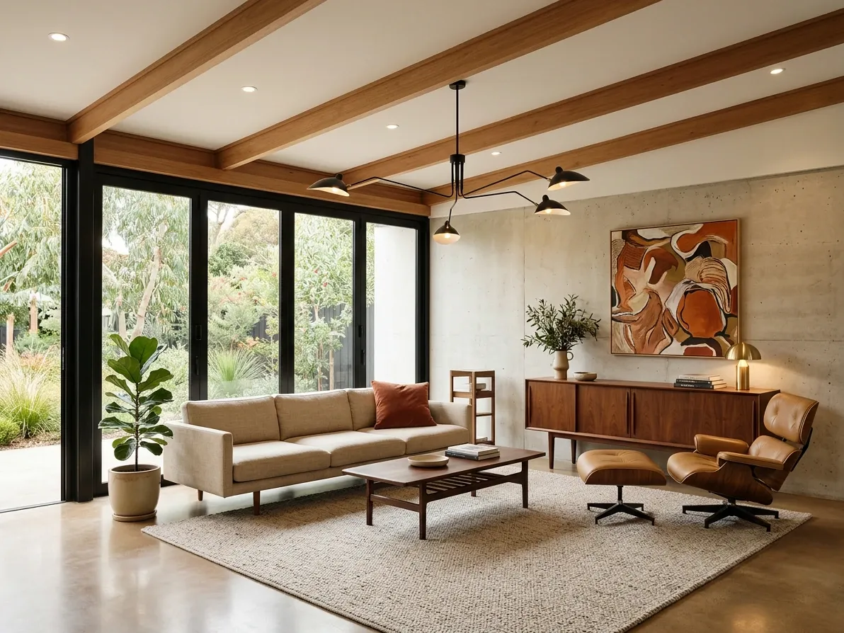
One hero chair, a walnut sideboard and one accent: the living room MCM owns.
Mid-century modern in the living room
The living room is the room that mid-century modern owns. The hero furniture pieces are nearly all designed for this space (the Eames lounge chair, the Saarinen Tulip range, the Florence Knoll sofa, the Featherston Contour Chair, the Wegner Wishbone, the Noguchi coffee table), the architectural moves (open plan, low horizontal ceiling, generous glazing, indoor-outdoor flow) are aimed at it, and the period accent palette lives most comfortably here.
The base specification reads:
Sofa in a low, horizontal silhouette with tapered or splayed timber legs. The 1950s American profile (a long horizontal Florence Knoll sofa, or its many descendants) is the canonical choice; a contemporary sofa in linen, bouclé, leather or wool felt in a warm neutral works equally well. The sofa is usually one of the longer pieces in the room and its proportions need to read horizontally rather than vertically.
A hero chair is usually the strongest single mid-century reference in the room. The Eames lounge chair (introduced 1956), an Arne Jacobsen Egg or Swan (1958), a Hans Wegner Shell or Wishbone (1949 and earlier), a Featherston Contour or R152 reading chair, or a contemporary equivalent. One hero chair is the right number; two is a furniture parade.
Coffee and side tables in walnut or teak, with sculptural or geometric forms. A Noguchi coffee table (1947), a Saarinen Tulip side table (1957), or a contemporary walnut piece with tapered legs. Walnut against a linen or bouclé sofa is the classic combination.
Storage and case goods are walnut or teak sideboards, credenzas and shelving units on slim splayed legs. A horizontal walnut sideboard along one wall, used as a media console and as a record-and-book display, is one of the most distinctive mid-century modern moves and is easily achievable in 2026 with reissue or contemporary pieces.
Lighting is layered. A standing or floor lamp with an arc or sculptural form (an Arco floor lamp from 1962 is the canonical reference; reissues are widely available), one or two table lamps with sculptural ceramic or brass bases, and a hero pendant over a dining area if the space includes one.
Walls and surfaces carry the architectural reference. A single feature wall in exposed brick, off-form concrete, walnut panelling or floor-to-ceiling stone is a strong mid-century modern move and sits well behind the hero seating group. A second feature in art (an original or licensed mid-century print, a 1960s ceramic, a sculptural fabric piece) ties the room together.
Indoor-outdoor connection is the architectural argument. Where the room opens onto a garden, a courtyard, a deck or a pool, the threshold is generous (full-height glazing or stacking doors) and the outdoor space is treated as part of the room rather than as a separate zone. Where the room is closed (apartment, mid-renovation house) the connection is reproduced through a single large window, a strong garden view from one elevation, or an internal courtyard.
The 2026 reading on the living room is lighter and less period-saturated than the original. One accent colour from the period palette (mustard, burnt orange, teal, avocado) appears in upholstery, cushions or art. The rest of the room carries warm neutrals and timber. The result is a recognisably mid-century modern room that reads as current rather than as costume.
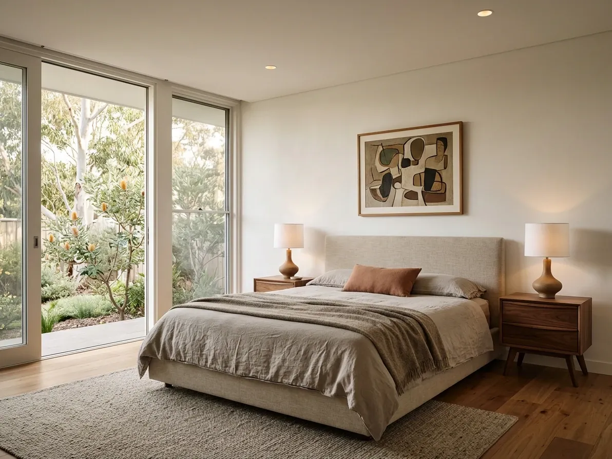
Low horizontal bed, walnut bedside tables, one accent: the bedroom register.
Mid-century modern in the bedroom
The bedroom is the most flexible of the rooms. The architectural moves matter less here (the bedroom is rarely open-plan and rarely has the same indoor-outdoor opportunity as the living room) and the period reference comes through the furniture and the palette rather than through the architecture itself.
Bed in a low, horizontal form with a low headboard, walnut or teak frame, or upholstered linen or wool. The 1950s and 1960s bedroom ran low to the floor, which still reads as the period choice. A tall four-poster or a heavily-upholstered Hamptons-style bed reads out of the style.
Bedside tables in walnut or teak, with slim splayed legs and a single drawer. A pair of matching walnut side tables next to a linen-upholstered bed is the classic reading.
Storage is built-in or freestanding low chests in walnut or teak. A long horizontal dresser along one wall is the period move; a tall vertical tallboy is later.
Lighting is two matching bedside lamps with sculptural bases (ceramic, brass or timber) and warm-white shades, plus an optional pendant or arc floor lamp for general light. Recessed downlights are acceptable but should be warm-white and dimmed; cool-white downlights are the most common Australian mistake in any bedroom and break the period reference instantly.
Textiles are linen sheets, wool blankets, a textured throw and a single accent cushion. The textile palette runs warmer than the 2010s grey-on-grey bedroom and warmer than a strict Scandi version; this is mid-century modern’s warmer register doing its work.
Wall and surfaces are warm white or oat-painted plaster, with one accent wall optional (walnut panelling, exposed brick or a strong period wallpaper) and a single piece of mid-century art or photography.
The deeper read on bedrooms sits in the bedroom design and decoration guide, which covers the room-specific decisions across style families.
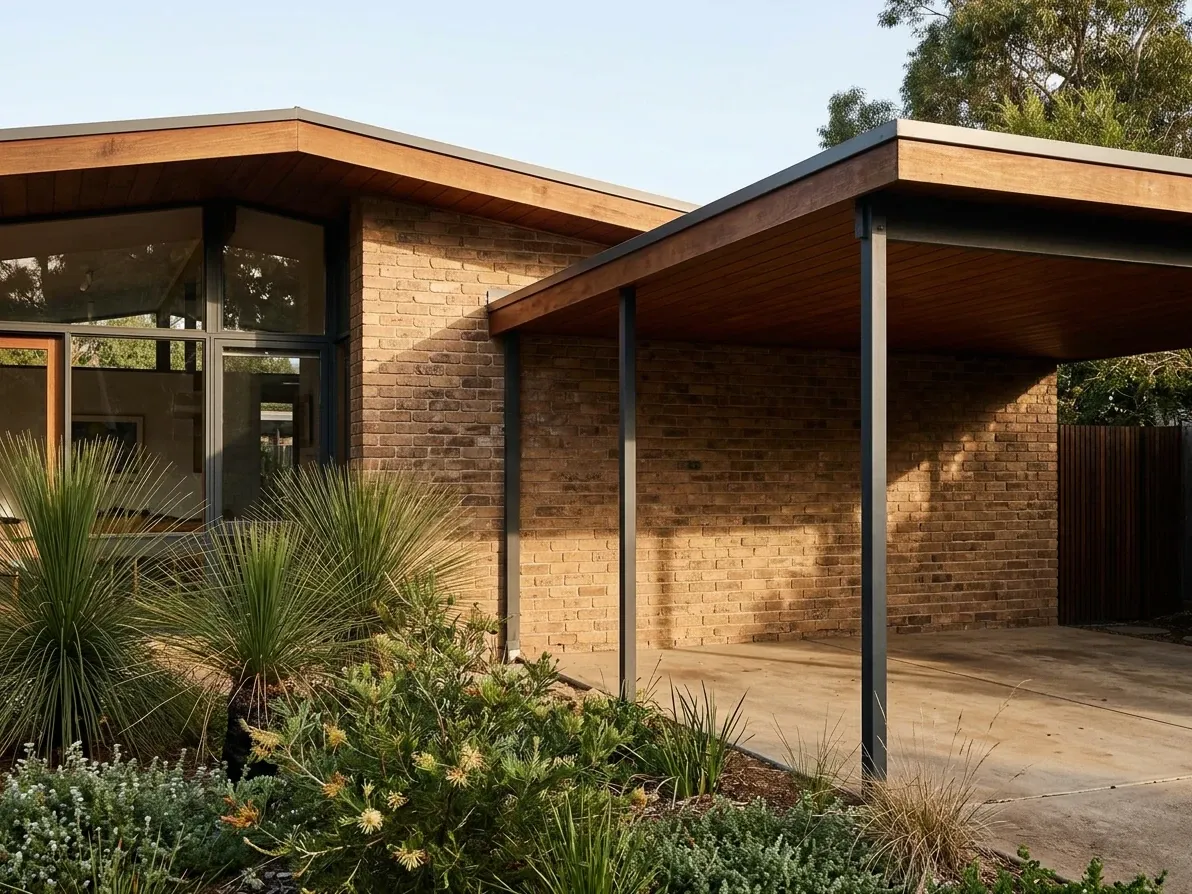
Skillion eave, brick, slim steel posts and carport: local exterior signatures.
The Australian mid-century modern exterior
The exterior is where the Australian version of the style differs most clearly from the American one. The Boyd-and-Seidler vocabulary that established Australian residential modernism in the 1950s used materials, proportions and detail that were specifically Australian rather than American.
The roof is low-pitched (typically 5 to 15 degrees), often skillion (a single sloping plane) or low-pitched hipped, occasionally flat. According to Lateral Building Design’s mid-century architectural style guide, the roof line is one of the most identifiable signatures of the style in Australian houses. Roof materials are corrugated steel, terracotta tile, or concrete tile in dark grey or charcoal. Eaves are deep, usually 600 to 900mm, and serve as solar shading for the windows below.
The walls are face brick (often a warm-tone clinker brick, a sand-coloured brick, or a deeper red brick), rendered brick, exposed concrete (off-form or aggregate-exposed) or vertical timber cladding. The Australian mid-century modern facade rarely uses the painted weatherboard that characterises so much earlier Australian housing; the modernist preference for honest material expression rules out painted-over timber as the dominant exterior.
The windows are large and horizontal in proportion, often grouped into long horizontal ribbons rather than individually-framed openings. Aluminium frames in mill-finish, anodised bronze or black are the period choice. Steel-framed glazing appears in the more architectural Seidler-and-Iwanoff work but is less common in the broader mid-century housing stock.
The carport, rather than the closed garage, is the period parking solution. A carport with a flat or shallow-pitched roof, supported by slim steel posts or by a continuation of the house’s masonry, sits at the front or side of the house. The integration of the carport into the architectural language of the building is one of the cleanest tells of a genuine mid-century modern Australian house; a later closed-garage addition usually breaks the line.
The landscape is integrated. Native planting (eucalypts, banksia, grevillea) sits alongside the architecturally-deliberate hardscape (concrete paving, brick paving, stone walls). The 1950s and 1960s Australian mid-century gardens drew on Edna Walling and Glen Wilson’s planting philosophy, which emphasised native species and structural restraint and remains a strong contemporary reference. A 1960s lawn-and-roses garden in front of a Boyd house breaks the building; a contemporary native-planted landscape strengthens it.
The contemporary read on the exterior is more confident than it was a decade ago. The ‘modern barn’ that has dominated Australian custom-build conversations since about 2018 is mid-century modern with a steeper roof and more rural detailing. The ‘warm modern’ or ‘Australian modern’ label that Habitus, Est Living and The Local Project use for current high-end residential work is mid-century modern under a different name. The architectural language is back in mainstream contemporary work.
What mid-century modern costs to do well in Australia
The cost of a mid-century modern interior depends almost entirely on whether the homeowner is buying reissue or original period pieces. The architectural surfaces and the painted walls cost the same whatever style they sit inside. The joinery is comparable in cost to any other modernist or contemporary specification (flat-panel veneer cabinetry is not unusually expensive). The variable is the furniture and the case goods.
The reissue tier runs current contemporary prices for licensed reproductions of the canonical pieces. An authentic licensed Eames lounge chair from Herman Miller is in the order of $9,000 to $14,000 in Australia depending on hide and trim. A licensed Knoll Saarinen Tulip dining table is $4,000 to $9,000. A licensed Vitra DSW chair is $700 to $1,200. A pair of Wegner Wishbone chairs is around $1,200 to $1,800 each in licensed teak or oak. These prices are at the high end of the contemporary furniture market but not unique to the style; an equivalent specification in Hamptons or Scandi furniture would land in similar territory.
The reproduction tier runs significantly cheaper for visually-similar but unlicensed pieces. An unlicensed Eames-lounge-look chair is $1,500 to $3,500 in Australia. An unlicensed Wishbone-look chair is $200 to $400. An unlicensed Tulip-look table is $1,500 to $3,500. The visual reference is close, the construction is usually adequate but not great, and the longevity is variable. For a homeowner choosing this tier, the practical recommendation is to spend the budget on one or two licensed hero pieces (the Eames lounge, the dining table) and use reproductions for the supporting furniture; the visual difference is real on the hero pieces and modest on the supporting cast.
The original period tier runs auction and dealer prices for genuine 1950s and 1960s pieces. Original Featherston Contour Chairs in good condition currently sell at around $3,500 to $7,000 at Australian auction. Original Schulim Krimper cabinetry trades at $10,000 to $50,000 depending on the piece and provenance. Original Wegner, Jacobsen and Saarinen pieces command international prices and are usually imported. The original tier is collector territory rather than mainstream renovation territory and is best engaged through an established dealer rather than online auction.
For a 2026 Australian household setting up a mid-century modern living room from scratch, a reasonable budget for the furniture alone is $25,000 to $50,000 at the reissue tier (one licensed hero chair, one licensed dining table, six dining chairs, a sofa, a coffee table, a sideboard, two side tables and lighting) and $10,000 to $20,000 at the reproduction tier. The kitchen renovation lands in the standard Australian range of $30,000 to $35,000 and is roughly style-neutral. Paint and architectural surfaces add modestly. A whole-house mid-century-modern renovation that includes furniture lands somewhere between $80,000 and $200,000 depending on the size of the house and the tier of furniture chosen.
The good news for an Australian homeowner already living in a mid-century modern house is that much of the work is already done. The architecture is in place, the orientation is usually good, the joinery is often original and worth preserving rather than replacing, and the renovation cost is mostly the kitchen, bathroom, painting and updated services. A 1965 Boyd-school house in Melbourne or a 1958 Iwanoff house in Perth is usually best treated as a sympathetic restoration rather than a renovation.
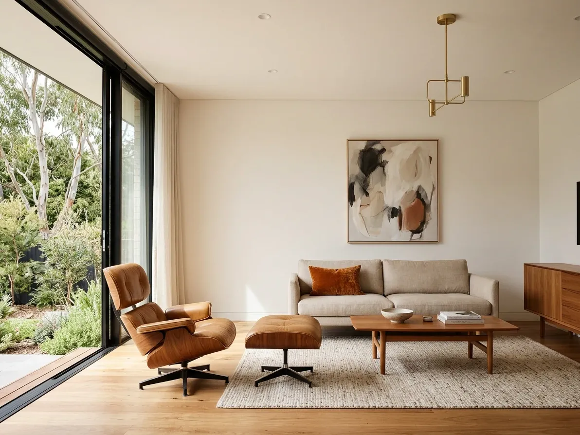
One hero piece, one accent, the rest contemporary: the kitsch-proof read.
The mistakes that send mid-century modern from intentional to kitsch
Mid-century modern is the style most often pushed into kitsch by good-faith homeowners, because the iconic furniture and the saturated period palette are visually distinctive and tempting to layer in heavily. The result, when it goes wrong, is a room that reads as theme rather than home: an Eames lounge in the corner, a sunburst clock above the fireplace, a tulip dining table, a Wishbone bench seat, two sideboards, an orange sofa, a mustard wall and a row of three globe pendants over the kitchen island. Each individual piece is correct; the cumulative effect is a furniture catalogue rather than a designed space.
The single most reliable fix is restraint at every layer. Pick one hero chair, not three. Pick one accent colour from the period palette, not five. Pick one or two pieces with strong sculptural forms and surround them with quieter contemporary furniture. Treat the period reference as the seasoning of the room, not the entire meal.
A handful of specific mistakes recur. The first is saturated wall colour across multiple rooms: a mustard wall in one room is a confident period reference, a mustard wall in three rooms reads as 1972. The second is matched suites of furniture: the 1950s and 1960s living-room suite (matching sofa, two armchairs, ottoman, all in the same fabric) reads as catalogue, not as designed; pick pieces that read as a curated collection rather than as a delivered set. The third is period appliances: an avocado-green dishwasher panel is a costume that breaks the kitchen. The fourth is over-styled retro accessories: too many starburst clocks, sunburst mirrors, geometric trivets, ashtrays and atomic-pattern textiles in one room reads as ironic rather than current. The fifth is the cool-white downlight grid: bright-white cool LED downlights flatten any period room and break the warmth that the timber is doing its work to establish; warm-white 2,700K is the right colour temperature for mid-century modern interiors.
The deeper rule is that mid-century modern in 2026 is an architectural language and a furniture vocabulary rather than a costume. The strongest rooms read as confidently contemporary with a deliberate set of period references, not as an attempt to recreate a 1962 lounge room. A homeowner who treats the style this way will end up with a room that reads as well-designed and timeless, rather than as a museum diorama of someone else’s decade.
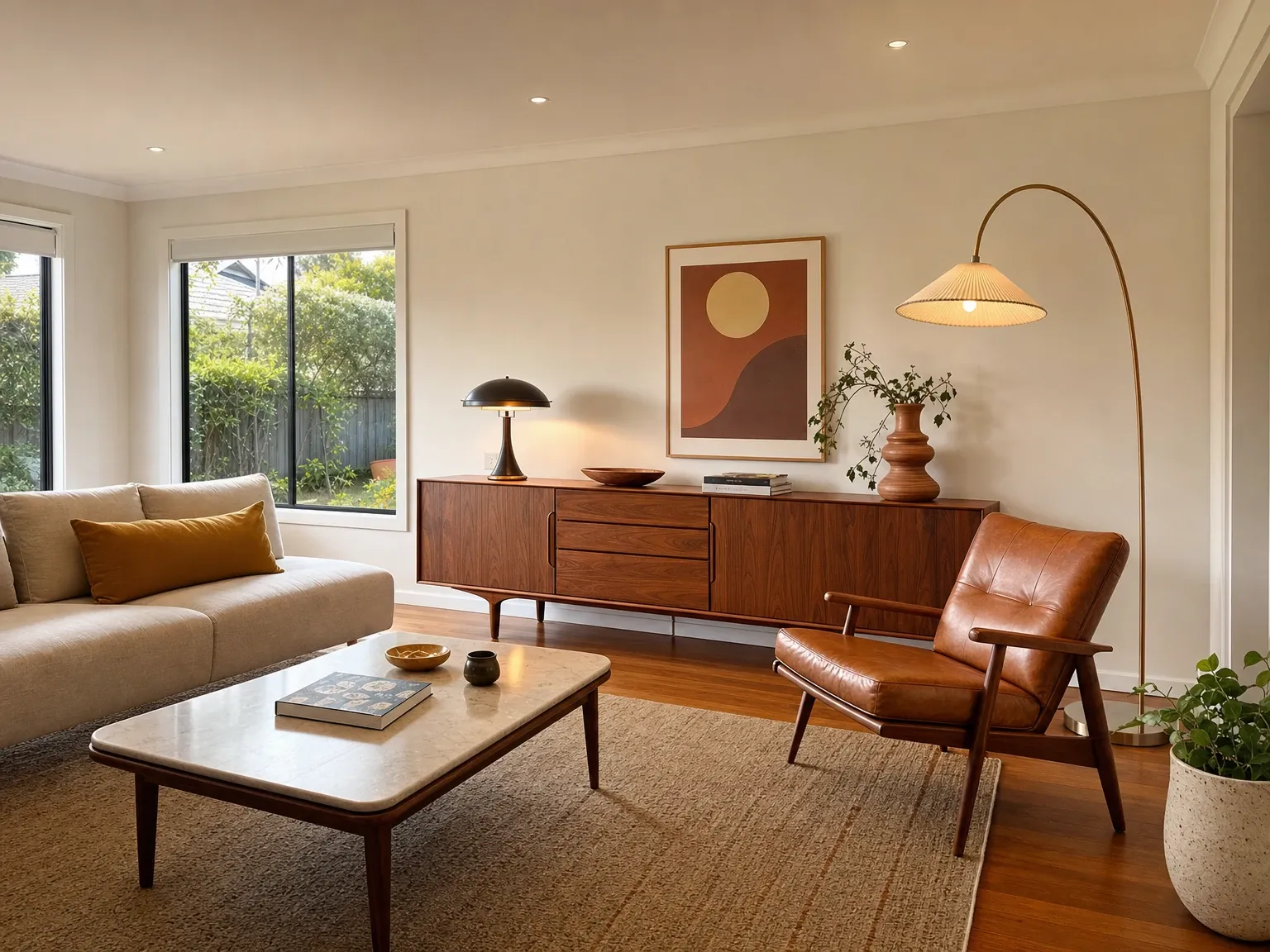
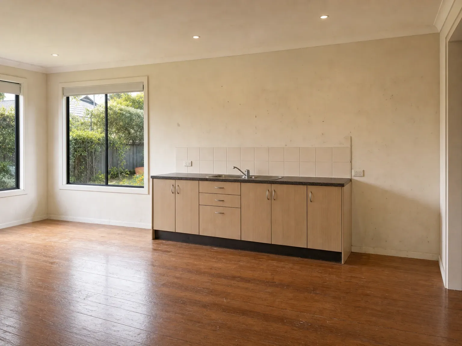 Before
After
Before
After
Seeing the style in your own home before you commit
The hardest part of any style decision is the gap between a Pinterest image and the result in your own room. A mid-century modern living room photographs beautifully in a 1960s Melbourne house with original walnut joinery and a brick fireplace; in a 1995 Western Sydney project home with painted-MDF skirtings, low ceilings and the original carpet, the same furniture will sit differently. The fix used by Australian designers, photographers and developers is to visualise the result before signing the cabinet maker’s order. reIMG produces photorealistic before-and-after visualisations of an actual room, with new joinery, paint, flooring and furniture dropped in over the original photo, so the homeowner can see whether the mid-century walnut-and-brass kitchen actually reads as well in their specific space as it does in the inspiration image. That removes most of the guesswork from a renovation that would otherwise commit serious money before anyone has seen the outcome.
Frequently asked questions
What is mid-century modern interior design?
Mid-century modern is the post-war design language that emerged between roughly 1945 and 1969, drawn from European Bauhaus functionalism, Scandinavian craft tradition and a wave of new materials made viable by wartime industry. In a room it reads as clean lines, low horizontal furniture, warm rich timbers (walnut, teak, oak, beech), restrained use of bold accent colour, organic sculptural forms, generous glazing and a deliberate connection between indoors and out. The intellectual core is functionalism: every piece should do its job, every surface should be honest about what it is made of, and ornament should earn its place rather than appear by default. The 2026 read keeps the timbers, the proportions and the indoor-outdoor instinct but uses the period accent colours (mustard, burnt orange, avocado, teal) with much more restraint than the original era did.
When is the mid-century period in design history?
The widely accepted bracket is 1945 to 1969, with the strongest residential output between about 1950 and 1965. The American historian Cara Greenberg coined the label ‘mid-century modern’ in her 1984 book of the same name, applying it retrospectively to the post-war furniture and architecture of that twenty-five-year window. Most authoritative references (Wikipedia, museums of design, the major retrospective books) treat the early 1970s as the cut-off; anything later usually shows the stylistic shift into late-modernism, postmodernism or High-Tech and is not part of the mid-century period proper. In Australia the local mid-century output runs slightly later than the American one, with significant residential work continuing into the early 1970s in Perth (Iwanoff) and Melbourne (the dissolution of Grounds, Romberg and Boyd in 1962 marks the end of the strongest Melbourne phase).
What’s the difference between mid-century modern, modern and contemporary?
Modern is the umbrella. It covers the design movements that emerged from the early twentieth century onward (Bauhaus, the International Style, Scandinavian modern, mid-century modern, Brutalism, late-modernism) and is now used loosely by retailers to mean anything clean-lined and stripped of traditional ornament. Mid-century modern is one specific era inside that umbrella, dated roughly 1945 to 1969 and defined by warm timbers, low horizontal proportions, organic sculptural curves alongside straight industrial lines, and a connection between indoors and out. Contemporary refers to what is being designed now, whatever that is, and shifts each year; it is currently characterised by warm minimalism, soft natural materials, restrained palettes and a heavy Japandi and Scandi influence. The cleanest practical test in a furniture showroom: a walnut sideboard with tapered splayed legs is mid-century modern; a clean-lined sideboard in pale oak with a flat plinth base is contemporary; a sideboard with the broader ‘modern’ label could be either.
What colours are mid-century modern?
The base palette is warm and earthy: creams, oat, soft beige, warm white, mid-tone greige and warm charcoal carry most of the room. The timber palette (walnut, teak, oak, beech) does most of the heavy lifting, so wood is treated as a colour in its own right rather than a neutral backdrop. The signature accent colours are mustard yellow, burnt orange, avocado or olive green, terracotta, deep teal and slate blue; black appears as a grounding element rather than as a primary colour. The 1950s original used those accents densely (a mustard wall, an orange sofa, an avocado armchair, a geometric rug all in the same room) and that density is what now reads as kitsch. The 2026 read picks one or two accent colours from the period palette and lets the timber and the architecture carry the rest.
Does mid-century modern suit the Australian climate?
Yes, and arguably better than it suits any of its other markets. The style emerged in Northern Hemisphere climates that mostly fight light in winter, but its core architectural moves (low-pitched roofs with deep eaves, expansive north-facing glazing, indoor-outdoor flow, single-storey horizontal massing, brick veneer construction) translated directly onto the Australian quarter-acre block and the warm climate. Robin Boyd, Harry Seidler, Roy Grounds, Peter Muller and Iwan Iwanoff each adapted the international vocabulary to local light, brick, timber and landscape between roughly 1948 and 1986, leaving a substantial mid-century housing stock across Melbourne, Sydney, Canberra, Perth and parts of regional Australia. A well-resolved Australian mid-century modern home was always engineered for our sun rather than the imported version of it, which is why the style still reads as current here in 2026.
What does a mid-century modern kitchen cost in Australia?
The base specification is not unusually expensive. According to the Housing Industry Association, a typical Australian kitchen renovation falls in a median range of roughly $30,000 to $35,000, and a mid-century modern kitchen specified honestly (flat-panel walnut or teak-veneer perimeter joinery, warm-white painted or pale-stone-faced island, a single hero pendant, brushed brass or matte black tapware, an integrated rangehood and a restrained tile splashback) sits comfortably inside that envelope. Costs move when the timber moves to solid walnut, when the appliances go fully integrated and high-end, or when a custom curved joinery profile (a 2026 mid-century-modern direction) is specified. Most of the look comes from the choice of timber and the proportions of the cabinetry, both of which can be specified within the median rather than above it; the discipline is in the editing rather than the spend.
Is mid-century modern still in style in 2026?
Yes, and it has been the dominant historical reference behind contemporary Australian residential design for most of the last decade. The 2026 conversation in Australian interiors (warm minimalism, organic modern, Japandi, contemporary) is built on mid-century-modern foundations: warm timbers, low horizontal proportions, indoor-outdoor flow, considered negative space, honest materials. The Style Sourcebook, Carlisle Homes and Style Magazines 2026 trend forecasts all name mid-century modern, or styles that owe most of their vocabulary to it, as a leading direction. What has changed is the literalness of the reference. The 1950s accent palette is now used with restraint, the iconic furniture pieces are reissued rather than replicated, the architectural moves are folded into modern open plans, and the result reads as current rather than dated.
How do I avoid the kitsch version of mid-century modern?
The single biggest cause of kitsch is loading the period accent palette in at full strength. A mustard wall plus an orange sofa plus an avocado armchair plus a sunburst clock plus a starburst light fitting in the same room reads as theme rather than home. The 2026 fix is to pick one accent colour from the period palette, treat it as the only accent, and let the timber and the architecture carry the rest. The second cause is over-specifying the iconic pieces: an Eames lounge chair next to a Tulip table next to a Wishbone dining chair next to a Noguchi coffee table is a furniture parade rather than a room. Pick one or two hero pieces, surround them with quieter contemporary furniture in compatible proportions, and let the hero pieces breathe. The third is treating the style as a costume rather than an architectural language. A mid-century modern room reads strongest when it sits inside a house that is already low, horizontal, well-glazed and connected to the outside; in a heavily-decorated period house the style fights the architecture and either piece loses.