Minimalist Australian homes: the design principles
What minimalism actually means for an Australian home in 2026, why the imported version reads cold, and how to do it warm, liveable and on-brief.
An Australian couple finish their bathroom renovation in 2024, brief lifted straight from a Pinterest board: white walls, white floor tiles, a white floating vanity, polished chrome tapware, one ribbed-glass pendant light. It looks exactly like the photograph. Within a fortnight, three shampoo bottles, a stack of folded face washers, a hairdryer and a small forest of small bottles have colonised the vanity top. Within six months, the room reads as cold rather than calm. Within a year they are searching “warm minimalist bathroom ideas Australia” trying to figure out where the look went wrong. The problem is not that minimalism is the wrong answer for their bathroom. The problem is that they took the surface of the look (white, sparse) and missed the underlying discipline that makes it work (enough hidden storage, a warm and tactile material palette, layered light, an edit that respects how the room is used). Minimalism done well is one of the calmest, most timeless, most genuinely liveable directions in Australian residential design. Minimalism done as a Pinterest aesthetic is an austere stage set that nobody can keep up with. This guide is about the difference between the two.
This guide covers what minimalism actually is as a design principle, how it has shifted in 2026 toward the warmer reading most leading Australian sources now publish, how it adapts to the climate, light, and indoor-outdoor lifestyle of Australian homes, how to apply it room by room (with the bathroom, kitchen, living, bedroom and outdoor connection covered in depth), what it honestly costs to do well, the failure modes that turn a minimalist room into a sterile one, and where the style sits next to its closest neighbours (Scandi, Japandi, contemporary, organic modern). It is written for homeowners renovating or building, designers and builders briefing clients, and anyone who has already searched “minimalist bathroom Australia” or “minimalist living room ideas” and found the same recycled Pinterest images on every result.
It sits inside the wider interior design styles guide for Australia, where minimalism is one of the foundational contemporary directions alongside Scandi, mid-century modern, industrial, coastal and farmhouse. This page is the deep read on minimalism specifically.
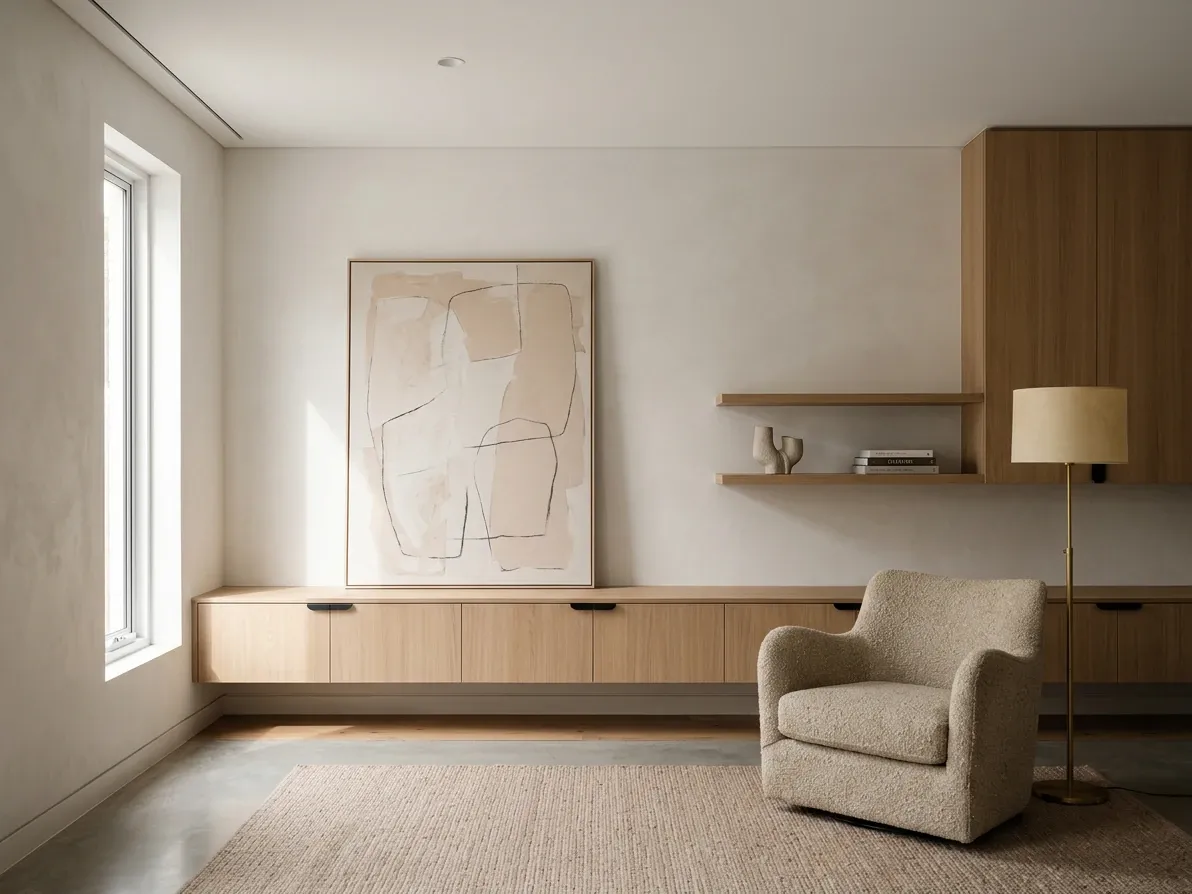
Restraint, not emptiness. Everything visible is there on purpose.
What minimalism actually means as a design principle
Minimalism in interior design is the discipline of editing a room down to what genuinely earns its place, then making each remaining element work harder. The shell is calm. Storage is generous and concealed, so nothing has to live on display unless it deserves to. The material palette is short and repeated. The styling layer is curated, not accumulated. The point is not to remove things until the room is bare; the point is that everything you can see is there on purpose. A room can be densely furnished and still be minimalist, if every piece is doing real work and the visual field is controlled. A room can be sparsely furnished and still fail at minimalism, if the few things it contains are uncoordinated, the storage is missing and the bench is covered in everything that has nowhere else to go.
The principle came out of post-war modernism and the mid-twentieth-century movements that ran in parallel: International Style architecture, Japanese minimalism rooted in Zen Buddhist and tea-house traditions, Scandinavian design’s functional restraint, and the studio practice of artists like Donald Judd and Agnes Martin who reduced their work to essential form. Across all of those traditions the underlying brief was the same: remove what is not essential, then resolve what remains to a higher standard. The brief migrated into residential interior design through the 1990s and 2000s, became a mainstream trend in the 2010s, and was almost immediately reduced in popular culture to a thin aesthetic of white walls, polished concrete and an Eames chair, which is the version most readers picture when they hear the word.
What separates a working minimalist room from a stage-set one is straightforward to name and harder to do. The architectural shell is resolved before the styling layer goes in, with clean lines, good light, generous ceiling height where it can be achieved, and an absence of visual noise from skirtings, architraves and door surrounds where the budget allows shadowline or square-set details. Storage is designed in from the start, not bought as separate furniture later, so daily clutter has a planned home rather than ending up on a bench. The colour palette is short and controlled, usually three to five hues across the whole room, with strong restraint on accent colours and pattern. The material list is similarly short: one or two timbers, one or two stones, one or two textiles, one metal finish for hardware and one for tapware. Lighting is layered, dimmable and warm, never a single overhead downlight grid. The styling layer is light: a small number of well-chosen objects rather than a tableau that has to be reset daily. Negative space, the empty surfaces and walls between elements, is treated as part of the design, not as something to be filled.
The relationship to the room’s use is where the discipline is tested. A minimalist room that does not give the people living in it enough storage will fail within weeks, because the clutter has nowhere to go and ends up on the surfaces the design was trying to keep clear. A minimalist kitchen with a single short run of base cupboards will lose the look in a month. A minimalist bathroom with a vanity that has no drawers will lose it inside a fortnight. The look survives only when the storage carries the load.
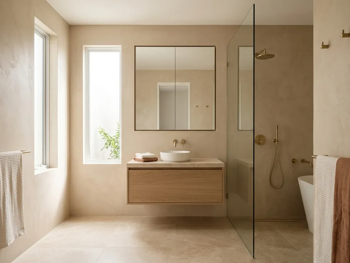
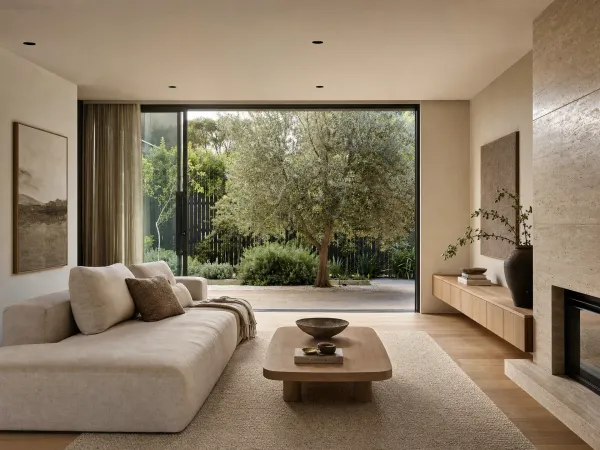
Warm minimalism in 2026: oat, clay, honed stone, brushed brass.
How minimalism has shifted in 2026: the warm minimalism turn
The version of minimalism most leading Australian sources are publishing in 2026 is materially warmer, softer in palette and more deliberately liveable than the version that dominated the previous decade. The shift is most consistently labelled “warm minimalism” across Australian publishers, including Castlery Australia’s warm-minimalist explainer, and it shows up directly in the language of the leading 2026 trend reports. The Stylesmiths’ 2026 interior design trends piece frames the year as one where “minimalism is becoming warmer, softer, and more human, defined by clean architectural lines balanced with tactile materials and relaxed comfort”. Banana Bathrooms’ 2026 Australian bathroom trends report, which collates renovation briefs across Newcastle and the Central Coast, calls out the same direction in the bathroom specifically, with a move “toward spaces that feel intentional, calming and quietly luxurious”.
The change is best understood as a material recalibration on top of the same underlying principles. Stark whites have stepped back in favour of warmer off-whites, oat, sand, greige and clay-toned neutrals. Polished concrete has stepped back in favour of microcement, honed stone, honed porcelain and limewash. Polished chrome has stepped back in favour of matte black, brushed brass, gunmetal and aged nickel. Cool grey has been largely retired in favour of palettes that lean either toward warm taupe and oat, or toward muted sage, terracotta and dusty ochre. Glossy lacquer joinery has stepped back in favour of matte two-pack and timber-veneer. Sleek manufactured materials have stepped back in favour of natural ones used at scale, with linen, wool, bouclé, leather, timber, real stone, clay and ceramics doing most of the soft-layer work.
Bathtime Bathrooms’ 2026 warm minimalism piece summarises the shift cleanly: “for years, the standard for a modern bathroom was clinical, stark white. While it looked clean, it often felt cold, more like a hospital suite than a home sanctuary. In 2026, the trend has shifted toward Warm Minimalism. This design philosophy keeps the clutter-free, functional benefits of minimalism but replaces the ice-cold aesthetic with a palette that feels grounded, organic, and incredibly inviting.” That sentence could stand as a manifesto for the wider shift, not just for bathrooms.
The point of the recalibration is liveability. The hard, all-white version of minimalism that the previous cycle popularised was photographable but rarely comfortable, and Australian readers who tried to live in it found out quickly that a room without any tactile warmth reads as a workspace, not as a home. The warm version keeps the discipline (edit, hide storage, repeat materials, control palette, layer light, respect negative space) and changes only the inputs. The result is a room that feels calm and considered and is genuinely pleasant to spend an evening in, which is the test that matters.
Why imported minimalism reads cold in Australian homes
Most minimalist content on the internet was written for the northern hemisphere, and a fair proportion of it was written for climates and building stock that do not match Australian conditions. The reference projects in the major minimalist tradition (Japanese, Scandinavian, Belgian and German) are built for a different light, a different temperature range, a different relationship to the outdoors, and a different cultural appetite for hard, austere surfaces in a domestic setting. When the surface vocabulary is transplanted into an Australian home without translation, three problems show up.
The first is the light. Australian natural light is high-intensity, warm-toned and abundant for most of the year across most of the country. A pure-white palette that reads as soft and luminous in a Stockholm winter reads as glaring and flat in a Brisbane summer. The reflective load off white walls, white floor tiles and white joinery is genuinely uncomfortable in rooms that get direct sun for any meaningful part of the day, and the warm-tone northern light tends to bias every neutral toward yellow rather than the cool blue-grey the source palette was tuned for. Warm minimalism, with its oat-and-clay neutrals rather than pure whites, looks consistently better in Australian light because it works with the light rather than against it.
The second is the temperature range. Hard, polished, light-coloured surfaces have low thermal mass and tend to amplify the climate they sit in. In a cool-climate Melbourne or Hobart living room they feel cold underfoot for half the year. In a hot-climate Brisbane or Perth bathroom they bake through the day and read as cold and hard at night. Warmer materials with more thermal mass and more tactile depth (microcement, honed stone, real timber, clay tile, limewash) handle Australian temperature swings more gracefully because they hold and release heat slowly and feel comfortable against the skin in both seasons.
The third is the cultural fit. Australian residential life is more relaxed, more indoor-outdoor-oriented and more centred on social hospitality than the cultures most of the minimalist tradition came from. A formal, hard-edged minimalist living room reads as a showroom or a hotel lobby in an Australian context rather than as a home, because most Australians are not in fact going to take their shoes off, sit at a tea table and observe a moment of silence; they are going to drag a footstool over, put a glass of wine on the floor next to the sofa, walk in barefoot from the deck and have three friends round for a long dinner. The room has to accommodate that pattern of life. The architectural translation of minimalism that suits Australian homes is the version that holds the discipline and adjusts the soft layer to match how the room is actually going to be used.
This is the underlying reason warm minimalism is the dominant Australian read in 2026. It is not a separate style; it is the version of minimalism that takes the climate, light and lifestyle seriously and adjusts the inputs accordingly.
A case for editing: how big Australian houses have become
One of the strongest arguments for a minimalist instinct in 2026 is structural rather than aesthetic. Australian houses are large by world standards, and the per-square-metre price of building, fitting out, heating, cooling and maintaining that space has compounded over the same period. The average new house in Australia has hovered between roughly 230 and 246 square metres for the past two decades, more than double the typical Australian house size of the 1960s.
The implication for minimalism is direct. The reason most Australian homes feel cluttered is not that they have too little space; it is that the space they have is too large for the volume of things actually being used in it, so the unused stuff fans out to fill the rooms, leaving nowhere genuinely calm to land. Editing the contents of the house down to what earns its place is the move that makes a 240-square-metre home feel like a 240-square-metre home rather than a 240-square-metre store. The minimalist instinct is not anti-house-size; it is pro-using-the-house-you-have. Designing in with restraint (fewer pieces of better furniture, fewer rooms with single dedicated functions, more flexibility per room) is a more honest answer to the size question than buying more storage to manage more stuff.
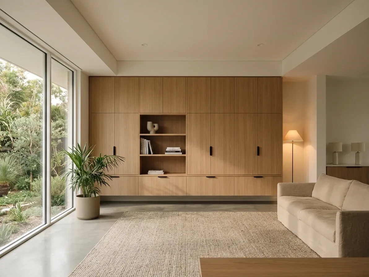
Hidden storage, short palette, warm light: the principles at work.
The seven principles that hold whatever else changes
The surface of the style will keep shifting (oat will give way to clay will give way to whatever the 2028 colour conversation lands on), but the discipline underneath is stable. These are the principles that hold across every era of minimalism, applied to an Australian residential context.
Storage is the foundation. A minimalist room is only as calm as the storage behind it. Plan storage for the real routines of the household first (coffee and breakfast, cooking, cleaning, entertaining, clothes, shoes, bags, sports gear, kids’ projects) and the look will hold. Skimp on storage and the bench will fill, the floor will fill, and the look will collapse within a fortnight. The single highest-impact move in a minimalist house is full-height built-in joinery wherever it can be accommodated: wardrobes that run floor to ceiling, a pantry that runs to the ceiling, a vanity wall that runs to the ceiling, a living-room joinery wall that holds the TV and media and books and toys behind closed doors. Visible shelving is allowed but it is the styling layer, not the storage layer; the storage layer must be closed.
The palette is short and repeated. Three to five hues across the room is the working limit. A typical minimalist Australian palette in 2026 might run warm white, oat, mid-tone oak, matte black, and a single tonal accent (sage, terracotta, dusty ochre, clay). Repeat the same five through every room of the house and the spaces read as continuous rather than collaged. Use cool whites, grey, polished chrome and cool wood tones in one room then warm whites, terracotta and brushed brass in the next and the house reads as five different houses joined together.
The material list is short and repeated. One or two timbers, one or two stones, one or two textiles, one hardware finish, one tapware finish. Repeat these through every room. The most common single-source failure in Australian minimalist briefs is too many materials: an oak floor, walnut joinery, marble bench, terrazzo splashback, brass tapware, black hardware, leather, linen, bouclé and wool all in the same room. Every material is beautiful and the room is a noise floor. Cut the list, repeat what you keep.
Light is layered and warm. A minimalist room without lighting design reads as flat, which is the failure mode that produces the cold sterile look. Plan lighting in three layers: ambient (general room lighting, usually recessed downlights or surface-mount fixtures with a low-glare diffuser), task (under-cabinet lights, vanity wall sconces, reading lights), and feature (a single statement pendant, a piece of art lit, an architectural element washed). Specify warm-white globes (2,700 to 3,000K) on dimmers throughout. A single cool downlight grid in a minimalist room is the lighting equivalent of dressing it in fluorescent overheads.
Negative space is part of the design. Empty wall, empty bench, empty floor and empty shelf are design elements, not failures of styling. The instinct to fill every horizontal surface with a curated vignette is the single biggest tell of a minimalist room that has been styled by someone who does not trust the discipline. Leave more than you think you should. The eye rests on negative space and the room reads as calm.
Function leads, style follows. Every piece in the room has to do work, and the room has to support the actual life of the people in it. A “minimalist” room that does not have a place to put the iPad, the dog lead, the phone charger and the half-read book is going to lose the look the moment those things appear. Design the room around the routines, then style it.
Soft and tactile beats hard and reflective. This is the most directly Australian rider on the global principles, and the most useful single rule for keeping warmth in the room. When a choice is between gloss and matte, choose matte. When a choice is between polished and honed, choose honed. When a choice is between flat leather and slubbed linen, choose linen. When a choice is between a hard veneer and a real timber, choose the timber. The discipline of the edit holds; the warmth comes from the materials you keep.
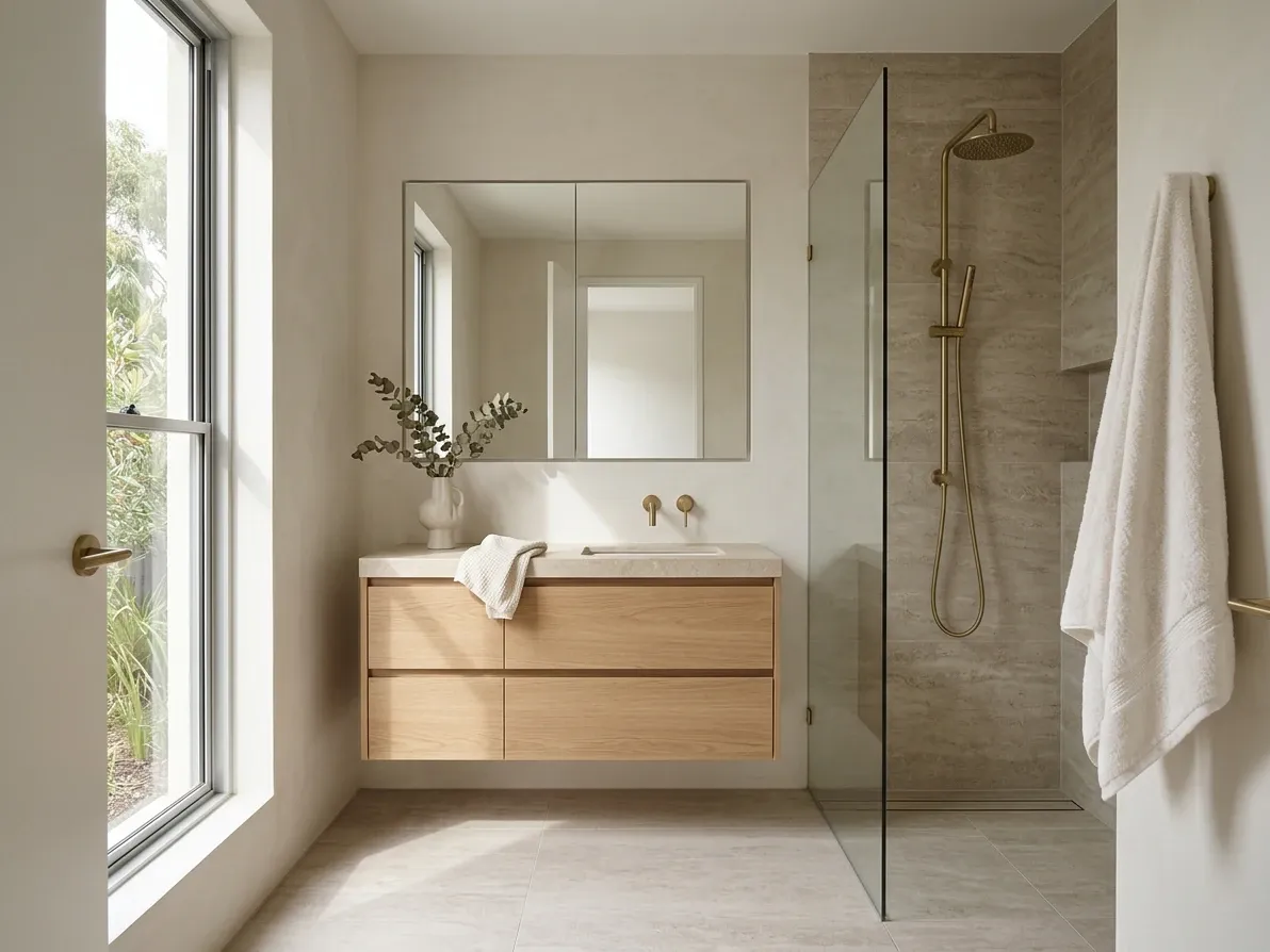
Wall-hung drawer vanity, large-format porcelain, one warm metal finish.
The minimalist bathroom: what to actually specify
The bathroom is where most Australian minimalist briefs land first, partly because it is the room where the look is most achievable on a normal budget and partly because the search volume on “minimalist bathroom” is the single largest in this style cluster. It is also the room where the look fails most visibly when the discipline slips, because a bathroom that has lost the edit reads as cluttered far faster than a living room with the same number of stray items.
The shell, in order of importance. Specify a wall-hung vanity with full drawer storage, recessed into the wall plane where the framing allows it, in a flat-panel finish (handleless, finger-pull, slim handle or push-to-open). The Pinnacle Kitchens minimalist guide for cabinetry generally is the same logic in bathroom form: drawers, not cupboards with shelves, because drawers hold more and find things faster. Add a recessed mirrored shaving cabinet above the vanity, so toothbrushes, electric razors, sunscreens and creams have a planned home. Plan for at least one full-depth tall cabinet in the room or in the immediate hallway for towels and bulk product. Without this storage volume, no surface treatment in the world will keep the room calm.
Tile and stone, in order of impact. Large-format porcelain on the floor and shower wet wall is the default minimalist move in 2026, because fewer grout lines produce a calmer visual field and easier maintenance. The current Australian preference is for stone-look porcelain in honed or matte finish (travertine-look, limestone-look, marble-look, microcement-look), with the tile size pushed as large as the room can take (typically 600 by 1200 or 800 by 800 millimetres in standard bathrooms, up to 1200 by 2400 in larger or higher-spec projects). For the dry wall, paint, microcement or limewash in a warm off-white or oat tone keeps the palette unified. A single tactile feature surface is allowed and adds depth: a hand-trowelled microcement wet wall, a fluted tile niche, a kit-kat mosaic feature, a single stone slab on the vanity. More than one feature surface and the room loses the edit.
Tapware and accessories, on a strict short list. Pick one metal finish (matte black, gunmetal, brushed brass, brushed nickel, warm-aged brass) and repeat it across every tap, mixer, towel rail, robe hook, shower rail, basin waste and floor waste in the room. Mixed metals can work in a confident hand but they are the second most common minimalist failure mode (the first is missing storage). Polished chrome has receded sharply in the 2026 conversation in favour of matte and brushed warm-toned metals. Wall-mounted basin mixers (rather than hob-mounted) keep the vanity slab clean. Hob-mounted bath spouts and mixers keep the bath surround clean. A recessed wet-area niche removes the visual noise of corner shower shelves. A recessed soap dish in the vanity keeps the bench clear.
Lighting, in three layers. A warm-white recessed ceiling downlight grid for ambient (specified at 2,700 to 3,000K, never 4,000K or above). Wall sconces at vanity height for task light on the face, or a backlit mirror for the same effect. A single low-level strip light under the vanity kickboard for night use and to make a wall-hung vanity feel like it is floating. Dimmers on every circuit. Done properly, the lighting carries the warmth as much as the materials do.
The bath, the shower, the toilet. Wall-hung toilet on a concealed cistern wherever the framing allows it (the visible drop in a floor-mount cistern is a significant source of visual clutter, and the cleaning around it is a continuous low-level annoyance). Walk-in shower with a frameless or thin-frame glass screen, set behind a low hob or with a flush waste channel, in the same tile as the floor for visual continuity. Bath choice is open: a built-in bath in matching stone-look surround reads as the most calm and most current 2026 direction; a freestanding back-to-corner or back-to-wall bath reads as a more sculptural alternative; a freestanding centred bath is the most magazine and the most demanding of the room around it. Pick one and commit.
The styling layer, kept light. A single stone or ceramic vase with a green branch, one or two folded face washers in the same tone as the vanity, a candle, a stack of two or three folded towels in a heavy washed cotton or linen, a small art piece on the dry wall. That is enough.
The most useful single discipline in a minimalist bathroom is the rule that nothing lives on the bench. Every product the household uses (shampoo, conditioner, body wash, face wash, moisturiser, sunscreen, deodorant, electric razor, toothbrush, toothpaste, mouthwash, cotton buds, hair products) has a planned home in the vanity drawers or the recessed mirrored cabinet. If a product does not have a home it does not live in the room. Done properly, this is the move that makes the difference between a bathroom that holds the minimalist look at year two and a bathroom that has quietly become a vanity-top product field by week three.
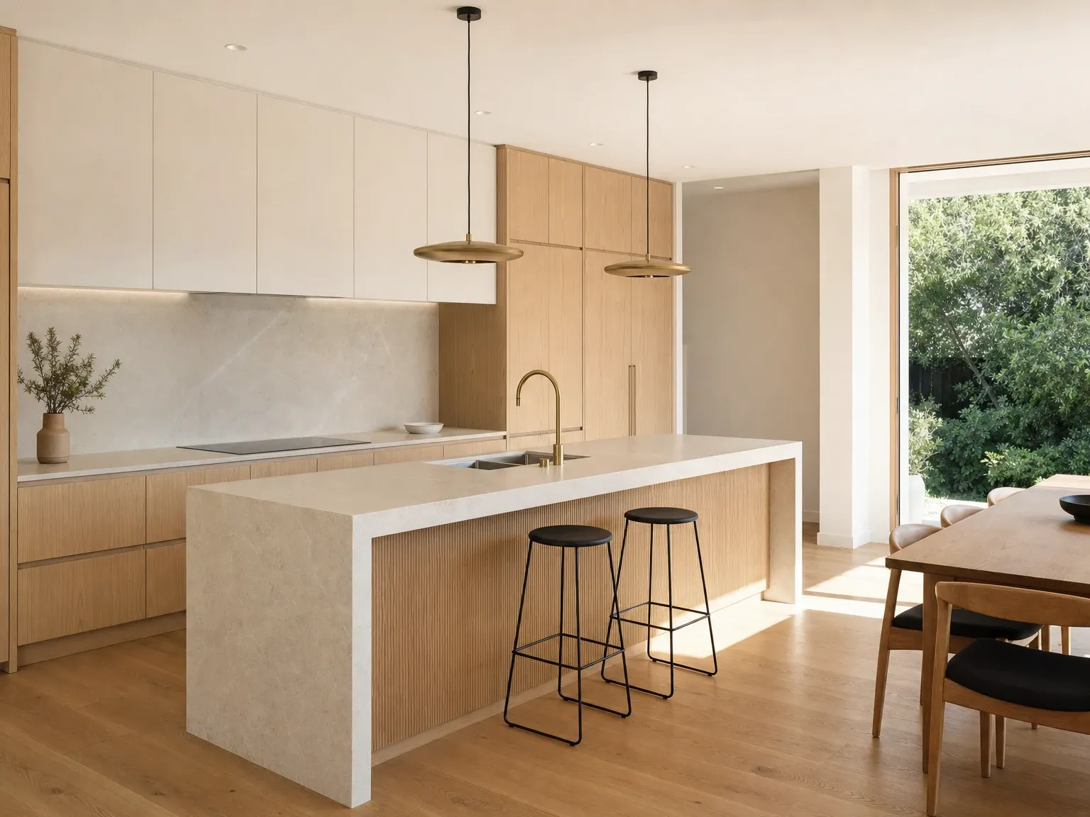
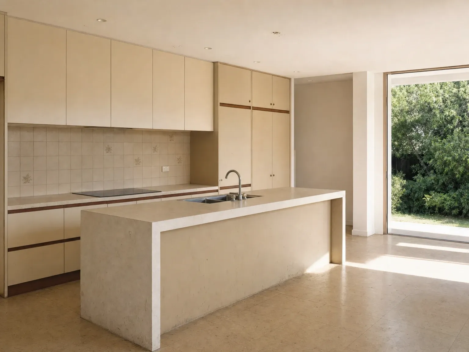 Before
After
Before
After
The minimalist kitchen
The minimalist kitchen runs on the same discipline as the bathroom, scaled up. Storage is the foundation, the palette is short and repeated, the material list is tight, and the lighting is layered and warm. The room-specific moves are below.
Layout is the first decision and the one most likely to be skipped in the rush to pick finishes. The two layouts that suit minimalism best in Australian homes are the galley (two parallel runs of cabinetry, with the working triangle compressed and the bench surfaces clean by default) and the L-shape with an island (the most common Australian kitchen footprint, with the island handling prep and the back wall handling appliances and storage). A U-shape works in larger kitchens if the cross-traffic problem is managed; a single-wall kitchenette works for very small footprints, particularly in apartments and granny flats. The layout principle, regardless of the shape, is to keep the working zones compact, the walkways clear, and the visual silhouette of the bench as long and unbroken as possible.
Cabinetry is where the minimalist discipline lives in a kitchen. Flat-panel doors are the default (slab, with no shaker frame and no profile), in matte two-pack, melamine, thermofoil or timber veneer. Handles are the most leveraged single styling decision in the room: slim bar handles, finger-pull recesses, push-to-open mechanisms, or true handleless systems with a routed channel. Handleless cabinetry costs 20 to 50 per cent more than handled cabinetry, according to Joyce Kitchens’ 2025 cabinetry pricing guide, because the channel routing and specialist hardware all cost more than a standard handle, but the visual payoff in a minimalist kitchen is significant. A full-height pantry that runs to the ceiling is a non-negotiable in a minimalist kitchen with any meaningful storage requirement; it stops visual noise, uses vertical space efficiently and keeps the bench clear by default.
Appliances are integrated wherever the budget allows. Dishwasher behind a panel matching the cabinetry. Fridge built-in behind a panel, or freestanding in a colour and finish that disappears into the joinery. Rangehood concealed in the upper cabinetry, integrated into the joinery, or as a single architectural moment in a matte finish if it is going to be seen. Microwave and air fryer in an appliance garage (a cupboard zone with internal power) so they live out of sight. The general rule is that appliances either disappear into the joinery or read as a single deliberate object, never as a row of mismatched commercial-finish boxes scattered along the bench.
Benchtop and splashback hold the visual weight. The bench is the most-seen horizontal surface in the room; choose a single stone or stone-look engineered surface and let it run unbroken across the island and back wall in the same material. Honed and matte finishes are the dominant 2026 direction (gloss has receded). The splashback can match the bench (a full-height stone slab is the calmest single move in a minimalist kitchen and reads as one continuous surface), match the cabinetry (a single tone running from cabinetry up the wall), or be a single large-format porcelain or glass panel. Tile splashbacks work in a minimalist kitchen if the tile, grout colour and grout-line minimisation are all deliberate, but they introduce visual noise that takes discipline to control.
Tapware and accessories on the same short list as the bathroom. One metal finish (matte black, gunmetal, brushed brass, brushed nickel), one tap profile (a gooseneck mixer, often with a pull-out spray), one sink (typically a single bowl or one-and-a-half-bowl undermount or top-mount in stainless or in a matching stone material). Pendant lights over the island read as the room’s single statement piece and are worth specifying carefully; a single oversized pendant or a row of two or three smaller pendants in a finish coordinated with the tapware lands cleanly.
Storage zoning is the discipline that makes the kitchen stay calm. Coffee zone, with kettle and toaster and cups behind closed doors. Cooking zone, with oils and spices and chopping boards immediately to hand. Cleaning zone, with bin pull-out, dishwasher and sink in a tight cluster. Entertaining zone, with platters and serving bowls and wine glasses stored together. Charging drawer for phones and tablets. Tray cupboard near the oven. If every routine in the household kitchen has a planned zone, the bench stays clear without conscious effort.
The minimalist kitchen failure that shows up most often in real Australian projects is too few drawers and too many low cupboards with shelves. A run of base cabinets with shelves quickly fills with stacked piles and becomes a place where things go to be lost; deep drawers in the same footprint hold the same volume more usably and find things faster. As a general rule, replace every base cupboard with shelves with a deep-drawer stack unless there is a specific reason not to. This single change has the largest effect on whether the kitchen will hold the minimalist look over time.
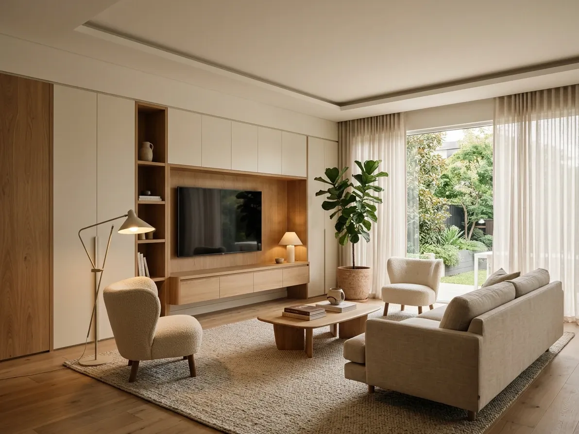
Built-in joinery does the storage; the floor stays clear.
The minimalist living room
The minimalist living room is harder than the bathroom or the kitchen for a single reason: there is no built-in joinery doing the heavy storage lifting unless you specifically design it in. Most Australian living rooms have only as much storage as the freestanding furniture provides, and most freestanding furniture provides almost no closed storage. The result is that the books, media, kids’ toys, blankets, throws, dog beds and assorted daily life that accumulates in the living room ends up on display, which is the single most reliable way to break a minimalist look.
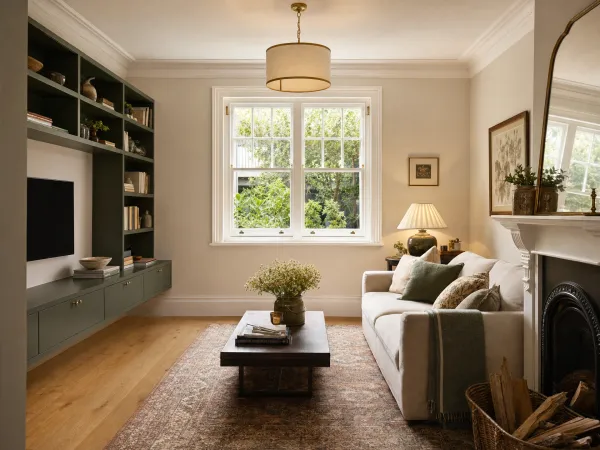
The fix is to design storage in. The single highest-impact move in a minimalist Australian living room is a built-in joinery wall, either along one wall or framing the TV and media, with closed cabinetry below and a small amount of open shelving above for the styling layer. Done well, this joinery wall absorbs the TV, the soundbar, the AV gear, the media library, the kids’ toys, the blankets, the games and the books that would otherwise live on display. A floor-to-ceiling joinery wall is the move; a low TV credenza without overhead storage is the failure.
The seating cluster is the second decision. A minimalist living room typically runs to one large sofa (a three or four-seater in a deep cushion depth, in a single coherent fabric and tone), one or two occasional chairs, a coffee table and a side table. Avoid a matched suite (a matched sofa and two armchairs in the same fabric reads as showroom rather than designed); pair the sofa with chairs in a complementary but distinct fabric and form. A modular sofa works in larger Australian living rooms and reads more contemporary than the conventional three-piece configuration.
The rug is the foundation of the room. A large wool or jute rug pulled under the front legs of the main seating ties the cluster together and adds the single biggest piece of soft tactile warmth to the room. A rug that is too small (sitting on the floor in front of the sofa without engaging the furniture) reads as cheap and the whole room loses its grounding. The general rule is the rug should be large enough that the front legs of all the seating sit on it.
Window treatments handle the second-biggest piece of soft warmth. Sheer or semi-sheer linen curtains in a tone that disappears into the wall colour, ceiling-mounted on a recessed track or wall-mounted on a simple round rod, and run full-width-of-the-wall rather than just covering the window. Heavy block-out is fine as a layer behind the sheer for evening use and bedrooms; for the main living room the sheer linen carries the daytime mood.
Lighting in layers as elsewhere. Ambient (recessed downlights or surface-mount fixtures with a low-glare diffuser), task (one or two floor lamps for reading and ambient warmth, table lamps on side tables and the credenza), feature (a single statement pendant or a piece of art lit). All on dimmers, all in warm-white. The single most common minimalist living-room lighting failure is over-relying on a recessed downlight grid and skipping floor and table lamps; the room reads as office-lit and loses the warmth that minimalism needs to hold its calm.
The styling layer in a minimalist living room is restrained: a stack of two or three coffee-table books, a single sculptural object or vase, one or two large-scale art pieces on the wall, real plants at architectural scale (a fiddle leaf fig, a rubber plant, a large peace lily in a simple matte planter is doing more for the room than a row of small succulents on a console). The negative space carries the weight; the styling fills less than you think it should.
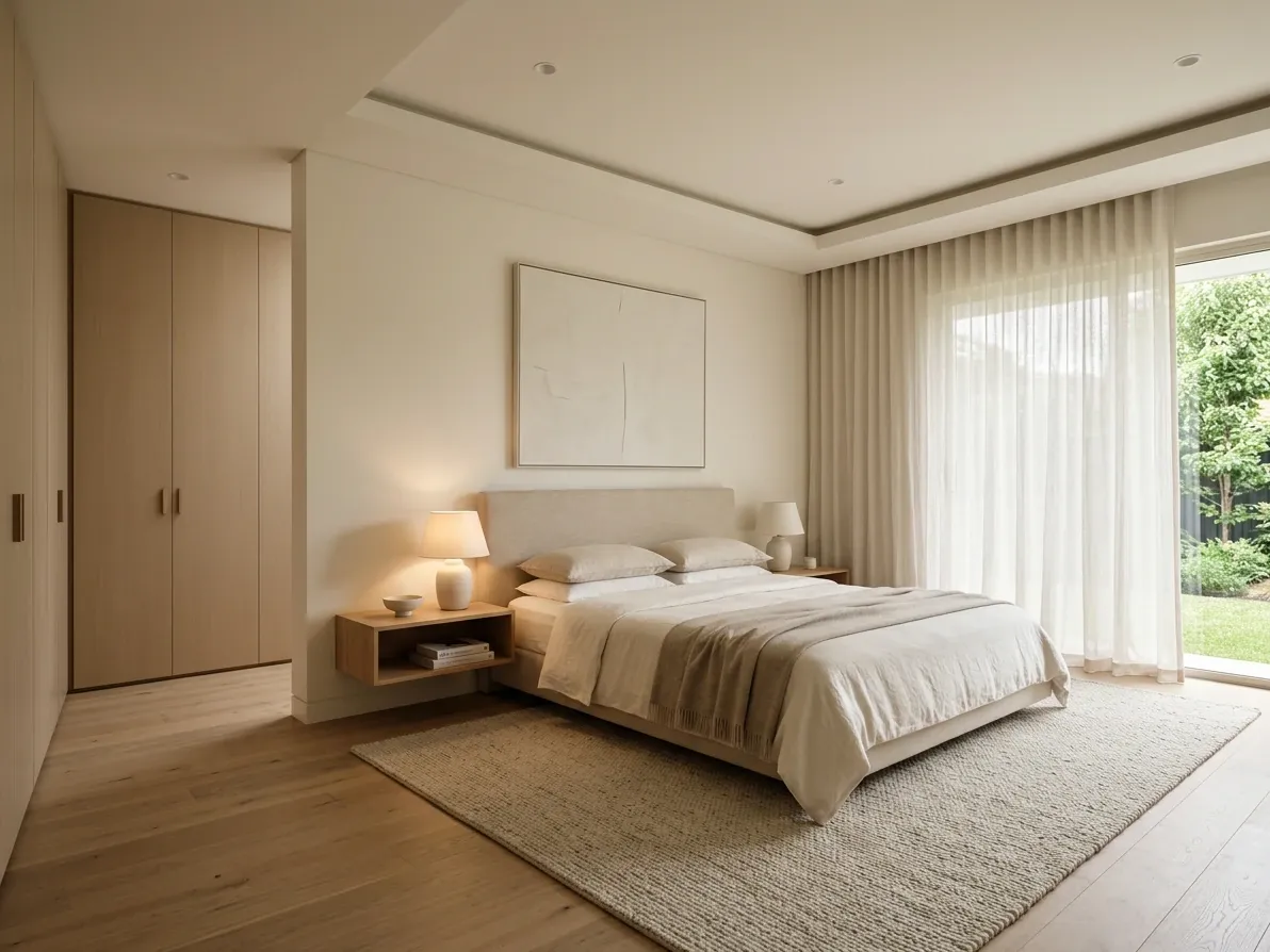
Built-in wardrobe wall, low bed, one large rug, sheer linen.
The minimalist bedroom
The minimalist bedroom is the room where the principles are easiest to apply, because the function is simple (sleep, rest, store clothes) and the visual demands are lower than in a living room or kitchen. The discipline still has to be deliberate.
Storage is the foundation, again. A full-height built-in wardrobe wall, in flat-panel joinery in a tone that recedes into the wall (white, oat, pale timber, matte black), is the move. Walk-in robes work in larger Australian homes; built-in joinery works in everything else. The freestanding wardrobe is the failure mode, because it never holds enough and it always reads as furniture rather than as architecture.
The bed sits as the room’s single hero piece. A low-profile platform bed, an upholstered bedhead in a neutral fabric, or a simple timber bedhead in the same tone as the joinery, with the bedhead height proportionate to the wall (typically a third to half the wall height between bed and ceiling). Mattress and bedding choices follow the same instinct: a heavy washed cotton or linen sheet in a warm white or oat, a heavier wool or linen blanket folded at the foot, and one or two pillows beyond the sleep set, never the eight-decorative-pillows-each-night failure mode that an aspirational hotel image inevitably produces.
Bedside is light. A simple side table or wall-mounted ledge, a reading lamp (table lamp or wall sconce on a swing arm), a stack of one or two books, a glass of water. Phone charging out of sight in a drawer rather than on the table.
Window treatments handle both light and acoustic mood. Block-out as a layer behind sheer linen, or a single block-out roller in a recessed pelmet. Curtains are warmer; rollers are cleaner; pick one and commit. For a south-facing or east-facing bedroom in a warm climate, plan the block-out layer carefully because the room will get morning sun.
Floor: a wool rug under the bed, large enough that it sits at least 300 millimetres beyond the bed on both long sides, or carpet floor-to-wall in a neutral tone. Polished or hard floor with no rug under the bed is one of the most reliably cold-reading moves in a minimalist bedroom.
Art and styling at minimum. One piece of art above the bedhead at a generous scale, or a single sculptural pendant, or nothing on the wall at all and let the bedhead and bedding carry it. The walls are largely empty by design.
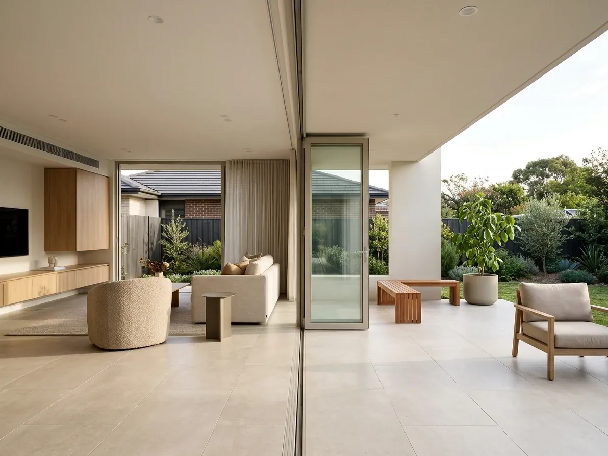
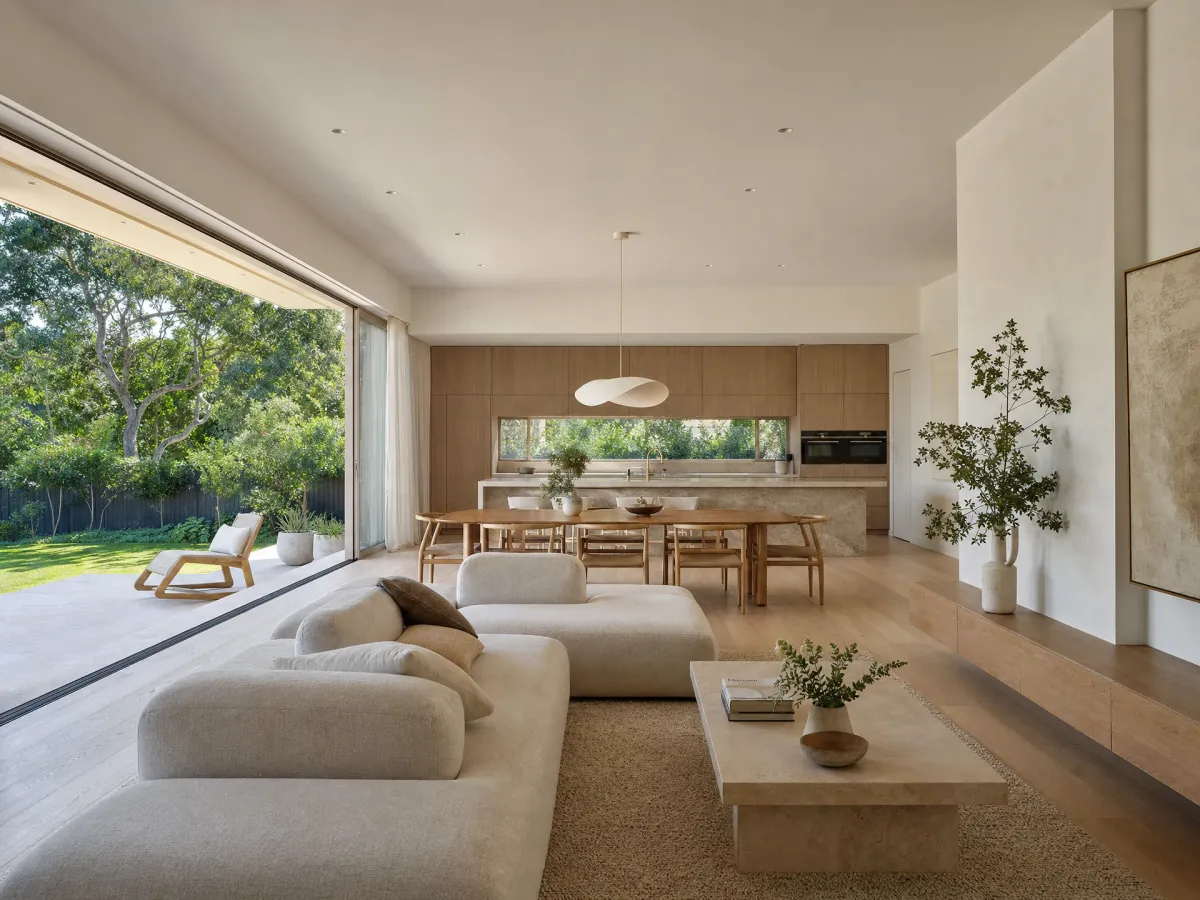
Stacking doors open, one floor finish, one room that runs outside.
Indoor-outdoor flow: the most Australian principle
The single design move that distinguishes Australian minimalism from the European, Japanese or American versions is the indoor-outdoor connection. Australian residential life happens at the threshold between inside and outside more than in any of the source cultures, and any minimalist design that ignores that fact reads as a transplant rather than as a home that belongs in this country.
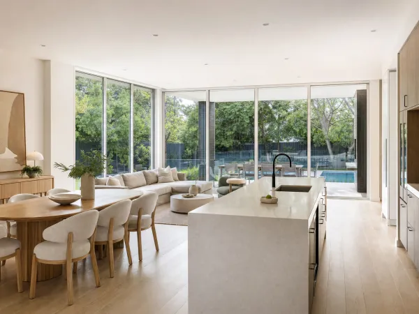
The architectural moves are well established. Large sliding or stacking doors on the main living wall, ideally full-height and full-width, that disappear into the wall cavity when open. A continuous floor finish between inside and out (large-format porcelain that runs through the threshold, polished concrete that flows onto a polished outdoor slab, or a timber floor inside meeting a hardwood deck outside at the same height). A continuous ceiling line between inside and the alfresco roof above, often with a single ceiling material running across both. A flush threshold detail at the door, with no step up or down, so the eye reads the inside and outside as one continuous space.
The minimalist instinct extends outward. The deck, the patio or the courtyard adjacent to the living room is part of the room, not a separate space, and the same discipline that controls the inside (short palette, repeated materials, generous storage, layered light, light styling layer) should run through the outside. Outdoor furniture in a coherent finish (one timber, one fabric, one frame metal) rather than five mismatched pieces accumulated over a decade. A single hero plant or planting scheme rather than a tour through a nursery. Outdoor lighting layered and warm (festoon strings on a dimmer, downlights in the alfresco ceiling, a single sconce on a wall) rather than a single bright security floodlight.
Climate-specific moves matter. Deep eaves on the north and west sides handle the summer sun. External shade structures (operable louvres, retractable shades, a pergola with deciduous plantings) handle the radiant load. Ceiling fans inside and in the alfresco zone handle the humid months. Operable windows and doors on both sides of the main living volume enable cross-ventilation. Done right, the indoor-outdoor flow makes a 200-square-metre house feel like 280, and gives the minimalist instinct a place to express itself at architectural scale.
What it costs to do minimalism well in Australia
The minimalist look does not have to cost more than a comparable conventional renovation, but the budget tends to land further up the spectrum because the discipline rewards better materials, custom joinery and built-in solutions over off-the-shelf parts. A working set of medians for the two highest-impact rooms is below.
For a kitchen, the Housing Industry Association’s working median across full Australian renovations sits around $30,000 to $35,000. A minimalist kitchen specified honestly inside that envelope is achievable: flat-panel cabinetry in melamine or thermofoil, integrated dishwasher, a single bench finish (engineered stone in a warm honed tone), a coherent matte-black or stainless tapware family, a large-format porcelain or glass splashback, and a full-height pantry. Moving to handleless cabinetry adds 20 to 50 per cent to the cabinetry line, according to the Joyce Kitchens 2025 cabinetry pricing guide, because the channel routing and specialist hardware all cost more than standard handles. A premium minimalist kitchen (two-pack handleless cabinetry running to the ceiling, full integration of every appliance, a slab-edge stone benchtop, custom matte tapware in brushed brass or gunmetal, a stone or microcement splashback) typically lands between $40,000 and $80,000.
For a bathroom, a working median renovation sits around $20,000 to $35,000 in 2026 across most Australian capitals. A minimalist specification inside that envelope is achievable with a wall-hung drawer vanity in melamine or thermofoil, a single floor and wet-wall tile in stone-look porcelain, a recessed mirrored cabinet, a single metal finish across all tapware, and a built-in or back-to-corner bath. A higher-spec minimalist bathroom (microcement walls, honed natural stone vanity slab, brushed brass tapware, custom recessed niches, a frameless walk-in shower, a wall-hung concealed-cistern toilet, layered warm lighting on multiple circuits) typically lands between $35,000 and $60,000.
The discipline that matters more than the budget is choosing fewer materials and specifying them well, rather than buying more materials and styling them down later. A small short list of premium materials (one stone, one timber, one tile, one metal, one paint) repeated through a project consistently outperforms a longer list of cheaper materials applied to the same brief. Where the budget pressure is real, the most leveraged places to spend are storage (full-height joinery is the foundation of the entire look), the bench or vanity slab (the most-seen horizontal surface), the tapware (single coherent family, in a finish that ages well), and the lighting (warm, layered, dimmable). The places where it is reasonable to compromise are the wall paint (a good warm white or oat in any reputable brand reads almost identically), the small accessories (a $30 ceramic vase reads as well as a $300 one in a minimalist styling layer), and the floor finish for non-wet areas (engineered timber, large-format porcelain or quality vinyl plank all work in the right tone).
The mistakes that turn a minimalist room cold
Minimalism fails in a small number of consistent ways. Knowing them up front is the most useful single piece of preparation before specifying the room.
Stripping clutter without putting warmth back in. The single most common failure. The room is edited down, the surfaces are cleared, the palette is reduced to white and grey, the floor is polished hard tile, the lighting is a single cool downlight grid, and the result reads as a hospital corridor rather than as a home. The fix is to put warmth back in deliberately at the material, textile, lighting and plant level (see the seven principles section).
Under-investing in storage. The second most common failure. The room is set up to look minimalist on day one and the household’s daily routines have nowhere to live, so within weeks the bench, the floor and the visible surfaces fill with the stuff the storage was supposed to hold. The fix is to plan storage first and aesthetics second.
Too many materials. The third most common failure. Oak and walnut and concrete and marble and travertine and brass and black and leather and linen and bouclé all in the same room. Every material is beautiful and the room has no through-line. The fix is to cut the list to one or two timbers, one or two stones, one or two textiles, one metal finish.
Too many feature surfaces. A microcement wet wall, a fluted tile niche, a stone slab splashback and a coloured cement-render accent in the same bathroom. The eye does not know where to land. The fix is to pick the single feature surface the room can carry and specify it well, then let everything else recede.
The single cool downlight grid. The lighting failure that produces the cold sterile look more reliably than any other single decision. A minimalist room lit only by recessed ceiling downlights at 4,000K or above reads as an office. The fix is layered warm lighting (ambient, task, feature) at 2,700 to 3,000K on dimmers.
The matched suite. A sofa, two armchairs and an ottoman in the same fabric and form, sold together. Reads as showroom, not as designed. The fix is to pair the sofa with chairs in a complementary but distinct fabric or form, so the cluster reads as composed rather than purchased as a set.
Decorative pillow overload on the bed. Eight decorative pillows that get removed every night, stacked on a chair, replaced every morning. The single most reliable failure mode in a minimalist bedroom. The fix is one or two pillows beyond the sleep set, never more.
Styling every horizontal surface. A curated vignette on every shelf, every console, every coffee table. The negative space disappears and the room reads as cluttered despite being technically minimalist. The fix is to leave more than half of the styling shelves empty and let the eye rest.
Forgetting the rug. A polished or hard floor with no rug under the main seating cluster or under the bed. The room loses its grounding and reads as cold regardless of how warm the rest of the materials are. The fix is a generous wool, jute or natural-fibre rug in every room with a primary seating or sleeping cluster.
Replicating a Pinterest photograph without translating it. The Pinterest image was photographed in a different light, in a different climate, in a different building, with different occupants, often without anyone living in it. Transplanting it to an Australian house without thinking through the climate, the light, the lifestyle and the storage produces the cold sterile result every time. The fix is to take the principles from the image (the discipline of the edit, the palette, the lighting strategy) and apply them to the actual room.
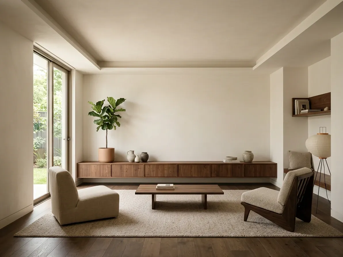
Warm minimalism in its Japandi neighbour: smoked oak, lower form.
Where minimalism sits next to its closest neighbours
Minimalism in 2026 does not live alone. It sits inside a wider cluster of related contemporary styles that share the underlying discipline of restraint and edit, and the cleanest way to specify a project is often to name where it sits in this cluster rather than to insist on a single pure label.
Minimalism and Scandi. Scandi is the regional Nordic application of the minimalist principle, with pale timbers, soft whites, hygge-driven textile warmth, and a strong mid-twentieth-century furniture heritage. A Scandi room is almost always a minimalist room; not every minimalist room is Scandi. The Australian read of Scandi tends to warm the palette and lengthen the indoor-outdoor connection.
Minimalism and Japandi. Japandi is the hybrid of Scandinavian and Japanese minimalism that has become the dominant emerging style label in Australian homes through the mid-2020s. The Scandi half brings pale timbers and bright neutrals; the Japanese half brings darker woods, lower furniture, and a more contemplative relationship to negative space. Japandi is one regional reading of minimalism with stronger contrast and more visual discipline; warm minimalism is the looser, more relaxed Australian reading of the same parent principle.
Minimalism and contemporary. Contemporary is the broader umbrella term for current Australian residential design, which can include minimalist, transitional, soft industrial and warm-modern directions. A contemporary house is not necessarily minimalist; it can be, and most of the leading contemporary residential work in Australia in 2026 leans on minimalist instincts even when the brand label is something else.
Minimalism and mid-century modern. Mid-century modern shares a furniture vocabulary with minimalism (Eames, Wegner, Saarinen, Nakashima) but is more permissive on colour, more sculptural in form, and more relaxed about pattern. A mid-century-leaning minimalist room is a common Australian read; a strict minimalist room with mid-century furniture pieces as styling moments is another.
Minimalism and industrial. Soft industrial overlaps heavily with warm minimalism in 2026. Both share the materials-honest instinct, the polished or microcement floor, the matte black metalwork, the open plan and the layered indoor-outdoor flow. The difference is that industrial keeps a stronger structural-vocabulary reference (exposed brick, steel framing, riveted detail) and a moodier tonal palette, while minimalism reads cleaner and lighter.
Minimalism and organic modern. Organic modern is the closest sibling to warm minimalism currently in circulation and the two labels are often used interchangeably in the leading 2026 publications. Organic modern leans slightly more sculptural and more curved (rounded sofas, curved arches, free-form furniture) and slightly less rectilinear than a strict warm-minimalist read, but the material palette and the discipline of the edit are largely the same.
The practical takeaway is that the dominant 2026 Australian direction sits inside a cluster of overlapping labels (warm minimalism, organic modern, soft industrial, Japandi, contemporary) that all run on the same underlying instinct: edit ruthlessly, hide storage, repeat a short material palette, layer warm light, treat negative space as design, and put tactile warmth back in. A project that lands cleanly in any of these reads is doing minimalism right.
Where minimalism does not fit
Minimalism is a discipline rather than a universal answer, and there are Australian houses and households for which it is the wrong call.
A house full of inherited or sentimental furniture from multiple generations is rarely a candidate for strict minimalism; the discipline of the edit asks for more compromise than the household is going to want to make. A maximalist who genuinely loves pattern, layered colour, collected objects, books on every surface and visible memory will not enjoy a minimalist home and should not be pushed into one. A renovation in a Federation, Edwardian or Victorian heritage cottage with intact period detail (decorative ceilings, deep skirtings, picture rails, ornate cornices, archways) is fighting the minimalist instinct at the architecture level; the period detail is not removable without losing the building’s character, and a minimalist treatment that tries to ignore it reads as awkward. The hybrid that works in those buildings is a more transitional read, where the period shell is kept and the contemporary intervention (the rear extension, the kitchen, the bathroom) carries the minimalist instinct without trying to remake the front rooms.
A young family in the first decade after kids arrive can do a minimalist home, but the version that works is the working-family minimalism described in the FAQ above (more storage, more durability, lighter styling), not the magazine version. A household running a home business with significant physical inventory or sample stock is unlikely to make minimalism work in the working areas of the house; the room has to absorb the work it does, and that work is not minimalist.
Naming the wrong-fit cases up front is part of what makes the right-fit cases work. Minimalism is most rewarding when the household genuinely wants the discipline it asks for: fewer things, better resolved, with negative space carrying the room.
Frequently asked questions
What is minimalist interior design in simple terms?
Minimalist interior design is the practice of editing a room down to what genuinely earns its place, then making the remaining elements work harder. The shell is calm (neutral palette, clean architectural lines, natural light), the storage is generous enough that nothing has to live on the bench or the floor, the materials are considered (a short list of timbers, stones and textiles repeated through the room), and the styling is curated rather than accumulated. The point is not emptiness. The point is that everything you can see is there on purpose. A working minimalist room is calm because it is well-designed, not because it is bare.
Is minimalism out of date in 2026?
No. What is out of date is the 2014 to 2018 version of minimalism that read as clinical white walls, polished concrete floors, a single Eames chair and nothing else. The 2026 conversation across leading Australian interiors media has settled on a softer, warmer reading of the same underlying discipline, most commonly published under the label warm minimalism. The core principles (edit ruthlessly, hide storage, design with a controlled palette, let light and negative space carry the room) are unchanged. What has changed is the surface: warmer timbers, limewash and microcement instead of stark white plasterboard, honed stone and clay tile instead of polished porcelain, linen and bouclé instead of flat leather, terracotta and sage and oat accents instead of grey-on-grey. Minimalism as a label is appearing less in trend headlines than it did a decade ago because the underlying instinct has been absorbed into mainstream Australian residential design, not because it has gone away.
How do I do minimalism without making my house feel cold?
Cold minimalism is almost always the result of a single failure: the room has been stripped of clutter but nothing has been done to put warmth back in. The shell stays cool because the materials are cool (polished tile, painted plasterboard, glass, polished metal), the lighting is cool (a single ceiling downlight grid at 4,000K or higher), the textiles are absent or flat (no rug, no curtain, smooth-finish upholstery), and there is no organic life in the room (no timber, no plants, no real handmade object). The fix is to put warmth in deliberately. Use warm-toned timber across at least one large surface (a wide-plank oak floor, a hero timber dining table, an island bench top, a feature wall, a vanity). Choose tactile textiles in real fibres (Belgian linen curtains, a wool or jute rug under the main seating, a slubbed-linen or bouclé sofa). Layer the lighting in warm-white (2,700 to 3,000K) at multiple levels rather than a single cool downlight grid. Bring in real plants at architectural scale. Specify honed and matte finishes on hard surfaces rather than gloss. Keep the discipline of the edit but make sure the materials you keep are warm by nature. Done that way, the room reads as calm and considered rather than as a showroom you have to live around.
Can a minimalist home work with kids?
Yes, but the version that works with kids is a working-family minimalism rather than a magazine minimalism. The principles are the same (edit ruthlessly, hide storage, controlled palette, durable materials) but the implementation has to assume the room will be used hard. Storage volume goes up, not down: every room needs enough closed cabinetry that the daily clutter (school bags, art projects, sports gear, toys, mismatched lunch boxes) has a home. A full-height built-in wardrobe in each child’s room, a built-in toy storage wall in the living or rumpus, a dedicated school-bag and shoe drop-zone in the entry, and a deep-drawer pantry in the kitchen are the heaviest-lifting moves. Finishes shift to wipe-friendly matte surfaces, washable rugs, and timber and stone that improve with wear rather than show every mark. The styling layer is light: a few well-loved hero objects rather than a curated styled vignette that has to be reset every day. Made Minimal, an Australian family-minimalism publication, frames the goal as “conscious decisions, not spotless rooms”, which is the right test. A minimalist family home does not look like an architectural photograph; it looks like the architectural photograph at the end of a normal day, which is to say: tidy, warm, used, lived in.
What does a minimalist bathroom actually need?
Three things, in order. First, generous concealed storage, because the single biggest source of visual clutter in a bathroom is the products that have nowhere to live. A drawer vanity (not a cupboard with shelves) and a recessed mirrored cabinet are the floor on this. Second, a coherent material palette across every surface in the room (one floor finish, one wall finish for the wet area, one wall finish for the dry area, one stone for the vanity top, one metal finish on every tap and accessory), repeated rather than mixed. Third, an absence of visual clutter at the architecture level: a wall-hung vanity rather than a furniture-style piece with legs, no exposed plumbing, no waste pipes visible under the vanity, no over-tile bath spout if a wall-mounted one will fit, no chrome heated towel rail bolted to the wall if the budget allows a recessed niche or a heated rail in the same metal as the tapware. From there the look is mostly about restraint: large-format stone-look porcelain or honed natural stone on the floor and wet walls (fewer grout lines, easier to clean, calmer to look at), a single statement element (a hand-trowelled microcement wall, a fluted tile niche, a single stone slab on the vanity), warm and layered lighting rather than a single ceiling downlight, and a strict short list of materials repeated through the room. A minimalist bathroom is not an empty bathroom; it is a bathroom where every visible thing has been chosen, and everything that does not earn its place has been put away.
How much does a minimalist kitchen or bathroom cost in Australia in 2026?
The minimalist look does not have to cost more than a comparable conventional renovation, but the budget tends to land further up the spectrum because the discipline rewards better materials and built-in solutions. A working median for a full Australian kitchen renovation is around $30,000 to $35,000 (Housing Industry Association figures), and a minimalist kitchen specified honestly inside that envelope (flat-panel cabinetry in melamine or thermofoil, integrated dishwasher, a single bench finish, basic but coherent matte-black or stainless tapware, large-format splashback) sits comfortably inside it. Moving to handleless cabinetry typically adds 20 to 50 per cent to the cabinetry line because the channel routing, the recessed pulls and the specialist hardware all cost more than a standard handle (Joyce Kitchens 2025). A full premium minimalist kitchen (two-pack handleless cabinetry, full-height pantry, custom integrated appliances, slab-edge stone benchtop, custom matte tapware) typically lands between $40,000 and $80,000. Bathrooms follow the same logic: a working median Australian bathroom renovation lands around $20,000 to $35,000, and a minimalist specification inside that envelope is achievable with large-format porcelain, a drawer vanity in melamine, a single coherent metal finish and a strict palette. A higher-spec minimalist bathroom (microcement walls, honed stone vanity slab, brushed brass tapware, custom recessed niches) commonly lands between $35,000 and $60,000. The discipline that matters more than the budget is choosing fewer materials and specifying them well, rather than buying more materials and styling them down later.
What is the difference between minimalism, Scandi and Japandi?
All three share a common ancestor in the design-as-discipline tradition, but they answer different questions. Minimalism is the parent principle: edit a room down to what earns its place, hide what does not, design with a short controlled palette. It is a method, not a look, and it can be applied to almost any aesthetic. Scandi is a regional reading of that principle that came out of mid-twentieth-century Nordic design: pale woods (light oak, ash, beech), bright whites, a colour palette tuned for low-winter-light Scandinavian climates, generous textiles for hygge warmth, and a strong functional tradition rooted in mid-century furniture design. Japandi is the more recent hybrid of Scandinavian and Japanese minimalism: the Scandi palette stays but the wood tones darken (smoked oak, walnut), the furniture sits lower, the negative space becomes more intentional (drawing on wabi-sabi and ma), and the styling becomes more restrained. Warm minimalism, the dominant 2026 reading of the parent principle in Australia, sits between Scandi and Japandi: less obviously regional than either, warmer than original mid-century minimalism, more relaxed than Japandi’s contemplative discipline, and shaped to suit how Australians actually live. The clean way to think about it: minimalism is the rule, Scandi and Japandi are two well-known regional applications of the rule, and warm minimalism is the Australian application of the same rule that absorbs what works from both.