White kitchens: how to pick one that lasts
Are white kitchens still timeless in Australia in 2026? The version that ages well, the version that dates, the right white to choose and why.
What this guide is for
White kitchens are the most-specified colour in Australian kitchens, have been for at least a decade, and almost certainly will be at the end of this one too. The 2023 Houzz Australia Kitchen Trends Study found 52% of homeowners specified white cabinetry against the next strongest single colour at 8%. Every year a wave of design writing announces white is over, dark cabinetry is the future, the warm-white moment has ended. Then the renovation numbers come in, white is still the most requested colour, and the cycle starts again.
The honest answer is more useful than either side of that argument. White kitchens are not a trend and not finished. They are a foundation that ages well or badly depending on the version you choose. The version that uses white as one element in a layered, textured room continues to look good for fifteen years and resells well. The version that paints everything white, picks the cheapest cool white tone, and lets the showroom photograph itself is the version most likely to feel dated five years from finishing.
This guide is the long answer to whether to pick a white kitchen, what kind of white to pick, and how to keep it from joining the catalogue of regret-yourself white kitchens already on the market. It assumes you are renovating in Australia in 2026, you are weighing white against a more colourful option, and you would rather not redo this in eight years.
We run an image visualisation service used by Australian builders, designers and renovators to test colours and finishes before the order goes in, and we mention it once where it is useful. Everything else is what we would tell a friend mid-quote.
- White52%
- Black8%
- Green6%
- Grey6%
- Other28%
The real answer first
A white kitchen is not one thing. There are at least four kinds, and they age very differently.
The all-white kitchen, where cabinets, benchtop, splashback, walls and sometimes flooring all sit in the same cool white family with no contrast and no texture, is the version that photographs well, dates fastest, and now appears on most “kitchen trends to avoid” lists. It was the dominant Instagram kitchen between 2015 and 2020 and it is the version pulling white kitchens down with it.
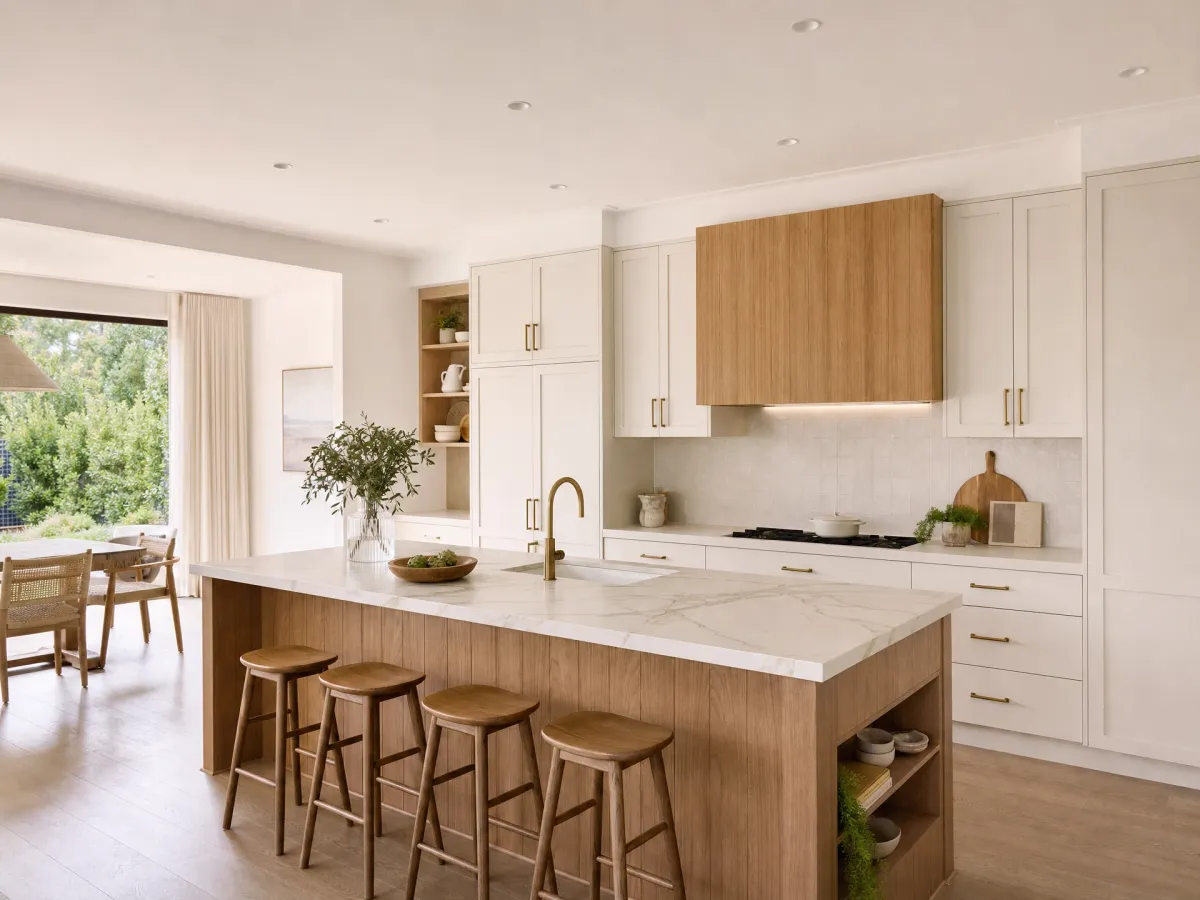
The warm white-and-timber kitchen, where warm-toned white cabinetry sits against oak or walnut timber on the island, floors or open shelves, is the version that has worked for a hundred years in Australian homes and will keep working. Hamptons, modern Hamptons, modern coastal, transitional and Australian contemporary all sit inside this shape.
The two-tone kitchen, where white perimeter cabinetry surrounds a coloured or timber island (or vice versa), is now the second-most-specified Australian configuration after solid white. It gives a kitchen a focal point without committing the whole room to a strong colour, which is why it has become the standard recommendation for renovators who want some colour but worry about resale.
The high-gloss handleless white kitchen, where the cabinetry is finished in gloss 2pac or thermolaminate and the doors run as one uninterrupted plane, is the version that suits modern apartments and contemporary architecture but reads as cold in older or family-occupied homes. It ages gracefully if it suits the architecture and ages badly if it does not.
The question is not “white or not white”. It is which of these versions fits your house, your light and your household. The rest of this guide works through it.
- White
- Wood
The white kitchens that date
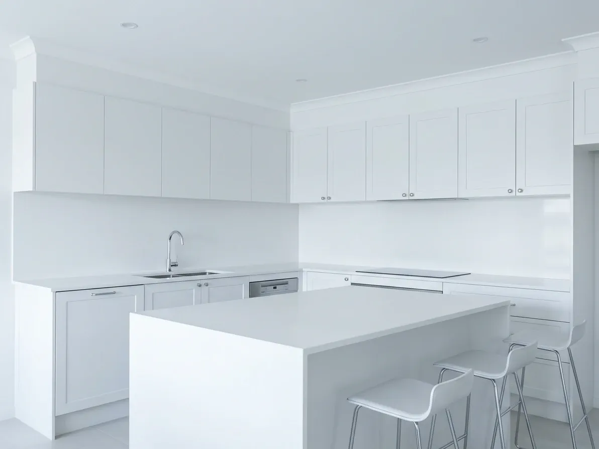
All-white, no contrast, no warmth: the version that ages fastest.
It is worth being specific about which white kitchens are now considered dated, because the design press and the renovation numbers disagree about which version of “white” is being discussed.
The single biggest dating mistake is treating white as the whole palette rather than the foundation. The kitchen where white cabinetry, white stone, white tile splashback, white walls and white floors all line up in one cool register has no contrast for the eye to rest on. It reads as flat in person, even when it photographs well. It is also the version with no timber, no metal, no stone with character and no warmth, which means there is nothing to soften the brightness of the cabinetry as the trend cycle moves on.
The second dating mistake is the wrong undertone for the room. A cool, blue-leaning white in a south-facing kitchen with little direct light reads as grey, washed out and slightly dingy. The same white in a north-facing kitchen reads crisp and bright. The “best” white is not a universal pick. The Dulux colour consultants will tell you the same thing on a free in-home appointment. White paint is the easiest finish to get wrong because the room does most of the work, and a sample that looks beautiful in a Sydney showroom can read as cold-storage white in a Melbourne flat in winter.
The third dating mistake is over-glossy finishes. High-gloss 2pac white in a family home with children, dogs and weekly dinners shows every fingerprint, every water mark and every greasy splatter within a year. Gloss handleless white in an Edwardian terrace looks like a hire-car interior next to the home’s original detailing. Gloss has its place, but its place is a contemporary apartment with handleless joinery, not a 1920s Federation in Hawthorn.
The fourth dating mistake is the wrong door profile. A heavy, ornate, beaded shaker with a routed centre panel and a Cabriole-style handle reads as the cottage kitchen your grandmother updated in 1996. A flat-front shaker with a slim 5mm rebate reads as timeless. Both call themselves “white shaker” on the quote. The fix is in the proportions, not the colour.
The all-white, cool, gloss, beaded version of the white kitchen is the one earning every “outdated trend” article in 2026. It is also the version still being sold by some volume builders as the default inclusion. If your project home brochure looks like this, that is the conversation to have with the joiner before signing.
The white kitchens that last
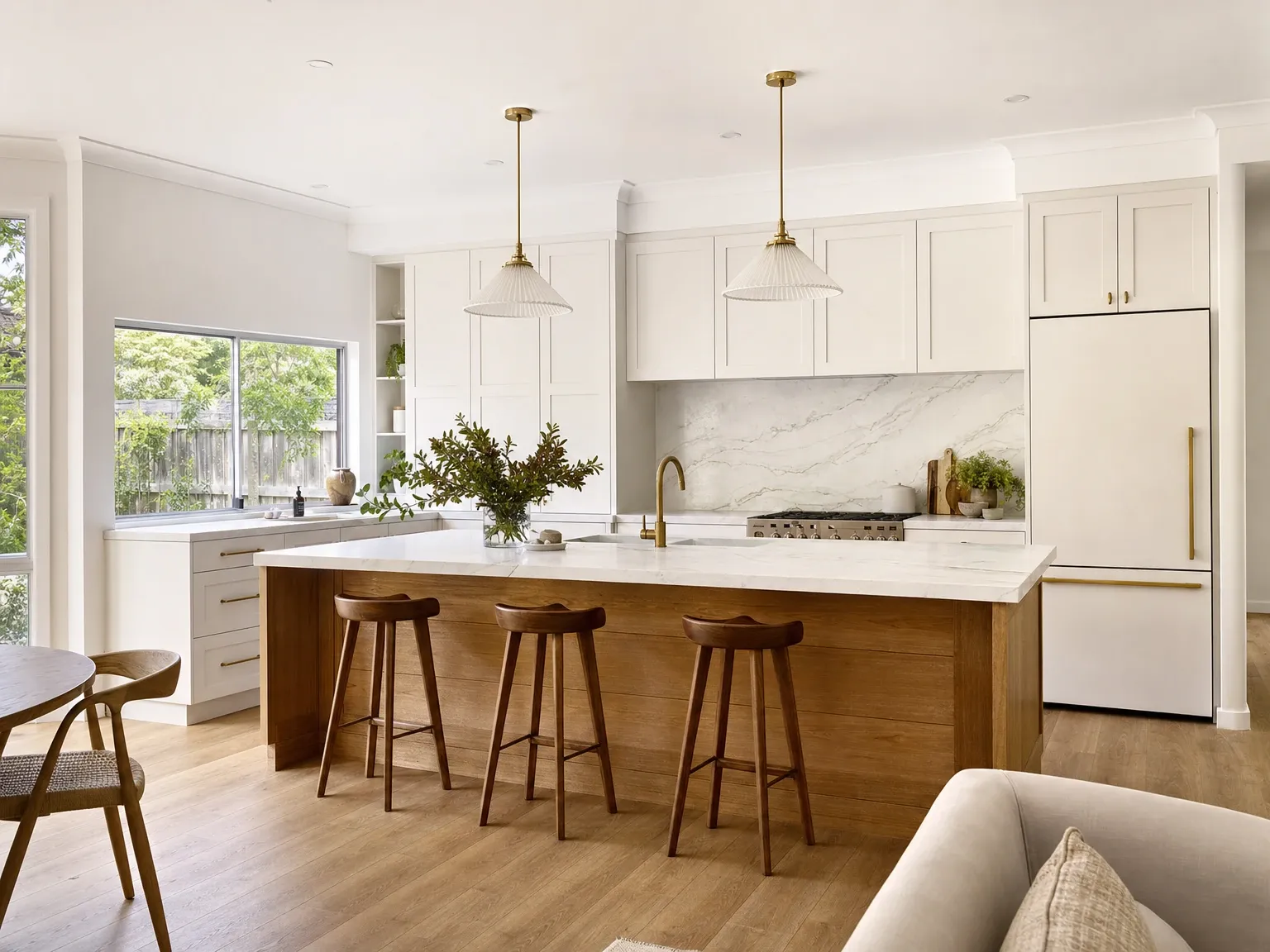
 Before
After
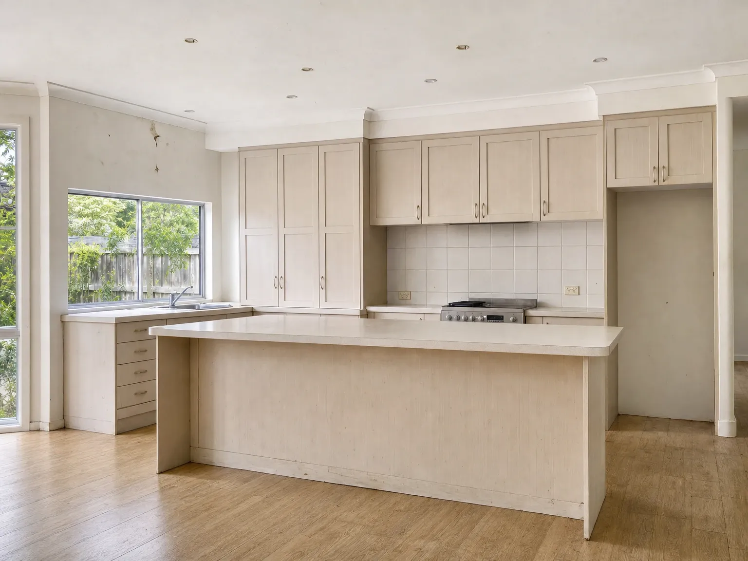
Before
After
The version of the white kitchen that holds up is the one that treats white as the dominant element but layers contrast, warmth and texture into the rest of the room.
In an Australian context, the durable formula has four habits.
Start with a warm-leaning white on the cabinetry. Dulux Natural White, Antique White U.S.A. and Whisper White are the three Australian cabinetry whites that age best across most light conditions. Each carries a subtle warm undertone that stops the cabinetry reading clinical in lower light. Cool whites like Lexicon Quarter, Vivid White and Snowy Mountains Half belong on north-facing kitchens with strong natural light, or contemporary architecture where the coolness is deliberate.
Bring in one warm material. A timber island front, a timber open shelf, a timber rangehood box, or solid timber floors carrying through from the living area. The eye reads the timber as warmth, the white as cleanliness, and the room as designed rather than empty.
Choose a stone with movement, not a flat white. A heavily veined Calacatta-look engineered quartz, a honed Carrara, or a real natural stone with visible movement gives the white kitchen its visual centre. A flat, evenly-coloured Pure White or Snow White benchtop reads as a sample chip stretched across the room. The benchtop is the largest single horizontal plane the eye lands on and a flat colour wastes it.
Add metal that contrasts with the white. Brushed brass, antique bronze, gunmetal, matte black or a warm aged nickel reads as intentional. Brushed chrome and polished nickel disappear against white cabinetry, which is fine functionally but does nothing for the design. The hardware is the kitchen’s punctuation.
This formula is not new. It is what Australian designers have been recommending in Hamptons, coastal, French Provincial and contemporary kitchens for ten years, and it is what the most popular kitchens on Houzz Australia keep showing. The “everything white” version has aged badly precisely because it skipped this formula.
Picking the right white
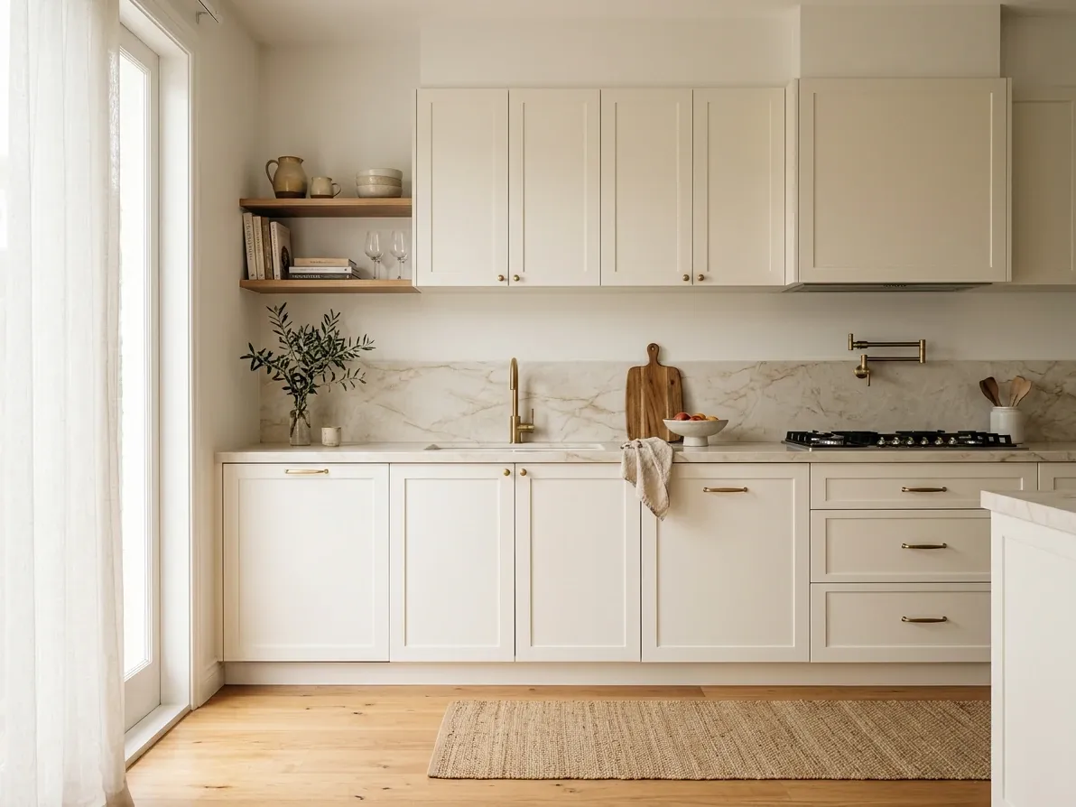
A warm-white kitchen reads inviting where a cool white reads grey.
The single decision that does the most to determine whether your white kitchen reads warm and welcoming or cold and clinical is the undertone of the white itself. Australian white paints fall on a spectrum from very warm (creamy, yellow-leaning) through neutral (the natural light registers as white) to cool (blue, green or grey-leaning).
For cabinetry, the most-recommended Australian whites cluster in a fairly narrow band around neutral with a slight warm pull.
Dulux Natural White is the most popular Australian cabinetry white and the safest single recommendation in the country. It has a barely-there grey undertone that reads as neutral in almost any light. It pairs cleanly with both warm and cool finishes, which makes it the white of choice when you do not yet know what your stone, hardware and timber are going to be. According to Dulux Australia’s own published shortlist, it is one of the three most-specified whites nationally for both walls and cabinetry.
Dulux Antique White U.S.A. is the next step warmer and the standard pick for Hamptons, French Provincial and traditional Australian homes. It carries a clear cream undertone that suits oak, brass and warmer stones and would look jaundiced against cool grey marble. If the rest of the kitchen is leaning traditional or warm, this is the white that holds the room together.
Dulux Whisper White sits between the two and is widely used as a cabinetry colour because it has enough warmth to feel inviting without committing to a clear cream undertone. It works particularly well in kitchens with a mix of warm and cool elements because it does not fight either side.
Dulux Lexicon Quarter is the popular cool white and the right pick for contemporary, modern, very bright north-facing or large-window kitchens. In a south-facing room with limited natural light, Lexicon reads as cold and slightly grey, and is the source of most “my white kitchen looks dingy” complaints six months after the renovation.
Dulux Vivid White is true pure white, with no undertone in either direction. It is the brightest of the popular whites and the most demanding to live with: any wear, fingerprint, scratch or watermark shows immediately. It is best used as an accent (cornices, ceilings, splashbacks against a coloured wall) rather than as the dominant cabinetry colour in a working family kitchen.
A small confession this part of the guide cannot avoid: the colour names are Dulux because Dulux dominates Australian cabinetry painting, but the equivalents exist in Taubmans, Wattyl and most cabinetmaker-supplied 2pac systems. The naming differs; the undertone families are the same.
The cardinal rule is never to commit to a white from a colour chip. The chip is 30 by 30 millimetres and shows you the colour against white card under shop lighting. The same colour on a 2 by 3 metre cabinet wall in your actual room under your actual light bears no resemblance to the chip. Order or paint an A3 sample, mount it vertically on the kitchen wall where the cabinets will sit, and look at it in morning light, afternoon light and evening lamp light over at least three days. Whites change more across times of day and weather than almost any other colour, and a confident sign-off from a chip is the most common reason for white kitchen regret.
Cool versus warm: the rule that makes or breaks the room
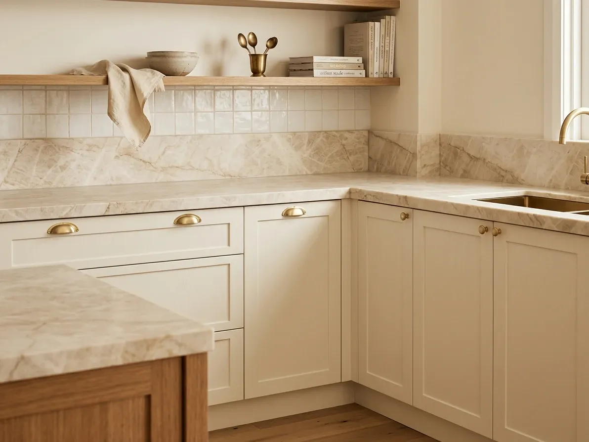
Every element in one undertone family reads as designed, not discoloured.
The single test that catches most white kitchen mistakes early is the cool-versus-warm consistency check.
Every white paint has an undertone. Every stone has an undertone. Every timber has an undertone. Every metal has an undertone. The trick to a white kitchen reading designed rather than discordant is keeping these aligned.
A warm white cabinet (Natural White, Antique White, Whisper White) wants warm stone (warm-veined marble, Calacatta-look quartz with a yellow or beige pull, travertine, honed limestone), warm timber (oak, walnut, blackbutt), and warm metal (brushed brass, antique bronze, aged copper).
A cool white cabinet (Lexicon, Vivid, Snowy Mountains Half) wants cool stone (Carrara-look quartz, grey-veined marble, mid-grey stone), cool timber (ash, beech, pale Tasmanian oak with a grey wash), and cool metal (polished chrome, brushed nickel, satin stainless).
The most common white kitchen mistake in Australia is splitting these. A warm Antique White cabinet against a cool grey-veined Carrara benchtop reads as cabinets that have started yellowing, even on day one. A cool Lexicon cabinet against warm honey-oak floors reads as a foreign object in the home. Both kitchens were specified in good faith; both look subtly wrong because the undertones disagree.
The check is simple: lay all the samples (cabinet, stone, splashback tile, hardware finish, timber) side by side on a single board and ask whether they read as one family. If one sample stands out as either much warmer or much cooler than the rest, swap it. The white kitchen lives or dies on this consistency test, and it is the test most renovators discover too late.
How to add contrast without losing the white
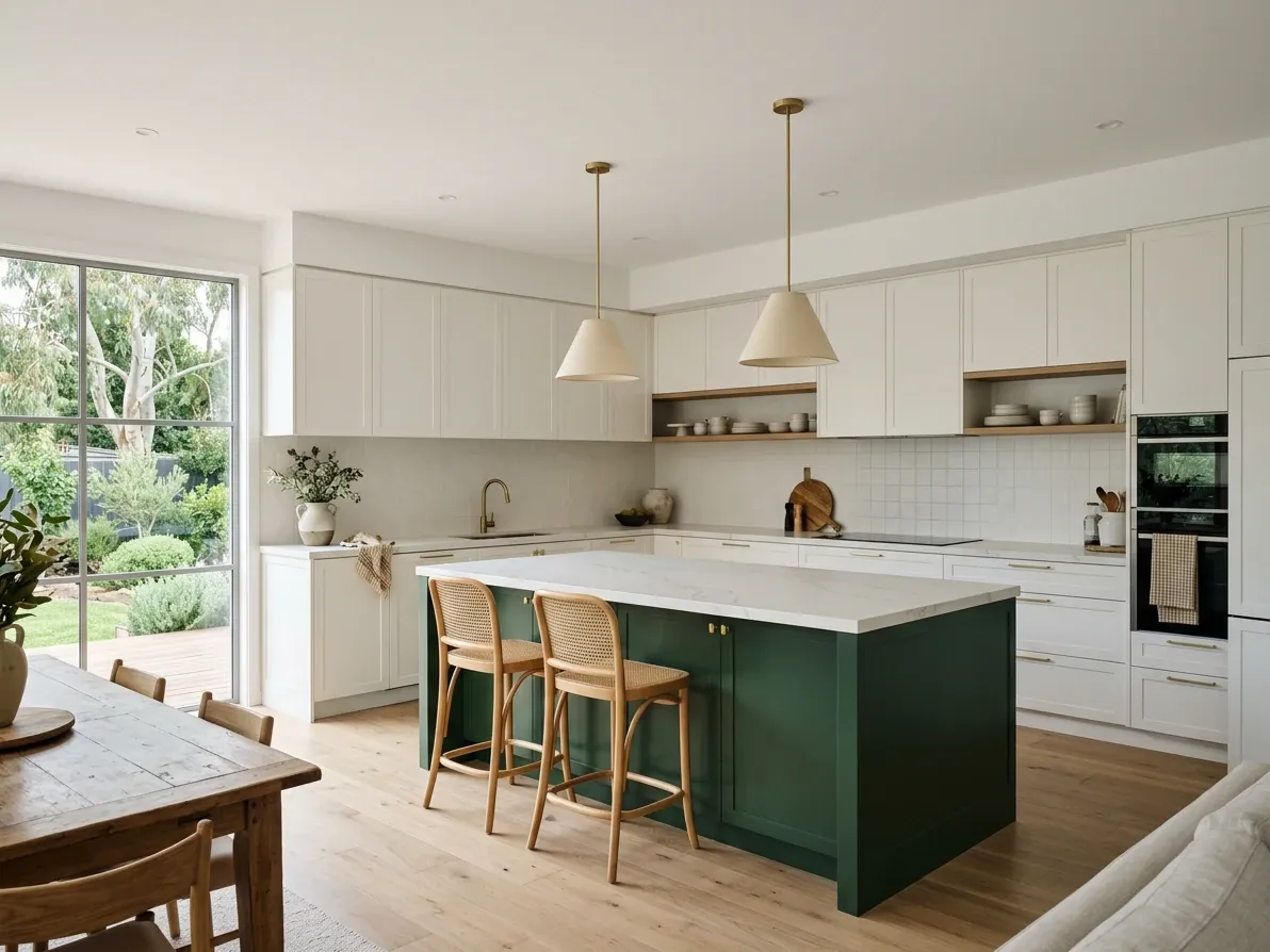
A coloured island gives the room a focal point without changing the whole kitchen.
The other technical move that separates the white kitchens that age well from those that flatten over time is contrast. White on white on white photographs cleanly but reads as institutional in person. The room needs at least one element with enough visual weight to hold the eye when it walks in.
Five contrast moves are reliable in Australian white kitchens.
A timber island front is the most popular single move. Keeping the perimeter cabinetry white but cladding the island in matched timber (vertical V-joint, plain panels, or fluted) gives the kitchen a focal point without committing more than one cabinet run to a strong colour. The 2026 Australian default is light to medium oak on a white perimeter, but blackbutt, walnut and stained ash all work.
A stone-clad island, where the benchtop carries down the sides of the island as a waterfall edge, turns the stone into the focal point and lets the cabinetry recede. This works best with a stone that has visible veining or movement; a flat white solid waterfall edge reads as expensive but bland.
A coloured island is the option that has grown the fastest in Australia between 2023 and 2026. White perimeter cabinets surround an island in deep navy, hunter green, charcoal or a clay tone. The island becomes the personality of the kitchen and the surrounding white cabinetry stays neutral. Resale risk is contained to one cabinet run, which is a much cheaper repaint than the whole kitchen.
A bold splashback. Real natural stone (honed marble, travertine), a coloured zellige or subway tile with a contrasting grout, fluted glass or a deep-toned brick splashback gives the back wall enough visual weight to balance an all-white cabinet plan. The splashback is the element of a kitchen most renovators undercook.
A timber rangehood housing or open timber shelves. If the rest of the kitchen has to stay white for resale or layout reasons, a single timber rangehood box and two timber open shelves above a feature wall is enough to bring warmth to the space without changing the cabinetry.
The aim is not three or four of these at once. Pick one strong contrast move and let the white cabinetry support it. Two contrast moves can work in larger kitchens. Three or more and the white starts to look like an afterthought rather than the foundation.
Finishes: matte, satin, gloss and what each one teaches you
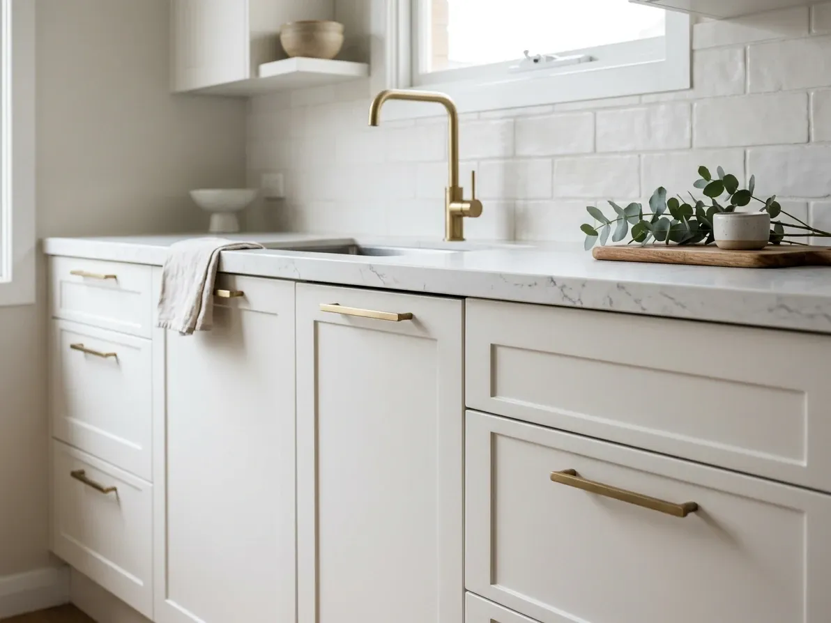
Matte 2pac hides fingerprints, scratches and water marks far better than gloss.
The finish of the white is at least as important as the white itself, and the finish is what determines whether the kitchen is forgiving or punishing to live with.
Three finishes account for almost every white kitchen sold in Australia in 2026.
Matte 2pac (two-pack polyurethane in a low-sheen or matte finish) is the premium standard. The colour comes from sprayed pigment, the surface is hard, the finish is smooth without being reflective, and it photographs as soft, designed and expensive. Matte is the best at hiding fingerprints, scratches and water marks because no light is bouncing off the surface to expose them. The downside is cost: matte 2pac is the most expensive cabinetry finish, typically running $400 to $800 per square metre of door area depending on the joiner. For most family homes, matte 2pac in a warm white is the finish that earns its premium.
Satin or low-sheen 2pac sits between matte and gloss. The slight sheen gives the cabinetry a subtle reflectivity that helps small or dark kitchens feel brighter without committing to a high-gloss look. Satin shows slightly more wear than matte but considerably less than gloss. For a north-facing apartment kitchen or a galley where every bit of light helps, satin is often the right pick.
Gloss 2pac is high-shine, mirror-finish white. It maximises light reflection, suits modern handleless joinery, and looks striking in showroom photography. In a working family kitchen it shows fingerprints, water marks and child-handprints constantly. Gloss white is the right specification for a high-end contemporary apartment with a handleless system and minimal cooking, and the wrong specification for a family of five who actually cook every night.
A fourth common finish, thermolaminate (vinyl wrap on MDF), is the affordable alternative and the riskiest in white. Cheap thermolaminate in white is the finish most prone to lifting around ovens, dishwashers and steam-prone joints, and it is the finish most likely to yellow visibly under sustained UV exposure. The quality of thermolaminate has improved significantly through 2024 and 2025, particularly from German-supplied wrap systems, but it is still the white finish to avoid in any cabinet panel within 200mm of a heat source or in direct full-day sun.
The trade-off between the finishes is durability versus cost. If the budget allows matte 2pac, take it; the family kitchen will look better in year ten than the gloss kitchen does in year three. If matte 2pac is out of reach, satin 2pac is the next best. Thermolaminate in white is genuinely fine if the kitchen does not face direct sun, the joiner has used quality wrap and PUR adhesives at the edges, and the cabinets are not directly bracketing the appliances.
The yellowing problem
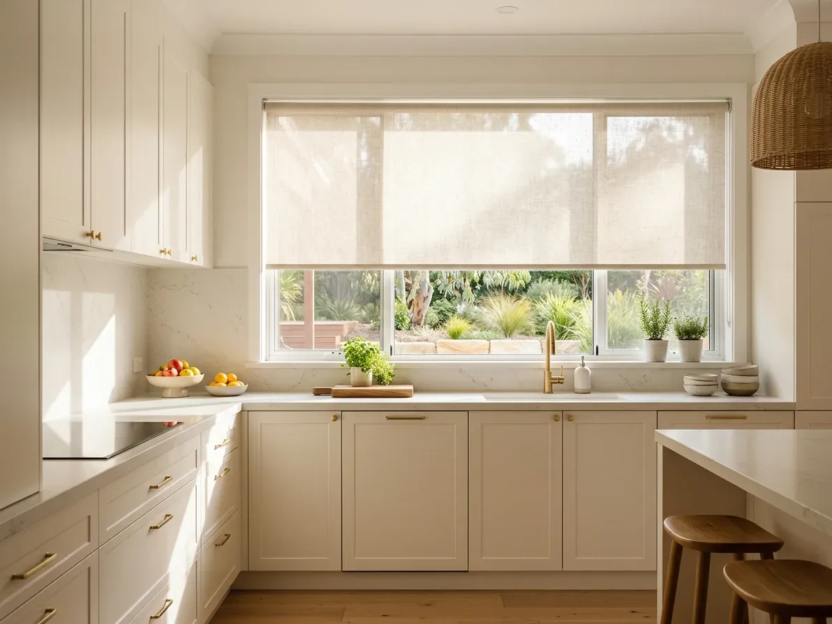
A sheer blind in front of strong sun is the cheapest yellowing insurance you can buy.
The single most-asked question about white kitchens, after “is it dated”, is “will it turn yellow”. The honest answer is: a little, eventually, and most of the time you can control it.
White kitchen finishes yellow for two reasons. Surface yellowing comes from cooking grease, smoke, dust and skin oil building up on the finish over time, and it is the same yellowing that happens to any white surface near a cooktop. It wipes off with warm water, a mild detergent and a soft cloth, and it is mostly avoided by giving the doors a damp-cloth wipe-down each week. This is the yellowing most homeowners mistake for the finish itself failing.
Permanent yellowing comes from UV breaking down the chemistry of the finish. Polyurethane clear coats (the protective layer on 2pac) and thermolaminate vinyl wraps both photo-oxidise under direct sunlight. The yellowing penetrates the finish so cleaning cannot lift it, and the rate at which it occurs depends on how much direct sun the surface receives and what protective additives the manufacturer included. According to most cabinetry painters, modern 2pac systems include UV inhibitors that slow this down to the point that yellowing is not visibly noticeable for ten years or more under normal indoor conditions. Older 2pac systems and cheaper thermolaminate can show visible yellowing within two to three years of direct western-sun exposure.
The practical preventions are simple. Use a quality 2pac system from a known supplier (Dulux Renovation Range, Wattyl Cabinet & Door Enamel, or a joiner-specified imported European system). Avoid pointing white cabinetry directly at an unscreened west-facing window. Use sheers, blinds or window film on any north-facing window directly above white cabinetry. And for the cheapest insurance, write into the cabinet contract that the finish warranty covers yellowing under normal indoor light conditions for at least five years.
The yellowing problem is real but it is also overstated. Most yellowed white kitchens are yellowed because nobody wiped them down for ten years, not because the 2pac failed. The kitchens that have actually photo-oxidised tend to be the ones in full afternoon sun with no window covering, which is bad for cabinetry of any colour, not just white.
White kitchens in small and dark Australian rooms
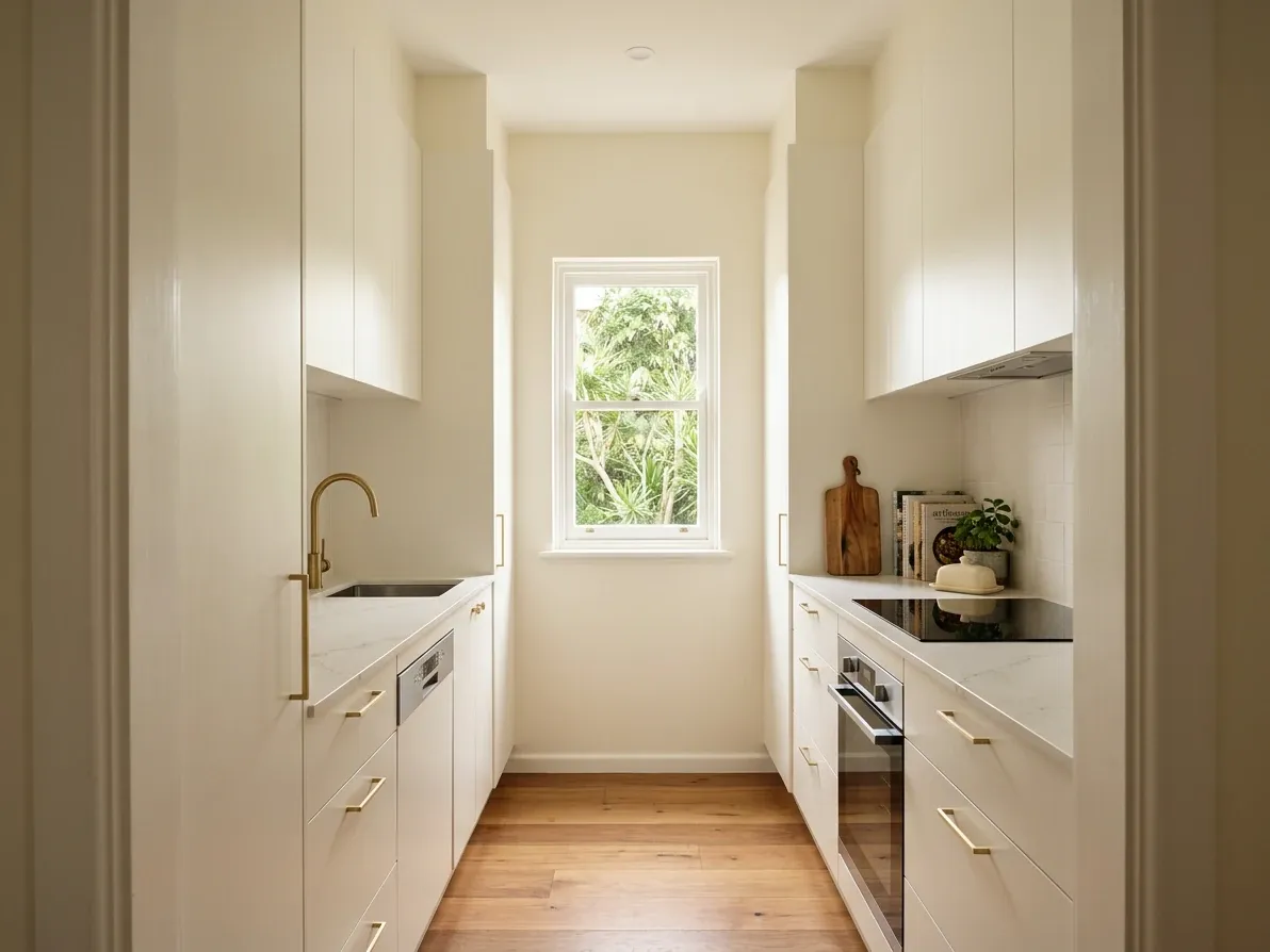
White cabinetry bounces ambient light, which is why galleys still go white.
There is a practical reason white still dominates Australian kitchens, and it has nothing to do with trends. Most Australian homes built in the last forty years run open-plan kitchen-dining-living configurations on relatively standard 2,400mm to 2,700mm ceilings, and the kitchen rarely has direct natural light above the bench. Light colours reflect; dark colours absorb. White cabinetry bounces whatever ambient light the room gets, which is why the kitchen photographer’s go-to advice for a small or dark space is still to lighten the cabinetry rather than darken it.
This is not a rule, it is light physics. A 2.7m by 3m galley kitchen in a 1960s brick veneer in inner-suburban Melbourne with a single south-facing window does not gain from charcoal cabinets, no matter how beautiful that particular charcoal is on the trend board. A 4m by 5m country kitchen with a 2.7m ceiling, a 1.5m sash window above the bench and a glazed door to the alfresco can absolutely take a deep green or navy. The same dark colour in a small dark kitchen reads as cave; in a large bright kitchen reads as confident.
This is the most consistent under-discussed reason white kitchens still get specified at the rate they do. Real estate agents, builders and designers know that for the median Australian kitchen footprint and ceiling height, the safest colour for functional brightness is a warm-leaning white. For larger, brighter kitchens with skylights, oversized windows or expansive ceiling height, the colour conversation opens up. The kitchen size and light conditions should drive the colour decision at least as much as the trend article does.
If you are unsure, the simple test is to photograph your existing kitchen in mid-morning daylight, then darken the cabinet area by 40% in a phone photo editor. If the kitchen still feels usable, your room can take a darker cabinet. If the photo immediately reads as gloomy, the room wants light cabinetry.
What a white kitchen actually costs in Australia
The total cost of a white kitchen in Australia in 2026 is essentially the cost of any equivalent kitchen with a small premium or discount depending on the finish. White does not cost more or less than coloured cabinetry as a colour, but the finish you typically pair with white does shift the cost.
The all-Australia median spend on a kitchen renovation sits around $35,000 in 2026, with cabinetry making up between 30 and 40% of the project. On a $35,000 kitchen that is $10,500 to $14,000 on the boxes and doors before appliances. White cabinets in entry-level flat-pack laminate sit around $3,000 to $8,000 supplied only. Mid-range white thermolaminate or 2pac on a semi-custom modular system runs $11,000 to $20,000 installed. Premium white in matte 2pac with full custom joinery starts around $20,000 and runs above $40,000 for larger kitchens or complex hardware.
The premium between white and a stained timber-veneer or coloured-spray finish is rarely more than a few hundred dollars on any one finish line. Where the cost actually changes is in the door profile (shaker is around $30 to $60 more per door than slab) and the hardware system (handleless adds 10 to 15% to the cabinetry total). The colour itself is not the driver.
The full cost breakdown for the rest of the kitchen, including appliances, benchtops, splashbacks, plumbing and trade margins, is covered in our kitchen cabinet design guide and the related kitchen styles guide for how a white kitchen fits into the Hamptons, modern coastal, modern, French Provincial and contemporary style families.
The mistakes we keep watching
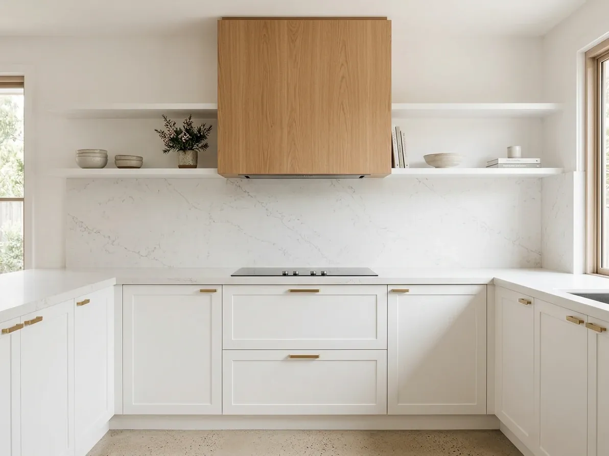
One timber move is usually enough to keep a white kitchen feeling warm.
A handful of white kitchen mistakes repeat often enough that they are worth naming.
Picking the white from a tiny paint chip. A 30mm chip cannot tell you what a 6m run of cabinet wall will read like in your actual light. Order an A3 sample, mount it vertically, look at it across three days.
Mixing warm and cool undertones. Warm white cabinets against cool grey marble (or the reverse) will always read as wrong, no matter how expensive each material is. The undertone family check is the single thing most likely to save the project.
High-gloss 2pac in a working family kitchen. Gloss white in a household with kids, dogs and weekly cooking is high-maintenance, period. Matte 2pac is the family-kitchen default for a reason.
Cheap thermolaminate around heat sources. The cabinet panel either side of an oven or dishwasher is where thermolaminate fails first. If the budget forces thermolaminate, write into the contract that the panels flanking the oven are 2pac-finished MDF, not wrap.
Beaded shaker with ornate handles. The traditional cottage-style beaded shaker door with a swan-neck handle reads as a 1990s update of a 1970s kitchen. A slim flat-panel shaker with a 5mm shadow rebate and a plain bar handle reads as timeless. Both call themselves “shaker” on the quote.
A flat white benchtop. The benchtop is the largest single horizontal plane in the kitchen and the eye lands on it constantly. A flat unpatterned white stone wastes that real estate. Pick a stone with movement.
No timber, no metal, no contrast. The all-white, no-warmth version is the version every “outdated kitchen trend” article is written about. One timber element, one warm metal, one stone with character is the minimum to stop the room reading institutional.
Brushed chrome hardware. Chrome and polished nickel disappear against white cabinetry and add nothing to the design. Brushed brass, matte black, antique bronze or warm aged nickel earn their place.
Pure cool white in a south-facing kitchen. The kitchen will read grey, washed-out and slightly dingy from year one. The fix is a warmer white, not more downlights.
Refusing to test the colour before committing. This is where reIMG genuinely earns its place: it is much cheaper to visualise three white-kitchen variants on your actual room photo before you sign the joinery contract than it is to discover the wrong undertone after install. Send us your kitchen photo and the cabinet samples you are weighing; you get three test renders back in 24 hours. The whole point is to stop a $35,000 kitchen from becoming a $35,000 regret.
So, timeless or trend?
White kitchens are a foundation, not a trend.
The version that uses white as one element in a layered, textured, warm room continues to age well in Australian homes and almost certainly will through the rest of the decade. The version that paints everything white, picks the cheapest cool white tone, and skips the timber, metal and stone with character is the version every “white kitchens are over” article is actually writing about.
The decision is not whether to do a white kitchen. The decision is which white kitchen to do. Pick the warm-leaning white that suits your light, pick a stone with movement, pair it with one timber move and one warm metal, choose matte or satin 2pac rather than gloss in a family home, and the kitchen will look good in 2031 and in 2036.
The white kitchens that have aged badly aged because they were specified as a Pinterest aesthetic, not as a designed room. The ones that age well are designed rooms that happen to be mostly white.
Frequently asked questions
Are white kitchens still in style in Australia in 2026?
Yes, but the version that wins has shifted. White is still the single most-specified cabinet colour in Australian kitchens, sitting at 52% in the 2023 Houzz Australia Kitchen Trends Study, well clear of any single contrasting colour. What has changed is the white. The flat, all-white, zero-contrast kitchen that dominated Instagram between 2015 and 2020 is the version most designers now treat as dated. The white kitchen that earns its place in 2026 is warm rather than cool, paired with timber, stone with visible veining, brushed metal or a darker island, and reads as one element of a layered room rather than the whole palette.
What’s the most popular white for kitchen cabinets in Australia?
Dulux Natural White is the most-recommended Australian cabinetry white by a wide margin: a soft warm white with a very slight grey undertone that reads neutral in almost any light. Dulux Antique White U.S.A. is the next step warmer and suits Hamptons, French Provincial and traditional homes. Dulux Lexicon Quarter is the popular cool white for contemporary, north-facing or very bright kitchens. Whisper White and Vivid White round out the everyday Australian shortlist. The undertone matters more than the brand: warm whites suit south-facing rooms and timber floors; cool whites suit north-facing rooms and grey-toned stone.
Do white kitchens hurt resale value?
No. White cabinetry is the safest colour choice from a property-value perspective in Australia because it appeals to the broadest range of buyers and lets them mentally overlay their own taste. Dark and bold-coloured kitchens are polarising at resale: a buyer who loves deep navy sees a finished kitchen, a buyer who does not sees a renovation project. Where white can hurt resale is the specific stark, cool-toned, all-white version (cool grey-white cabinets, cool white stone, cool white splashback, no contrast) that has been on the property pages for a decade. A warm-white kitchen with a stone with character, timber accents and good hardware reads as timeless, not aging.
Why do white kitchen cabinets turn yellow?
Yellowing has two causes and only one is fixable. Surface yellowing comes from cooking grease, smoke residue and dust building up on the finish. It wipes off with warm water, mild detergent and a soft cloth, and it is mostly avoided by wiping the doors weekly. Permanent yellowing comes from UV breaking down the finish itself. Polyurethane (2pac) clear coats and thermolaminate vinyl wraps both photo-oxidise under direct sun, particularly above north-facing windows, and the yellowing penetrates the finish so cleaning will not lift it. Modern 2pac systems include UV inhibitors that slow this down significantly, but no white kitchen finish is immune to a fully sun-blasted window. Window film, sheer blinds, or simply not pointing the white cabinets directly at the western sun are the practical preventions.
Cool white or warm white for kitchen cabinets?
Match the undertone to the natural light, the stone and the timber in the room. Cool whites (blue, grey or green undertones) suit kitchens with strong natural light, north-facing windows, grey-toned stone, and contemporary or industrial designs. Warm whites (yellow, cream or beige undertones) suit south-facing kitchens with cooler light, oak or walnut timber, travertine or warm marble, and Hamptons, French Provincial, country or coastal designs. The cardinal mistake is mixing the two: warm white cabinets against cool white stone read as discoloured rather than designed. Sample both undertones on an A3 board, in the actual room, at morning and evening, before signing the joinery contract.
How do I stop a white kitchen looking sterile?
Treat the white as the canvas, not the design. Five reliable moves work in almost any home. First, swap one element for timber: a timber island front, timber open shelves, or a timber rangehood cover. Second, pick a stone with visible veining or movement rather than a flat white solid. Third, use brushed brass, antique bronze or matte black hardware instead of brushed nickel. Fourth, add texture on the splashback (subway tile with a grout colour, fluted glass, VJ panelling, or natural stone) instead of a flat white slab. Fifth, hang one warm pendant or two over the island. Any two of these is usually enough.
Is matte or gloss white better for kitchen cabinets?
Matte for most Australian homes, gloss only when the room and style genuinely call for it. Matte 2pac in a low-sheen or satin finish hides fingerprints, scratches and water marks far better than gloss, photographs as a softer, more designed finish, and ages more gracefully. Gloss white reflects light strongly, which suits very small or very dark kitchens where you want every bit of bounce, and pairs well with handleless joinery in modern apartments. The downside is that gloss shows every fingerprint, smudge and child-height handprint, and gloss thermolaminate (the cheaper gloss alternative to 2pac) can lift around ovens and dishwashers if poorly detailed. A young family in a north-facing kitchen should default to matte every time.